Hi all, new here, and to community in general.👋 Thinking through the layout of our community home page and seeing some communities that have a secondary nav bar located on the top left or right of page before the primary nav.
I like the idea of a secondary nav to link to our corporate website outside of community and also thinking we can link to other external pages. Is there a best practice with the secondary nav, or does it just boil down to preference?
Best answer by DannyPancratz
I think it’s just preference.
And also probably how many links do you need/want in your navigation? Or do those extra links clutter the community experience?
If your total number of links isn’t too much, the Mega Menu allows you to add custom links. This is the option I use; half of the links are to other parts of our web experience, half are on community.
Academy, Support, and Marketplace open new tabs to non-community resources
An example of the other option is what’s currently on this GameChanger community. Altogether there are 11 links in their two menus. So I understand why they split it up.
Resources that aren’t on the CC platform are in a separate menu
One advantage of that approach (that you could also look at as a best practice is) that I’ve seen a handful of companies use the non-community navigation like Gainsight has as a consistent navigation menu across a number of a disparate platforms (community, LMS/education, documentation, company blog, etc). That allows a consistent UX across different platforms, but you’ll run into different solutions for how to insert that at the top because each platform might be different.
We initially planned to do something like that and abandoned it due to complexity, and because we found a way to make it work with a smaller number of links in the standard Mega Menu.
Make sure that user understands the structures and navis; "Where I am going to if I click here”. It is confusing if user though he/she is going to the corporate page instead of community page and vice versa.
I have even seen the solutions where is two separate logins in the navigation 😃 Top one to the company page and below login to the community.
I recommend to plan and test carefully. Use your members, ask their opinions and show them your mokups.
One tip, I’ll provide that’s not necessarily a best practice, but can be helpful: Phantom Categories.
Our documentation lives on another CMS/platform and we’re only using the CC Knowledge Base module for a small subset of our documentation. But you’ll (notice in the image in my reply above) that our Documentation is a dropdown menu.
To do this, we have what I call “Phantom Categories.” The dropdown menu is the out-of-the-box Knowledge Base dropdown you get in the Mega Menu. To incorporate documentation that lives outside the CC KB, we created KB categories for each link we wanted in the dropdown. Nothing is published in the KB category, it’s just there to get it to populate in the dropdown. Then, we added a third party script on the backend to redirect the KB category link to the correct off-community link. So when they click on the link from the dropdown, it redirects them to the correct link.
An ancillary best practice that’s not necessarily about the navigation, but is adjacent:
Leverage federated search to bring the non-community resources you link to into your community search.
For example, if you link to a company blog site, index those blogs into your federated search.
This adds consistency between the two primary navigational experiences: menus and search. If it’s in your navigation, it’d be good to have it in search as well.
It’s a nice-to-have, but it can boost the stickiness of your community. Most of the platforms you’ll link to will have their own search options. Community can offer a comprehensive search if you leverage federated search.
Thanks @DannyPancratz & @revote for sharing- and so quickly! It’s exciting to experience the community in action! For now, decided on keeping it to one primary nav since its only 7 topics. Of the 7, only 1 links to an external site.
I’m *bringing this back to life- or perhaps should start a new question on understanding the HOW?
After thinking we don't want to have a secondary nav, we later found it too crowded, and changed our minds. But now, I need to figure out HOW to create that secondary nav (like the Gainsight community).
@DannyPancratz, you mentioned you abandoned the secondary nav approach due to complexities. Can you share, is this because it required a third party to configure this? I have three pages I want to link to externally, have them defined, and ready to put it into action, but not sure what it takes.
To clarify a bit, we were looking to fully replace the navigation with a custom navigation, not add a primary/secondary navigation. That was a big part of the complexity. The other major complexity is that our overall objective was to put that same navigation on other community-adjacent resources (documentation, learning academy, marketplace). So that’s why we abandoned that.
Now to the advice on your question…
It may seem a bit like semantics, but what you’re actually doing is adding a primary navigation above the Gainsight CC navigation (mega menu widget in customize mode).
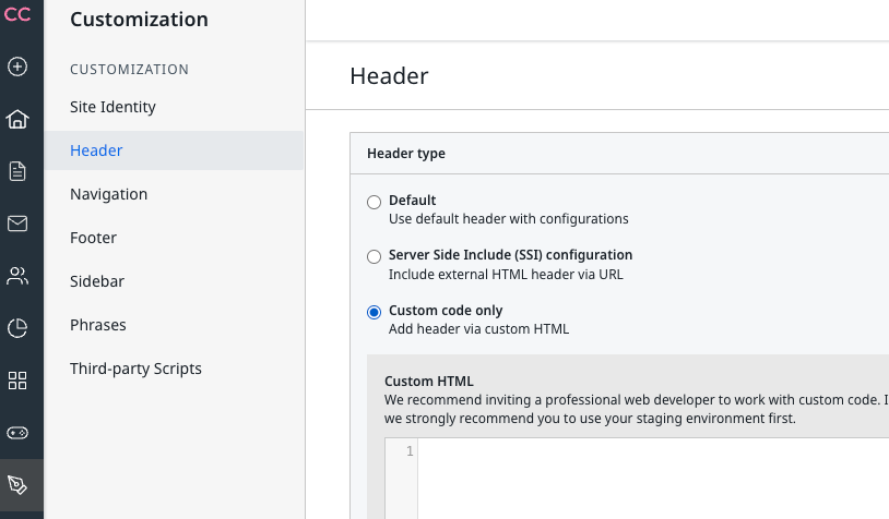
If I recall correctly, it’s simple enough to do in Control and you have two options. The hard part is coming up with the HTML code for it or the SSI configuration (i don’t know what that is :) )
Customization menu > Header
I believe if you add that, it’ll insert the header above the navigation via the mega menu widget.
@DannyPancratz Yep that’s exactly right! We can choose to have just the mega-menu header, which is entirely configurable from the Customization mode in the front-end, or to have a custom header configured in Control. Or, as we’re discussing here, to have both. Having the extra custom header at the top is ideal if you’re trying to make the community feel like an integrated part of a broader website, with consistent top navigation (for the site as a whole) along with the community-specific header below. That’s where the server-side include (SSI) approach is really handy - it injects the header code into the page, so if you have multiple portals (Support, Docs, Education, Community, etc...) you can in theory just create a single header file and inject it into all of them, so there’s just that one file to maintain. You then do have to host it (the SSI file) somewhere, and if that’s not realistic then you can just add the custom code directly instead.
If you ever had a profile with us, there's no need to create another one. Don't worry if your email address has since changed, or you can't remember your login, just let us know at community@gainsight.com and we'll help you get started from where you left.
Else, please continue with the registration below.