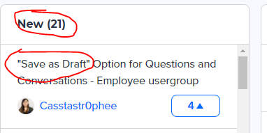
We’ve received feedback from our beta testers that the Idea Pipeline widgets on our Ideation module page could use some better styling/contrast. They’ve suggested that the status label be a different color/style from the idea tile (currently they are the same color, size, font, and style).
When I look at the Idea Pipeline here on the InSpired community, I see a different style between the Idea Status label and the idea. The status label is bold.

I’ve tried changing some theming options on our community, but it does not seem to update things. And I have not been able to find where to style/customize these areas in the backend control.
How can I style my idea pipeline widget and/or idea titles differently?


