Hi, Community.

Does anybody have experience in making it easier to navigate across different dashboards? The current tiny alphabetized dropdown seems far from good enough for me as soon as people have access to more than 10 dashboards. (even with a “Favorite” feature now giving it some saving grace).


I’m thinking that a separate dashboard hosting categorized hyperlinks to each dashboard might do the trick, but I’m curious if anyone has other good practices they’ve implemented.

I really want users to have a clear bird’s eye view of the situation of what kind of Dashboards do they have available for them so they can easily make the call which Dashboard should be used at what time, what Dashboards are new, etc.


I was just going to suggest the favorites feature, but came back and saw you’d already mentioned that.

Agreed that it quickly becomes hard to tell what dashboards are available. @kstim, tagging you here on the “Dashboard Home” dashboard with categorized hyperlinks to the different available dashboards idea.

I can’t remember who it was at Pulse that shared the idea of sharing a screenshot every couple weeks at the top of the new home highlighting “what’s new” -- maybe that’s something that could work? Otherwise highlighting during weekly (or regular) team calls to make those newly available dashboards visible. Or some sort of monthly “what’s new from Ops” emails?


I would love to do “What’s new” in Home, unfortunately there is still no option to “lock” a Rich Text Field in Home so that it is preserved and updated even for users who customize their Home. Currently if a user were to customize their Home, they would stop seeing any updates to such a text/image widget until they clicked to Reset and lost all their changes.


Nevertheless, I think this would only cover a case of communicating what is new. I really would like to make it easier to get your bearings even with old dashboards as they continue to pile up.


This would only cover a case of communicating what is new. I really would like to make it easier to get your bearings even with old dashboards as they continue to pile up.


Absolutely agree here -- there’s gotta be a way for the dashboards to be more easily organized. Maybe if Gainsight gave the option to use a widget-style view, rather than defaulting to the last accessed dashboard?

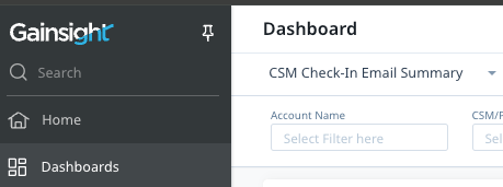
Current setup

Dashboard showing last active dashboard

Idea -- widget style

Maybe something similar to this screenshot? Different blocks that can be organized by category, with clickable links.


Exactly. I’m considering making this custom for us by creating a separate dashboard and inserting several Rich Text Blocks as these kinds of “widgets” that hyperlink into generally available public reports.

Sadly I already imagine I will be limited in terms of non-public reports and by a rather lackluster visual configuration due to inability to do HTML in the Rich Text field.

An extra idea that I think could be fantastic is a persistent tab or sidebar navigation that quickly lets you switch between related reports or dashboards. I could imagine myself making a set of dashboards that would be better navigated with buttons rather than infinite scrolling.


An extra idea that I think could be fantastic is a persistent tab or sidebar navigation that quickly lets you switch between related reports or dashboards. I could imagine myself making a set of dashboards that would be better navigated with buttons rather than infinite scrolling.


100% -- @kstim can attest to this, but we tend to limit the number of dashboards we create. Likely due in part to the infinite scrolling, though that may also be due to our heavy usage of Domo. Personally, since I straddle the ops line and am solely focused on client enablement communications (and email engagement), I’ve considered creating a personalized homepage with the reports I access most frequently, since I’m not as concerned with our other dashboards or widgets.


Reply