With the UI revamp, the Gainsight VisualForce widget for the Salesforce Account page is now to tall.
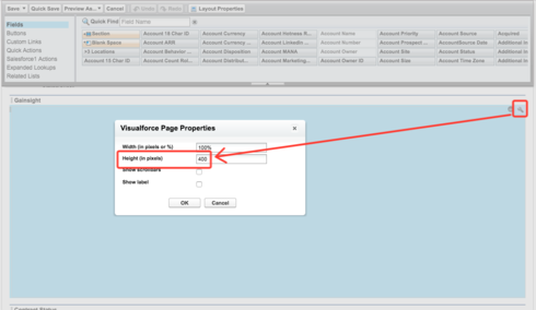
Firstly, I had to make the section in the Page Layout taller, doubling it from 200px to 400px:
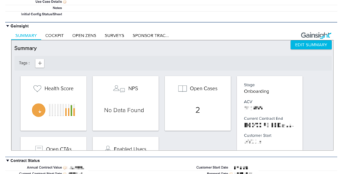
However, the information in the widget is still being cropped:
However, if I make the page section even taller, the Gainsight box does not continue to expand to fill it; I just end up with a bunch of empty space in the section.
Even if it [i]did expand, that would probably not be the best approach, since screen real estate on the Account page is at a premium, and I don't want to drop a 1000-pixel app into the middle of it. The content of the VisualForce page would ideally be drastically condensed, removing as much whitespace as possible.
Thanks, as always!
Page 1 / 1
I agree with you Seth. I have experienced the same. Expanding the size is the obvious answer but interesting that you prefer to have it smaller. Would 600 pixels be too big in your view?
HI Seth,
Did you try enabling scroll ? Yes the widget isn't responsive to fit into small viewports. However enabling scroll lets you see content on scrolling.
Hi Karl -- I think that 600 pixels would come across to our team as "Pretty darn large, but not quite large enough that I'm going to tell Seth to just remove it from the page entirely."
So, acceptable, but not ideal, and maybe not an improvement on having the scrollbar within the module.
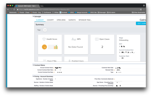
To give you a sense of things, our customer success team works on 13" MacBooks, and 400px already takes up more than half of the screen:
So, acceptable, but not ideal, and maybe not an improvement on having the scrollbar within the module.
To give you a sense of things, our customer success team works on 13" MacBooks, and 400px already takes up more than half of the screen:
Thanks for mentioning it, Azhar! Yes, I do have that enabled, so the module is still functional at this point, just not as suave as it could be.
@Seth, Karl - is there a way to direct the users from this SF section to Gainsight?
Yea. If you click on the Gainsight Logo in the upper right you get to the full 360 page.
Thanks much Karl!
Would love to see (at minimum) the Summary cards layout adjusted to properly fit the recommended height implementation. (per documentation - 400 pixels)
Agree with Seth that adjusting the height to 600 pixels is okay.
Our team is annoyed with the fact that they have to vertically scroll to see the widget information on every tab. We would prefer the widget to be tall enough so that they never have to scroll to see the information. Thanks!
I agree. This is being fixed in the upcoming release. 700px will work nicely.
Hi Karl, was this fixed in the latest release and if so, what was the final decision on pixel count?
Hi,
700 pixels is the recommended height for the account widget.
- Abhishek S
700 pixels is the recommended height for the account widget.
- Abhishek S
Thanks Karl, Abhishek -- You may want to update the support article: https://support.gainsight.com/Product_Documentation/Data_Management_and_Integrations/Technology_Part...
Thanks, Nora. The doc is updated.
Reply
Sign up
If you ever had a profile with us, there's no need to create another one.
Don't worry if your email address has since changed, or you can't remember your login, just let us know at community@gainsight.com and we'll help you get started from where you left.
Else, please continue with the registration below.
Welcome to the Gainsight Community
Enter your E-mail address. We'll send you an e-mail with instructions to reset your password.