Hi @JeppePeppe, it's fantastic to see your enthusiasm for exploring our enhanced Dynamic Content Widget 🚀
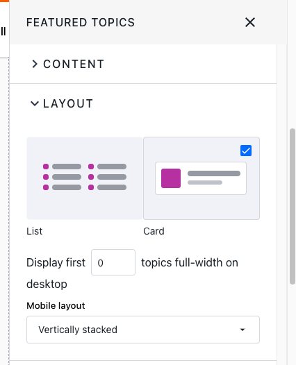
To modify the layout of the Dynamic Content Widget and Featured Topics Widget to better suit mobile viewing without the carousel feature, you can use custom CSS. While I’m not a CSS wizard, I'm always up for experimenting with new techniques. Below are some CSS adjustments I found to try out for you:
For the Dynamic Content Widget:
/* Hide carousel controls */
.dynamic-content-carousel .carousel-control {
display: none !important;
}
/* Adjust layout for mobile view */
@media (max-width: 767px) {
.dynamic-content-carousel .carousel-inner {
display: flex !important;
flex-wrap: wrap !important;
}
.dynamic-content-carousel .carousel-item {
flex: 0 0 50% !important;
max-width: 50% !important;
}
}
For the Featured Topics Widget:
/* Flexbox layout for the featured topic cards */
.featured-topic-container {
display: flex;
flex-wrap: wrap;
}
.featured-topic-card {
flex: 0 0 calc(50% - 20px); /* Adjust width as needed */
margin: 10px;
}
/* Adjust styles for mobile view */
@media (max-width: 767px) {
.featured-topic-card {
flex: 0 0 calc(100% - 20px); /* Make cards full width on mobile */
}
}
I hope these tweaks prove helpful! Let me know if this works for you :)
❗A quick reminder: Before rolling out any new Custom CSS, it's always wise to test it in your staging or sandbox environment to ensure a seamless experience for your community users.

