Hello everyone. 😊
I am Portuguese, so please mind my English. 😅
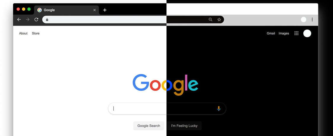
As some of you might know, some users including myself have been looking for a darkmode implementation for gainsight coammunities for sometime.
The context
In the community I currently am a part of, some power users started asking for a dark mode, so i started trying some solutions for this that:
- Would be simple enough not to interfere with gainsight’s modules;
- Its easy to implement and maintain on the long run;
💢 Note that I studied IT for 3 years but am no expert on the matter. 💢
I am sharing this code with all of you so you can tweak it to your needs, share your ideas and feedback on improvements that you would consider important and help each other.
Description of the idea
Since most of our visitors come from organic traffic, are mobile users (around 70%) and are arriving at the community in specific articles, I considered the following:
- The most important place to implement the dark theme would be in articles.
- The most important device do implement it in is mobile.
Since web browsers permit the installation of extensions (like chrome) which already do an ok job at this (for exemple this one), i figured the mobile devices are the ones to attack here.
Also, most of our power users also recommended this idea to be implemented in mobile, where reading of more extensive articles becomes more eyesoring.
Implementation
As the premisse was to be easy to configure, lets use the “Control” option of gainsight.
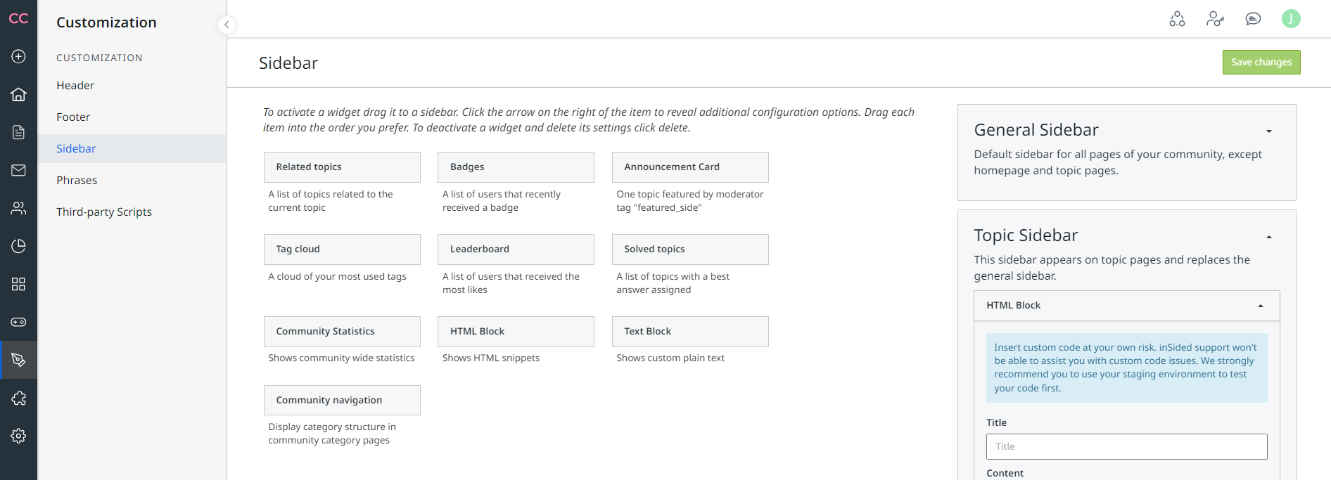
- In your comunity go to Control > Customization > Sidebar > Topic Sidebar

If the code is implemented here, it will only apply to te topic and articles created by the community or moderation team, not applying to Home Page or other community pages.
- Here, just drag a HTML Block to the Topic Sidebar area so we can add the code later on.
The Code
Here, I’ll share the code with you in a spoiler to save some scrolling in the article, since this is 151 lines.
The code creates a darkmode that can be activated/deactivated through a switch on the top right corner of the page.
💢Note that the code is a compilation of HTML + CSS + Java 💢
There are better ways of pulling this, but as stated, the premisse is simplicity to apply the code and maintain it, that’s why I went for this approach.
(The switch will show on top of the login button on standard header, since my community uses a custom header is no problem, but u can change the placement of the button on the page.)
CODE:
<!DOCTYPE html>
<html lang="en">
<head>
<meta charset="UTF-8">
<meta name="viewport" content="width=device-width, initial-scale=1.0">
<title>Dark Mode Toggle</title>
<style>
body {
background-color: #fff;
color: #000;
transition: background-color 0.3s, color 0.3s;
font-family: Arial, sans-serif;
}
h1, p {
margin: 20px;
}
.switch {
position: relative;
display: inline-block;
width: 50px;
height: 26px;
}
.switch input {
opacity: 0;
width: 0;
height: 0;
}
.slider {
position: absolute;
cursor: pointer;
top: 0;
left: 0;
right: 0;
bottom: 0;
background-color: #ccc;
transition: .4s;
border-radius: 34px;
}
.slider:before {
position: absolute;
content: "";
height: 20px;
width: 20px;
left: 4px;
bottom: 3px;
background-color: white;
transition: .4s;
border-radius: 50%;
}
input:checked + .slider {
background-color: #2196F3;
}
input:checked + .slider:before {
transform: translateX(24px);
}
body.dark-mode {
background-color: #121212 !important;
color: #e0e0e0 !important;
}
body.dark-mode h1,
body.dark-mode p,
body.dark-mode div,
body.dark-mode header,
body.dark-mode main,
body.dark-mode footer,
body.dark-mode section,
body.dark-mode article,
body.dark-mode span,
body.dark-mode a,
body.dark-mode li,
body.dark-mode ul,
body.dark-mode ol {
color: #e0e0e0 !important;
background-color: inherit !important;
}
body.dark-mode div,
body.dark-mode section,
body.dark-mode article {
background-color: #1e1e1e !important;
}
body.dark-mode a {
color: #9ecfff !important;
}
.dark-mode-toggle {
position: fixed;
top: 20px;
right: 20px;
z-index: 1000;
}
@media (min-width: 769px) {
.dark-mode-toggle {
display: none;
}
}
</style>
</head>
<body>
<div class="dark-mode-toggle">
<label class="switch">
<input type="checkbox" id="darkModeToggle">
<span class="slider"></span>
</label>
</div>
<script>
document.addEventListener('DOMContentLoaded', () => {
const darkModeToggle = document.getElementById('darkModeToggle');
const enableDarkMode = () => {
document.body.classList.add('dark-mode');
localStorage.setItem('darkMode', 'enabled');
};
const disableDarkMode = () => {
document.body.classList.remove('dark-mode');
localStorage.setItem('darkMode', 'disabled');
};
const darkMode = localStorage.getItem('darkMode');
if (darkMode === 'enabled') {
enableDarkMode();
darkModeToggle.checked = true;
}
darkModeToggle.addEventListener('change', () => {
if (darkModeToggle.checked) {
enableDarkMode();
} else {
disableDarkMode();
}
});
});
</script>
</body>
</html>
❗Disclosure ❗
Use this code at your own risk, its working on my community, but this doesn't mean it will work in yours since you can have other 3rd party scripts that conflict with it.
Always try new implementation on a test environment before going into production (use sandbox).
Ask for help to your IT team. Since this is a 3rd party script, Gainsight is not responsible to maintain it and may not be able to help you resolve compatibility issues with other implementations you might have.
Please share your thought on this, improvement ideas or questions you might have.
This is still not in production in my community, so all feedback is good feedback and I would love to hear some. 🤗
Sorry if I posted this in the wrong category. Please move this to anywhere you feel its a better fit Admins and Mods.
Cheers y’all 😎


