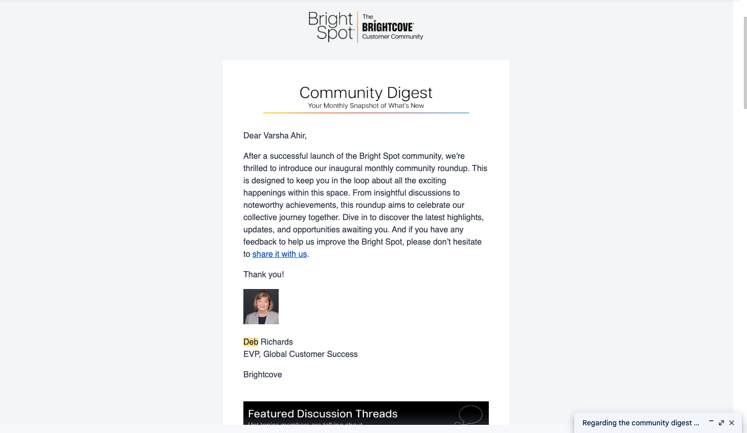
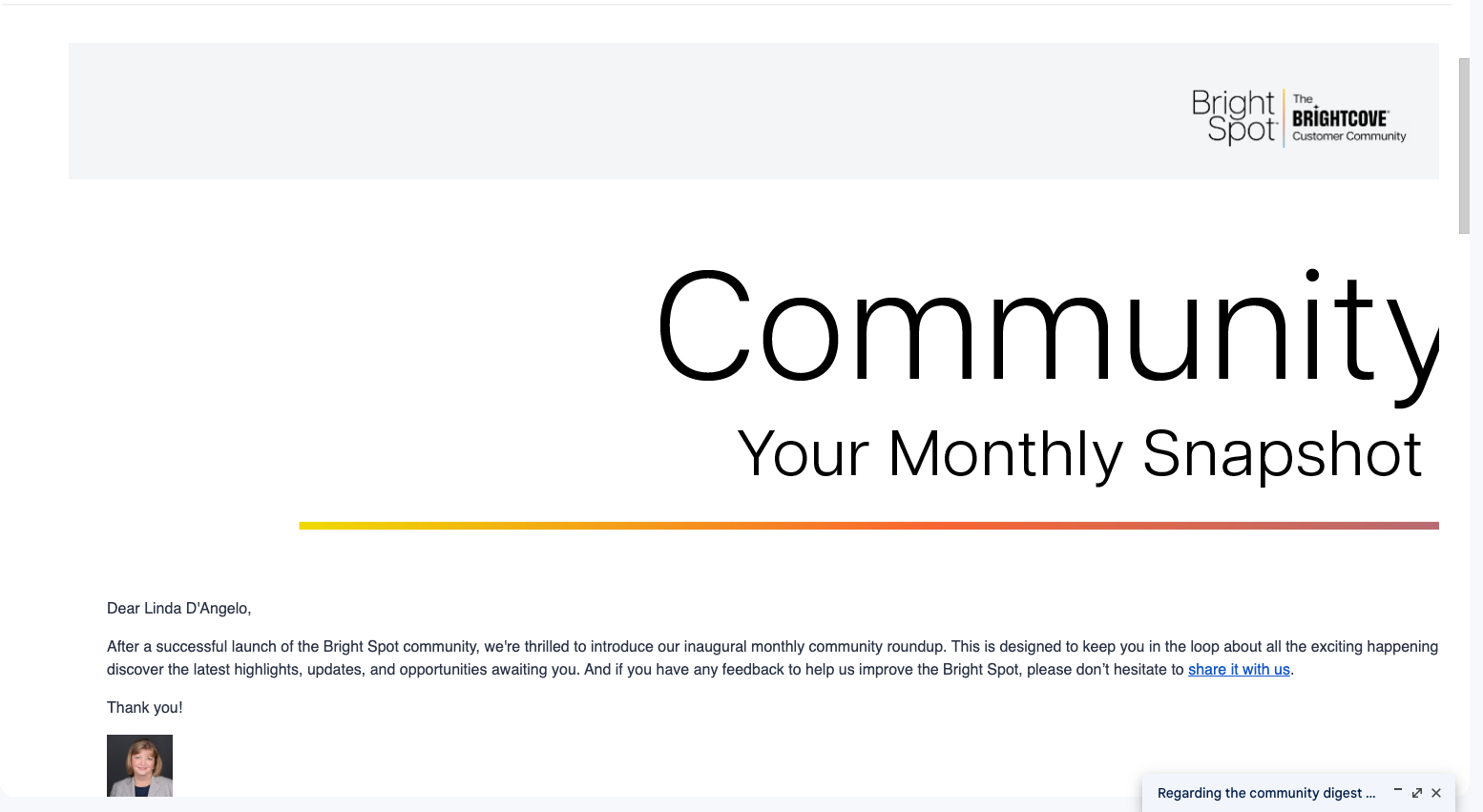
I recently sent out our first monthly newsletter to community members and design issues were noticed in that email. When I sent the test email to admins, everything looked fine. I have attached a snapshot of it for your ref. When we launched the campaign, the email just looked too wide at the receiver’s end. Has anyone experienced this? Wondering what I did wrong here.
This is the test email snapshot where banners look fine 👇🏽

This is the final email that was delivered to community members and you can see the hero banner looks too wide 👇🏽


