

andr_raposo
Helper ⭐️
March 4, 2021
Solved

Line chart by date by customer

  • March 4, 2021
  • 5 replies
  • 83 views

Hi everyone,

Got a newbie question related with lince charts in the report builder.


We have an MDA object where we store a weekly snapshot, per customer, of one aspect of their usage. 

Something like: Customer ID | Snapshot date |  # AOs


Now I was trying to build a line chart based on that object, that showed the # AOs(y axis)  over time (x-axis), With a line per each customer.

Now the issue that I’m having is that I cannot seem to show the usage without some kind of aggregation, which defeats the purpose.
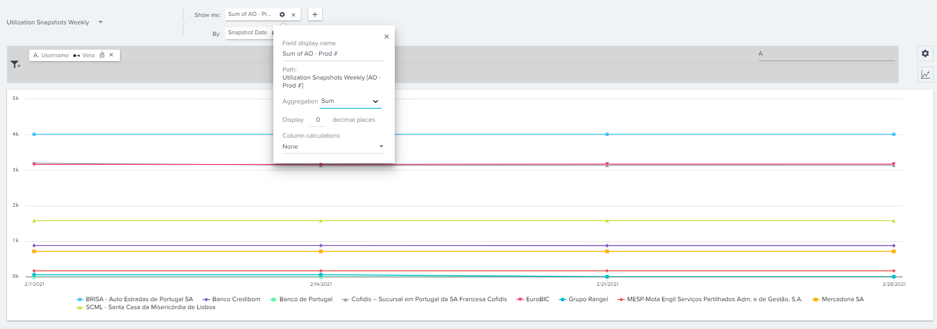


Am I’m missing something? Or this there a clever way around that? 


Thanks in advance! 

Best answer by gunjanm

@andr_raposo gotcha. Is there only 1 record for each Company each week? If so, change the aggregation to Avg and you should get what you need. 

  
End Proctoring-
 

5 replies

sai_ram
Expert ⭐️⭐️
March 4, 2021

@andr_raposo I will verify this and get back to you.

@gunjanm any idea about this?

andr_raposo
Helper ⭐️
March 4, 2021

Thanks @sai_ram ! Appreciate it! 

gunjanm
Expert ⭐️
March 4, 2021

@andr_raposo if I'm reading your screenshot correctly, you're missing a second By field to indicate the Company. That should help..

Gunjan
andr_raposo
Helper ⭐️
March 5, 2021

Hi @gunjanm, thanks for your input, but it’s actually there. Each line in that screenshot is from a customer.

My issue here is that show, I can only aggregate values, instead of showing the value for each customer in each week. 

gunjanm
gunjanmAnswer
Expert ⭐️
March 7, 2021

@andr_raposo gotcha. Is there only 1 record for each Company each week? If so, change the aggregation to Avg and you should get what you need. 

  
End Proctoring-
 
Gunjan