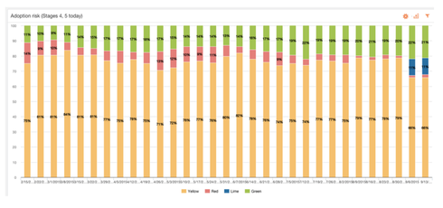
We are working to create a report that shows customers who went from red health last week to either yellow or green health this week. 


I've tried a few things, but without adding another usage field to push to every week, I haven't figured this out. 


It seems like it would be something that should already be stored and I'm just missing.
For my implementation, the current and previous score are within the SFDC Customer Info object. I can group by previous score to see aggregates of how many customers went from each previous score to current. I think getting a client-by-client analysis would require calculated fields in Reports 2.0 or another usage field as you suggested. 
I had a feeling that would be what we would need to do. But I also feel that this is something more people would be looking for. 
Agreed. I think I would want calculated fields in reports 2.0 to solve this and other things. If you took the raw score of last week and this week, you could stack rank all accounts from biggest positive change to biggest negative. Talk about an eye catching dashboard.
Lane/Matt,


Thanks for your note. Unfortunately, this report cannot be created easily. Over the next 1-2 quarters, we will be focussing on shipping out of the box reports and the mentioned score change report is definitely in our roadmap.


Thanks!
At Gainsight, we track week-over-week score changes for our Habits Risk scorecard, but this process could be adapted for Overall Score as well. However, this process requires adding multiple new fields to Usage Data.


1)


Convert Scorecard Values to Colors


2)


Set up the Rules and Report for Scorecard Movement
The overall score is stored weekly through a snapshot. Where is this data stored? I think this might help me get closer to what I'm wanting to do (see screenshot). This screenshot came from this blog post from Gainsight. I cannot tell if the timeframe is weekly or daily though.


A weekly snapshot of the Overall Score is saved on the Usage Data object. It is saved as a number field.


In order to produce the chart in the screenshot, you need to make a custom text field on Usage Data. Then make a rule that writes to that text field, writing "Red" "Yellow" "Green" "Lime" based on the numeric score.


Then you can make a report on the User Adoption subject area. "Show me" Account:ID, then group "By" Week Label and the custom text field. Then filter for Usage Data Aggregation Level Name = ACCOUNTLEVEL.

Reply