New Idea

Multiple Reports 2.0 Ideas

Related products:None

evan_luberda
This ideas are from Sam.

Sam and I had a conversation and he brought up a few different ideas that could make reports 2.0 more efficient. The following were these ideas.

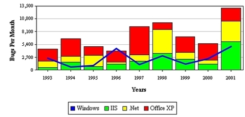
  1. The ability to create a stacked column report/chart with a line graph. We currently have the ability to use a column line as a chart but that limits to one type of data. A stacked column line report would allow different values of data (Instead of just usage data, each type of usage data) to be viewed in one convenient chart.
  2. Under the Customers tab there is a chart that allows for customization of the X and Y axis but only using the Customer Info object. The proposal is to add this chart to the Reports 2.0 tab in order to be able to customize the X and Y with anything that could have been created within their org. See image below for chart.[img]https://lh3.googleusercontent.com/-PpDx8FQ0prI/VthjhQC56KI/AAAAAAAAAkI/UrjPP7oD784/w935-h305-no/2016-03-03.png[/img]
  3. In the C360 there is a table about usage adoption. Similar to the previous idea adding this to the Reports 2.0 tab would allow for customers that can't utilize the native usage adoption because of their Salesforce data limitations. See image below.[img]https://lh4.googleusercontent.com/-FE54bJ77sPQ/VthkKTyG01I/AAAAAAAAAkM/P6Tsk638ULs/w934-h330-no/2016-03-03.png[/img]
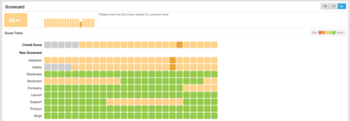
  4. Also in the C360 there is a native scorecard trending report, the addition of this to the Report 2.0 tab would also allow for customers unable to utilize native Salesforce data. This will also allow for more customized use cases that allow a user to fully utilize this report fully. See image below.


    5. The timeline view report in CS360 transactions widget would be helpful to have as a Report 2.0 type just as much as the other use cases.
sumesh
  • Helper ⭐️⭐️
  • March 7, 2016
Hey Evan! Thanks for the feedback. My responses below.

#1 - Suggested approach might not work. Let me explain- The 2 measures in "show me" should be grouped by both fields added to "by". We cannot implement a visualization that groups one field by both fields and another field by only a single field. This implies that instead of a single line, we will have multiple lines with similar colors in the stacked bar. This visulaization might be difficult to interpret.

#2, #3, and #4 - I guess you are referring to providing these reports OOB from report builder so that they are customisable? If yes, OOB reports is in the roadmap and will be executed soon. As a side note, all these reports can be created using report builder even today.

#5 - Thanks for the feedback. We will add this requirement to the roadmap.

Thanks! 
  

samuel_cummings
Sumesh,

Thanks for the response.

#1 The idea is to show a stacked column chart with the example below. This should be in Report 2.0 


#2,#3,#4. The problem with these use cases are with chart types not being avaliable as chart options in the Report 2.0 setup. Its not the report as much as its the chart type that I'm asking for access to. There is no milestones and selectable measures(usage adoption) chart options in Report 2.0

All together the theme of this Reports 2.0 idea post is to allow for more complex Report types to be built and applied to Dashboards, CS360 etc.  This concept is one that can dramatically boost the value of Gainsight without much design LOE. We should have a lot more chart types. We can start by making all native Gainsight chart types that are in the app available as chart options in report 2.0. *Some of which listed in this post. We should have a vast amount of Report types. This is a huge value point for Gainsight that we simply are not exploiting!

Best,

Sam


Cookie policy

We use cookies to enhance and personalize your experience. If you accept you agree to our full cookie policy. Learn more about our cookies.

 
Cookie settings