Adoption Explorer has nicer looking reports, however, I’m facing an issue when displaying multiple series on a line chart:
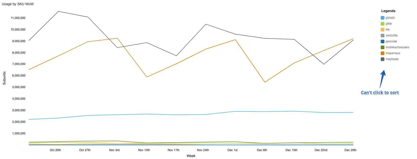
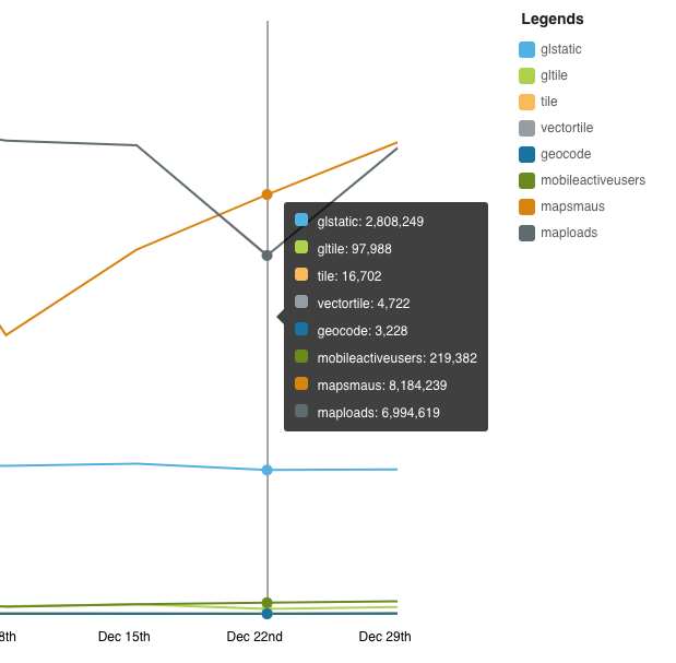
The issue is when you have series with vastly different scales. It is difficult to understand the relative value of sort series as is. There is a nice detail pop up when you hover over a data point, but this is still a little difficult to use:
In the standard Gainsight reports, you can click to filter which solves this issue:
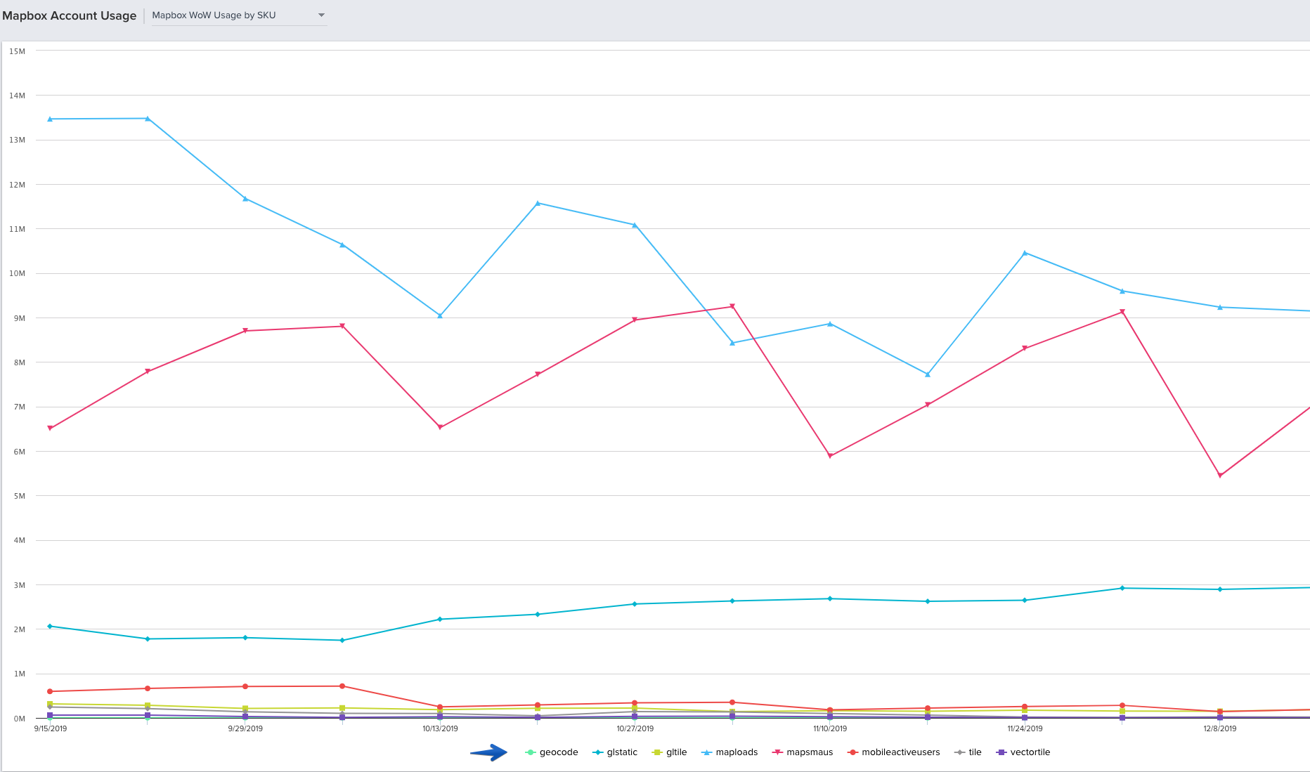
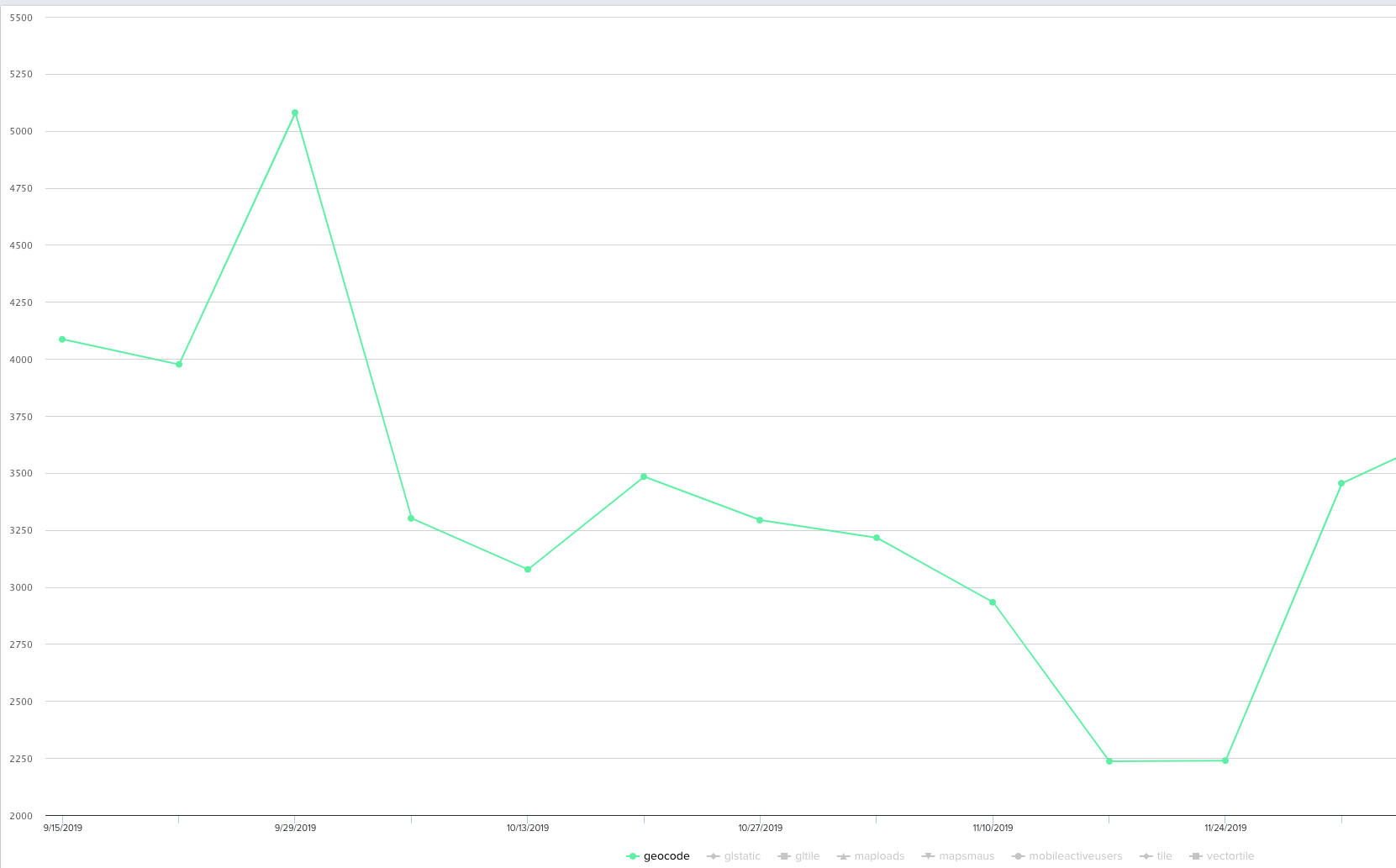
This feature that exists in standard reporting has been one of the most useful when embedding reports in C360. Hopefully, this is something that you can add to a future release :)

