This is really a few pieces of improvement:
- When the query builder widget is used on a dashboard, it strangely does not show any legend. You have to mouse-over the graph to see what the graph components mean. You should add an option to show the legend by default.
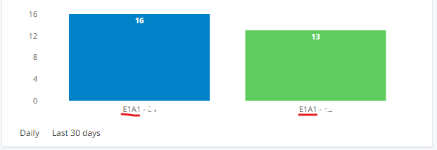
- We should be able to customize the legends and labels. Right now for bar charts, they have a non-human readable format like “E1A1”. We should be able to customize the labels, otherwise these widgets will have extremely limited usability:
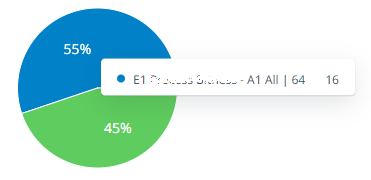
- Similar suggestion for the mouse-over tooltip/labels on the other chart types. We should be able to customize the labels rather than being stuck with the default “E1 [name] - A1 [name] | [Value]” format. It’s not useful for most people, and makes me not want to use the query builder widgets because the dashboards will look unpolished and unprofessional.