Our goal is to allow our customers to build the community or customer hub that they envision, and to tailor it to their needs. Today, we’re expanding our customization capabilities to better direct your users to specific areas of your community by offering the all new Banner widget.
What can I use it for?
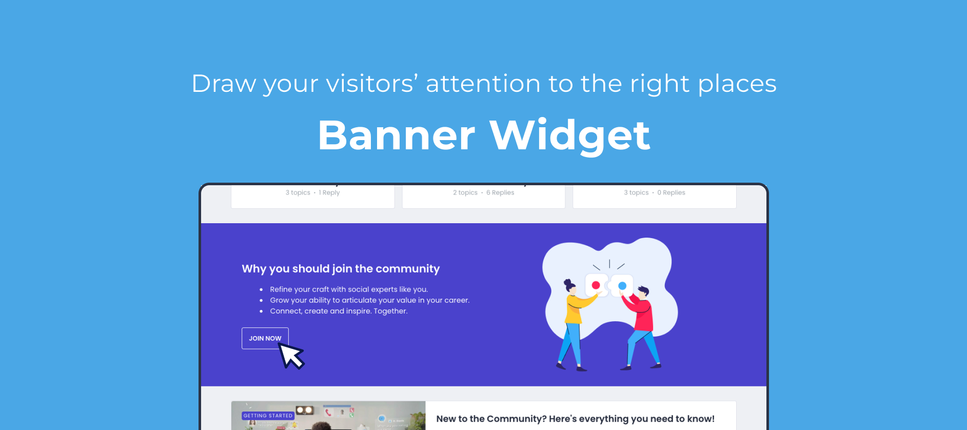
The new Banner widget will offer you a full-width section to better display images, text and buttons and draw your visitor’s attention. We feel this is an essential building block that, for example, allows you to:
Build a landing page to highlight 2 or 3 specific aspects of your community, and lead your visitors there
Better drive visitors to content that you’d like your audience to engage with
Improve conversion by creating a dedicated section with a clear CTA to register
Better draw attention to a specific announcement, and link to more details
Some visual examples:
How do I use it?
Just as with any widget, you can insert it by toggling Customization mode, and clicking the + icon at the line where you want to insert it. You’ll then be able to customize:
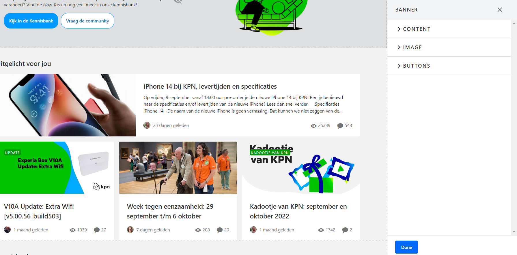
Header & content (and text alignment)
Image (and image alignment)
Buttons (primary and secondary)
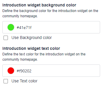
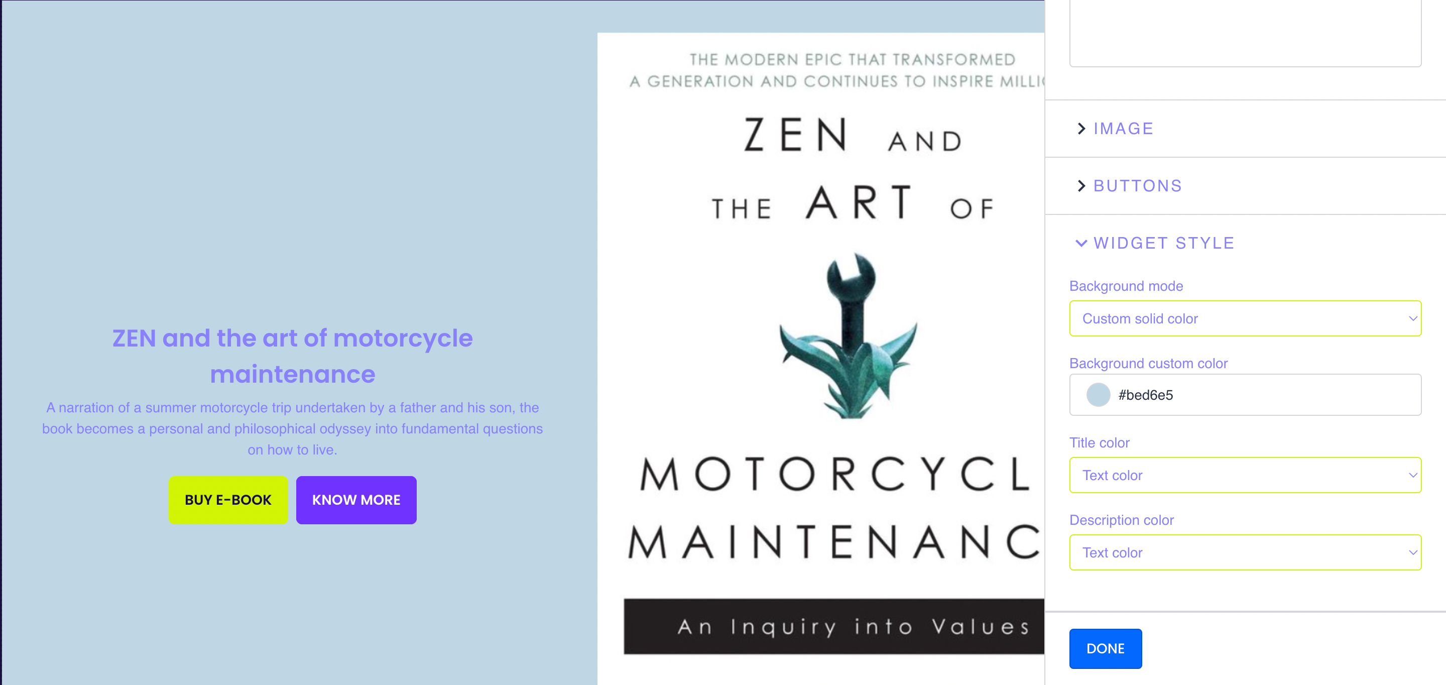
Background color
Title color
Description color
We’d love to hear from you!
What would you be using this widget for specifically?
What would make this widget even more powerful?

Page 1 / 1
What are the suggested dimensions for a banner image? Similar to other responsive components, how does the banner display on mobile and other devices?
It is very good idea
Recommended dimensions for Banner image is 640*480 px. The banner is also responsive: depending on the screen size, display size of the image is Screenwidth*240 px.
Odd. In-app it says 2400px
That’s incorrect. Thanks for pointing it out @Scott Baldwin.
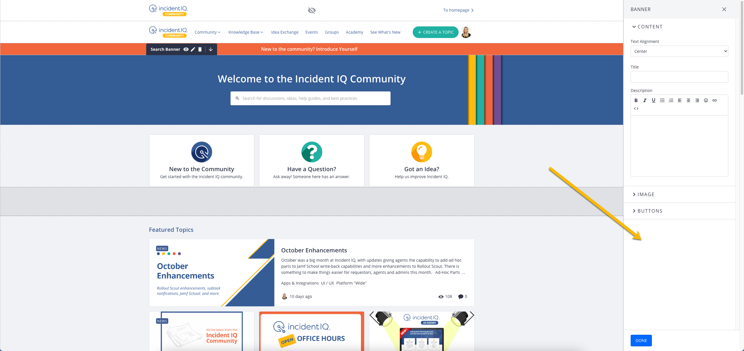
Where can I change the colors specifically for this banner widget?
Background color
Title color
Description color
Is it this? Or somewhere else?
Where can I change the colors specifically for this banner widget?
Background color
Title color
Description color
Is it this? Or somewhere else?
@Sudhanshu can you tell me this?
Hi @Paul_ , Apologies for the delay! The colors for Banner Widget can be changed in the customization mode:
Customize > Edit Banner Widget > Widget Style in the sidebar]
Hey @Sudhanshu
That's so weird. I don't see that option. Any idea why?
Can confirm, @Paul_, I don’t see that option either.
Pfew, I thought it would be a dumb question because no one asked it yet.
What would you be using this widget for specifically:
Introduction widget: Quick community intro (USPs) that includes a “register now” CTA
Promotion widget: Promoting a campaign (competition, product launch, anniversary, etc.)
What would make this widget even more powerful:
Targeting this widget to certain primary roles, e.g. only show the widget to unregistered / not logged in users
Ability to use the image as a full-size wallpaper with the content on top
It works now. Thanks @Sudhanshu & @Nadia Nicolai!
What would you be using this widget for specifically:
Introduction widget: Quick community intro (USPs) that includes a “register now” CTA
Promotion widget: Promoting a campaign (competition, product launch, anniversary, etc.)
What would make this widget even more powerful:
Targeting this widget to certain primary roles, e.g. only show the widget to unregistered / not logged in users
Ability to use the image as a full-size wallpaper with the content on top
@bjoern_schulze Very good points! We’ll definitely look into widget visibility settings. Regarding the full-size wallpaper, do you mean a full screen background with content in front?
Also, can you please check color customisations? Should be working now.
Regarding the full-size wallpaper, do you mean a full screen background with content in front?
Exactly. I was talking in terms of layers, i.e. the wallpaper being the background layer and the text being the top layer.
Also, can you please check color customisations? Should be working now.
Can confirm.
@Sudhanshu
I am unable to see the color customizations. Is this something that yall have to enable for us?
Also, can you please check color customisations? Should be working now.
Can confirm.
I need to take back my confirmation. I looked at the wrong place. I still can’t see color customization in the Banner Widget. I only have Content”, “Image” and “Buttons” customization available.
Also, can you please check color customisations? Should be working now.
Can confirm.
I need to take back my confirmation. I looked at the wrong place. I still can’t see color customization in the Banner Widget. I only have Content”, “Image” and “Buttons” customization available.
Hi @bjoern_schulze can you please check again if you have the widget style customization available for the banner widget?
@Hannah Bailey I would also kindly ask you to check if this is now working on your community.
Hi @bjoern_schulze can you please check again if you have the widget style customization available for the banner widget?
Yes, now the “Widget Style” configuration is available on our environment. Thank you!
Is there a way that I can create the banner settings to only show for a specific group of users? For example, if I want to create a banner that prompts someone to login or create their account and only have it trigger for users who are not logged in, how can I do that?
Thx
I’m not seeing any of these customization options either in the banner widget.
@Sudhanshu any chance you can help us resolve the above noted issue with the banner widget? It has both a primary and secondary button but none of us are seeing the options to customize colours. Is there a way to have the secondary button not appear the same as the primary?
Hi @Scott Baldwin ,
I’ve enabled this on your community now so you should now be able to see the “Widget Style” dropdown as well.
Buttons will appear as the same colour as configured for the rest of your community but this can be changed using custom CSS. Just let our support team know if you need any help.
Thanks @olimarrio
One more thing that would make this widget more powerful is the ability to target who sees it. Right now with a public community everyone sees it. It would be better to be able to control what types of users (registered, etc. ) can view and engage with it.
If you ever had a profile with us, there's no need to create another one. Don't worry if your email address has since changed, or you can't remember your login, just let us know at community@gainsight.com and we'll help you get started from where you left.
Else, please continue with the registration below.