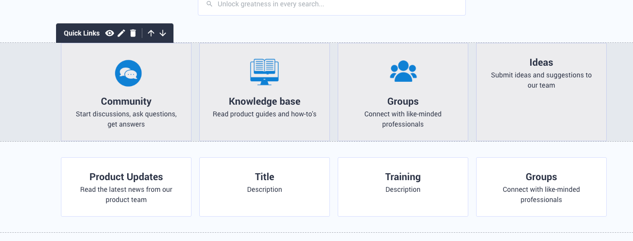
When deploying the Quicklinks widget, the number of links per row is three by default.

Default number of three Quicklinks per row


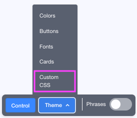
While the number of links per row cannot be changed in the widget, you can adjust it with Custom CSS.


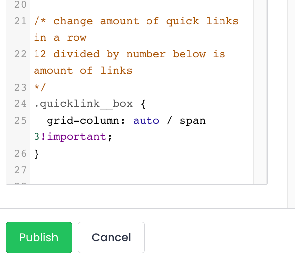
Add the CSS code shown below. The number of links will be 12 divided by XX (insert how many you wish):

/* change amount of quick links in a row
12 divided by number below is amount of links
*/
.quicklink__box {
grid-column: auto / span XX!important;
}

It will look like this:


To save click Publish.


Here are a couple of examples;

XX = 2


XX = 3


XX = 4


This is great @Alistair FIeld works like a charm!
Thanks a lot!


Thanks @paulvanhelmond for pointing this one out. 


Paul, @Alistair FIeld, your thoughts on this style on medium to small screens. I notice the breakpoint on viewport width is ~450px, where <450px has these quick links become carousel style. >450px and they keep they layout. 


If I choose to have 4 per row, which was the original reason I found this topic, the cards are too squashed for anything <800px. Do I need to add your suggested style in a media query for large screen sizes?


Tested this in the hope to get 8 widgets shown by default but the CSS only allows for integers so 1.5 did not work.


Would love to know if there is a way to use 2 (6 on a row) but then allow for a second row to show by default. As I type this, perhaps I will just add 2 widgets..


Yes that works! If you control the size of the widgets to be 4 wide, you can add a second group below to show all 8 on the homepage


@sam_buddery great to hear. What is the behaviour of those 2 rows of columns on medium screen sizes of around 700px (ie before it changes to a carousel)?


This is fantastic.  And I just built a page with custom html so it doesn’t affect my home page :)


Just a quick note - since this topic was created, we’ve made it possible to create a row of four Quicklinks in a row using the default widget in Customize mode (so no custom coding necessary if you want for links).  A nice example is on our homepage currently.  :) 

Edit: Quick correction - I erroneously posted just above that it’s already possible to add more than three quicklinks per row using the native widget.  It will be part of an upcoming release.  Will update this topic once it’s live.


I tried yesterday but I could only get 3,  every time I entered the fourth it overwrote the last one I added.


@Alistair FIeld in mobile view the cards extend beyond the screen - does anybody have any tips on how to make it fit? I would use the html-widget for these things, but want to avoid using it in this instance for simplicity


@JeppePeppe I ran into this too when I was reproducing the widget with the custom html widget.  I used <div style="overflow-x:auto;"> to allow no bar scrolling on mobile. I shared my html code in this post:


Hi everyone, great news - we’ve just deployed the new Quicklinks widget that allows you to natively add more than 3 items per row.  :)

The new widget might not play nicely with some custom styling scripts, so if you see something funky with your Quicklinks try commenting-out your custom CSS and enabling the new native setting instead.  


Reply