
Solved
Survey UI - Current color controls and response line creating user confusion
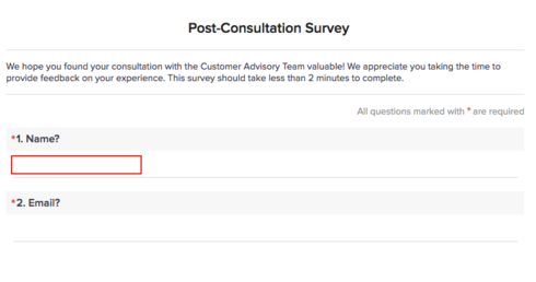
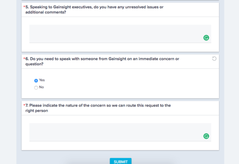
In the past few months, we have received feedback from our customers that the color box around the question + the "writing" line below the question has caused confusion for our customers. They tend to click the grey box versus the line below the question.
(We understand this information (name/email) would be captured if sent through co-pilot, but that isn't an option for the current workflow. An advisor sends an anonymous survey link as part of a post-meeting follow up.)
This leads customers to respond to us saying they are unable to fill out the
survey. It's definitely a bummer when we have someone engaged enough to
complete the survey who does not because it appears to be too
complicated. Unfortunately changing the color of the survey seems to
make it even worse.
Customer are clicking here:
Rather than here:
(We understand this information (name/email) would be captured if sent through co-pilot, but that isn't an option for the current workflow. An advisor sends an anonymous survey link as part of a post-meeting follow up.)
This leads customers to respond to us saying they are unable to fill out the
survey. It's definitely a bummer when we have someone engaged enough to
complete the survey who does not because it appears to be too
complicated. Unfortunately changing the color of the survey seems to
make it even worse.
Customer are clicking here:
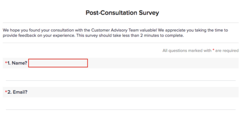
Rather than here: