Hello everyone!
We are excited to inform you about our upcoming initiative aimed at enhancing the way Event Cover Images are displayed across our platform. This initiative is part of our ongoing commitment to improving your user experience and addressing key feedback we’ve received.
What is changing?
Currently, you may have noticed inconsistencies in the height of content cover images when browsing featured content tiles on our platform. These discrepancies can disrupt the visual flow and overall experience. To resolve this, we are embarking on a project to standardize the image ratios for event images across all relevant sections of our platform.
Phase 1: Standardizing Event Image Ratios
In the first phase of this initiative, we will be focusing on unifying the image ratio for event images across three key areas:
- Event Overview Page
- Event Details Page
- Featured Event Tile
At present, each of these areas uses a different image ratio, which can lead to a fragmented experience. By standardizing the image ratio, we aim to create a more cohesive and visually appealing presentation of event content.
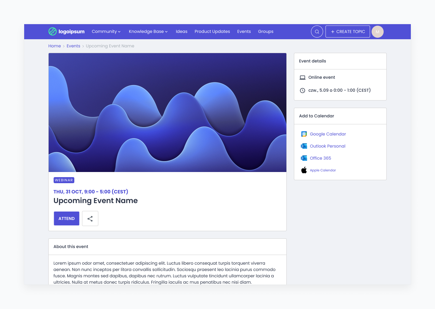
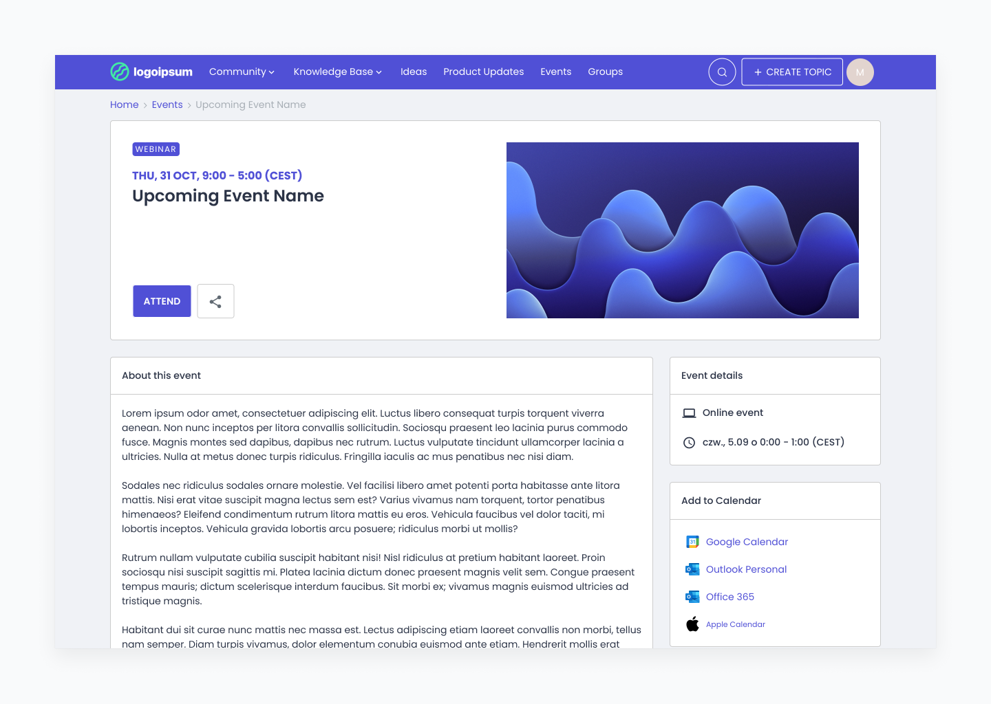
Additionally, we are proposing two different layouts for the Event Details page, each with a different image arrangement. We would greatly appreciate your feedback to help us determine which layout you prefer:
Phase 2: Aligning Event Image Ratios with Other Content Types
Looking ahead, our next step will be to align the image ratio of Event Cover Images with other content types on our platform, such as Topics, Product Updates and Articles. However, we want to be transparent about the potential trade-offs. If we proceed with this change, past event covers may be cropped at the top and bottom to fit the new standardized ratio.
We believe this solution is optimal because events have a shorter lifespan compared to other content. Therefore, adjusting the ratio for event images is less disruptive than requiring changes to cover images across other types of content.
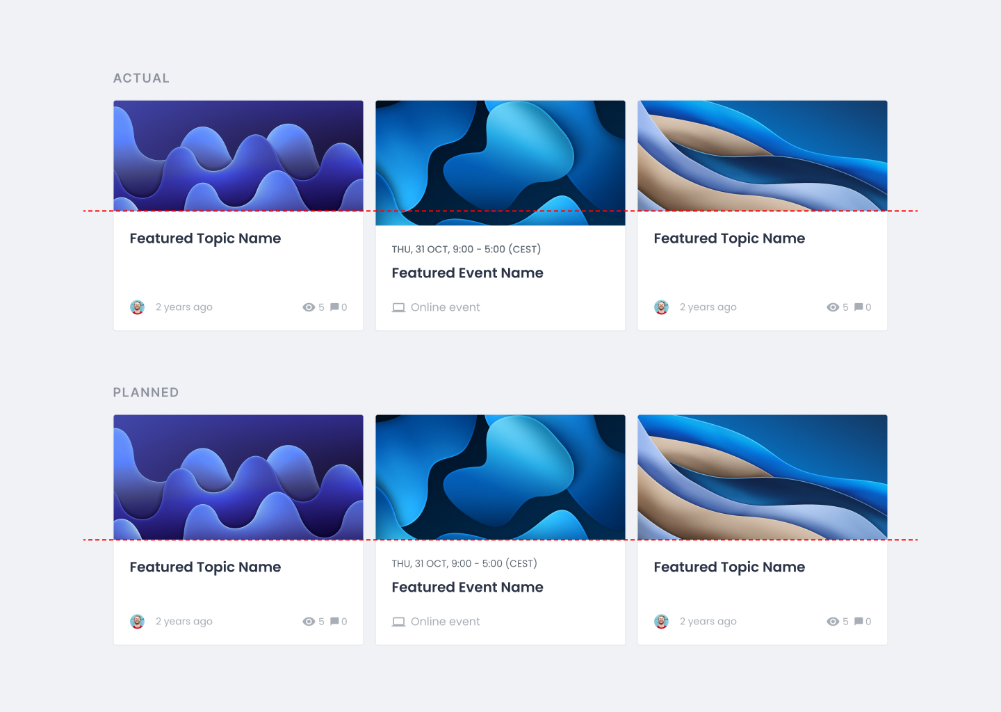
We Value Your Feedback
As we move forward with these changes, we would like you to answer two questions:
- Which layout of the Event Details page do you prefer and why? - Please specify the aspects you like or dislike about each layout.
- Would you prefer a consistent aspect ratio across all featured content, including events, even if it means that past event covers might be cropped? - Please share your thoughts on whether this compromise is acceptable to you.
Your feedback is invaluable to us as we work to improve your experience on our platform. Please share your opinions or any concerns you may have with us. We look forward to hearing from you!
Thank you for your continued support.
Event cover images by Martin Martz on Unsplash
