Our Visual Guide v2.0 is here!

The use of nice visuals and images is an important part of creating an attractive community.

To help you to choose or create suitable images for your community, we have updated our visual guidelines for you. Below you can find explanations of the most prominent images and their dimensions used in our platform.

Tip: Click on the images to see the enlarged version.
 

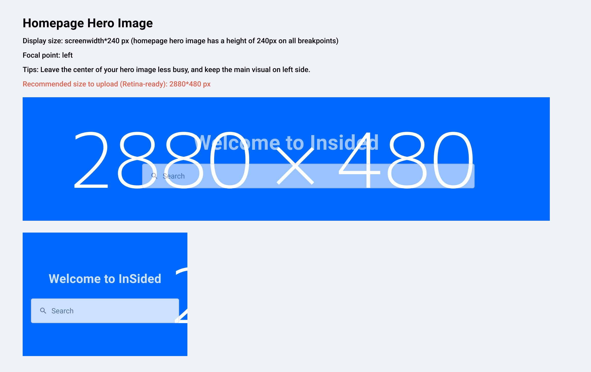
Homepage Hero Image

Example: https://community.insided.com/
 

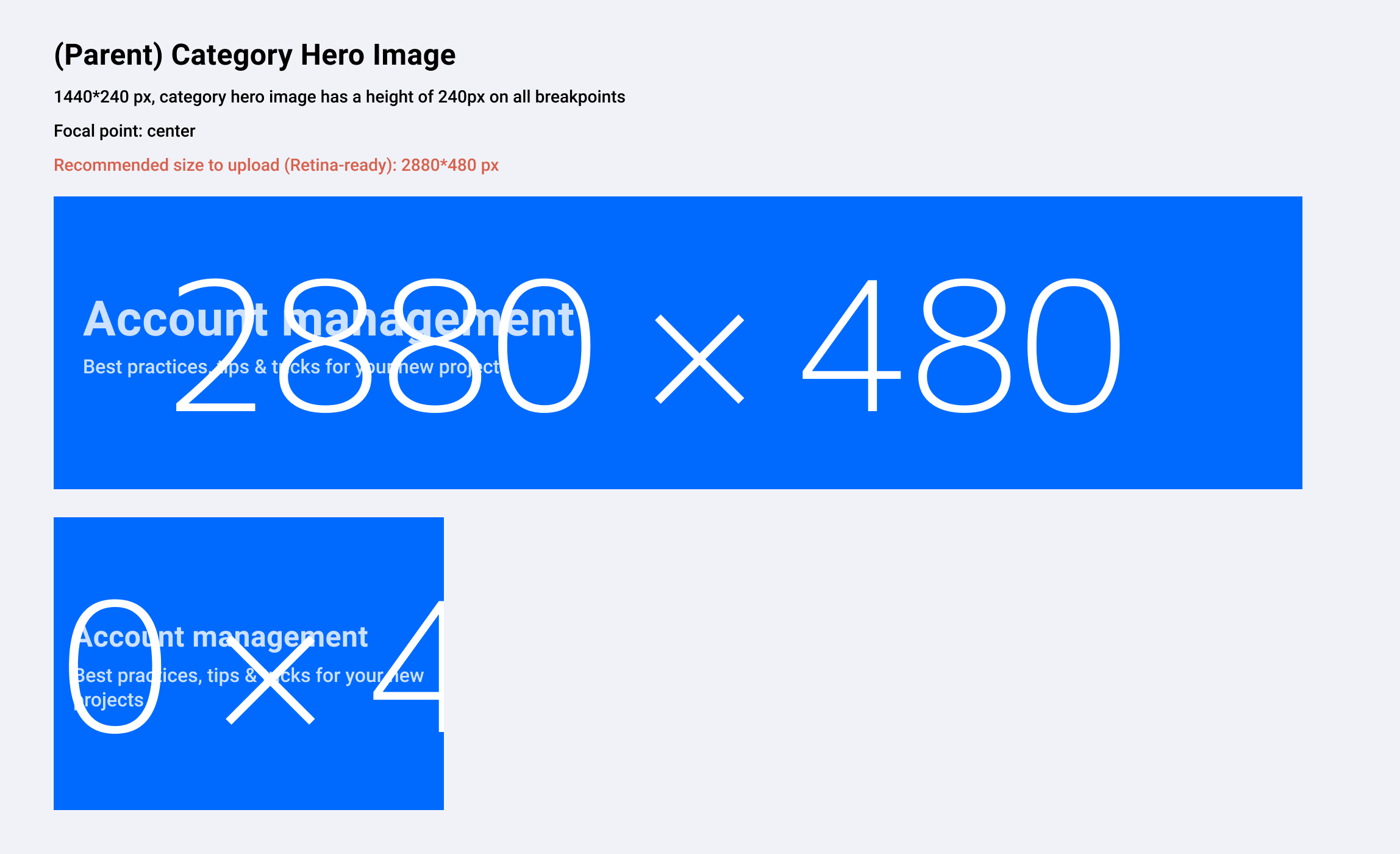
Parent Category Hero Image

Example: https://community.insided.com/platform-36

2a499c9e-91b3-4fc0-8459-46ec65ed26f4.jpg


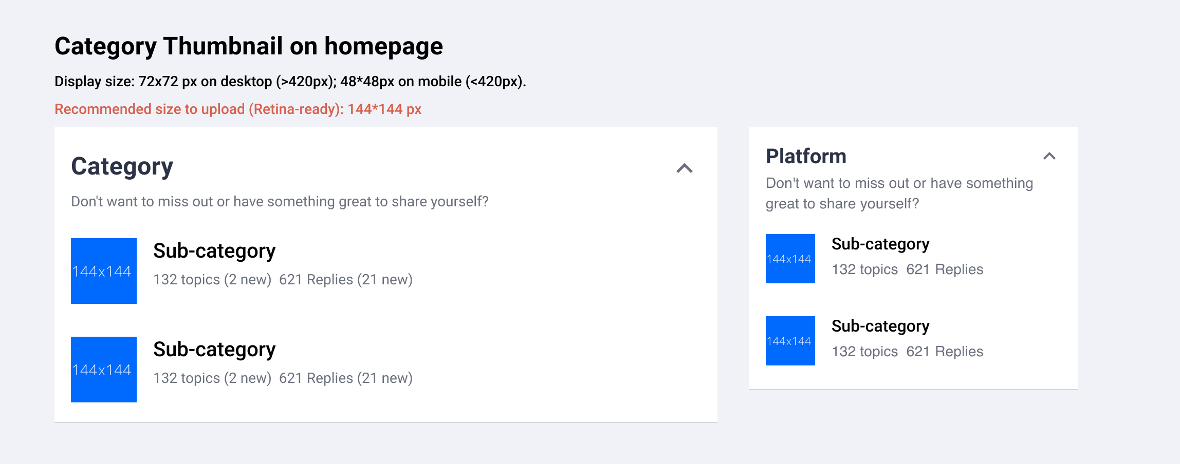
Category Thumbnail (Homepage)

Example: https://community.insided.com/
b052e921-436f-43be-9828-7951a2a78648.jpg


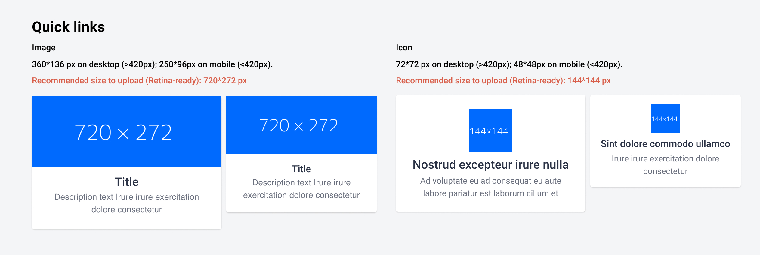
Quick Links (Homepage)

Example: https://community.insided.com/


Knowledge base (Homepage)

Example: https://community.insided.com/


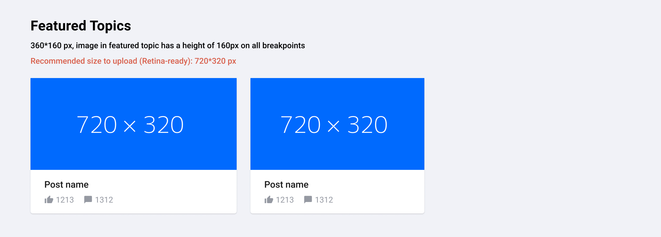
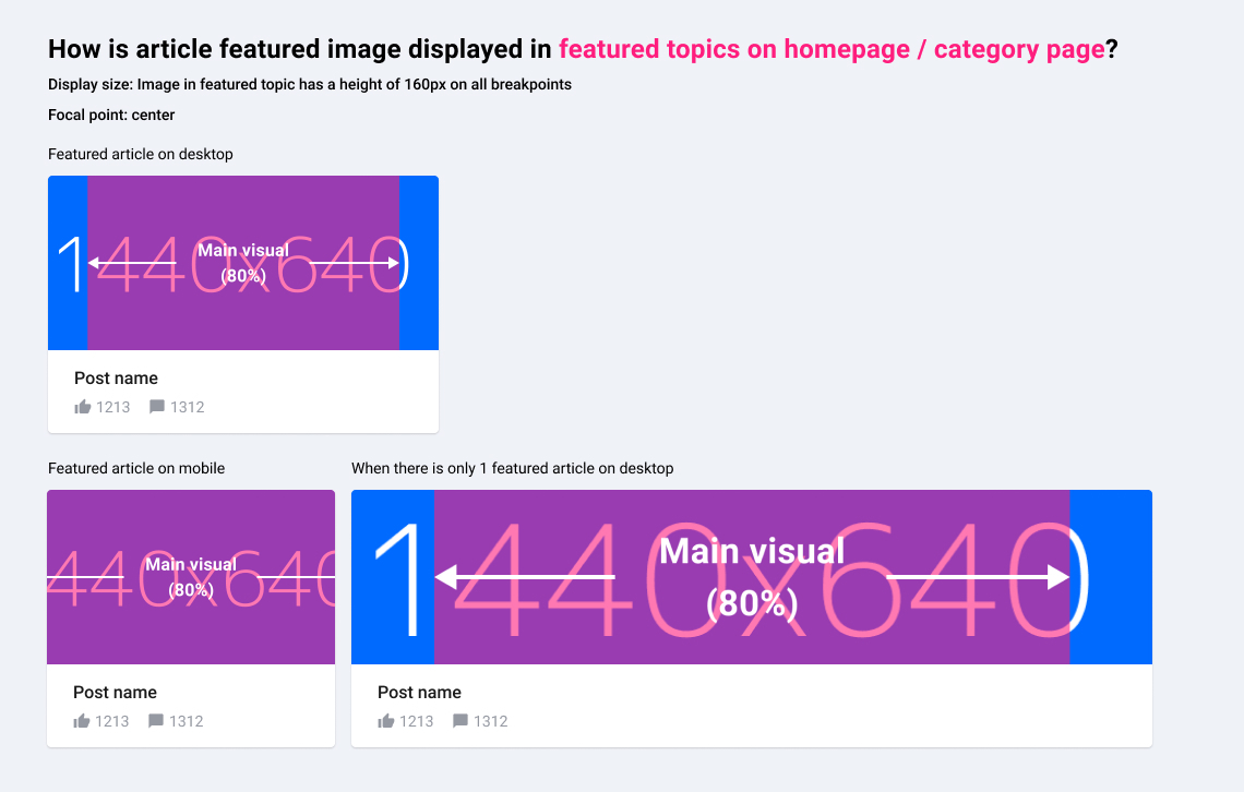
Featured Topics (activated optionally on top of Category- or Homepage)

Example: https://community.insided.com/news-platform-updates-16

88c2b27e-9686-4b44-933d-34c73295793b.jpg


Badge

Example: https://community.insided.com/
Recommended size (Retina-ready): 90*90 px


User profile picture

Recommended size (Retina-ready): 90*90 px


Rank Icon

Always shown above user avatar
Recommended size (Retina-ready): 36*36px


Username Icon

Shown next to username.
Example: Profile page
Recommended size (Retina-ready): 24px*24px

-----
Article image visual guide is updated on 26 Jun, 2019


Article featured image
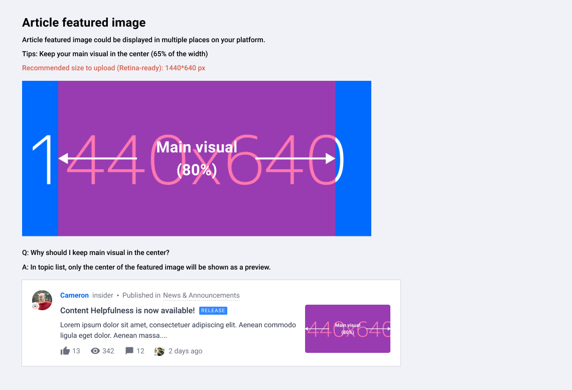


Where and how would article images be displayed on your platform?

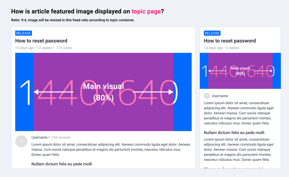
Topic page

Example: https://community.insided.com/getting-started-customers-only-33/visual-guide-v2-0-1462

dabb423e-cb54-4268-8429-1d2d5b4ece36.jpg


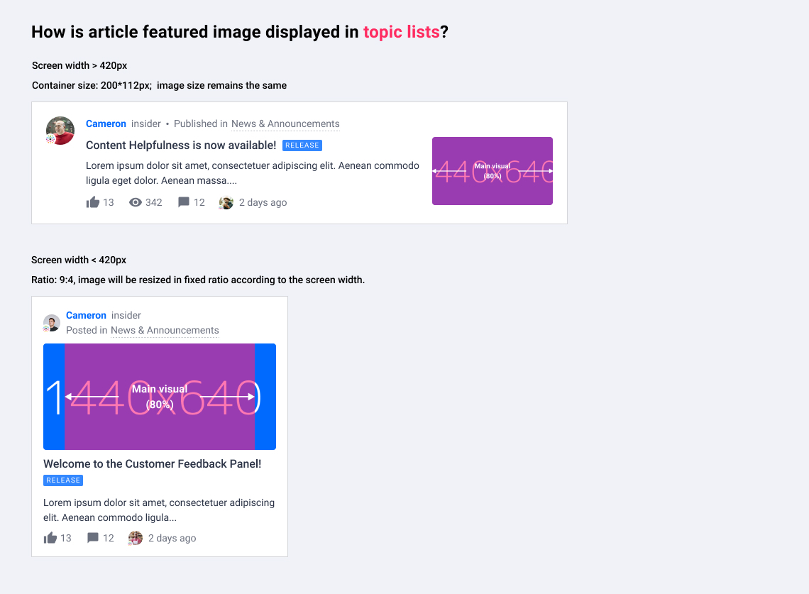
Topic list on homepage/search results/category page/etc.

Example: https://community.insided.com/news-platform-updates-16


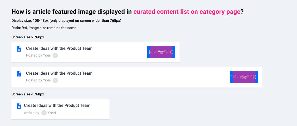
Curated content list on category page

Example: https://community.insided.com/news-platform-updates-16

f4d1cdf3-7776-486a-8ed3-d24b635b2d04.jpg


Topic list

ee3dd755-e2b4-401c-ab4a-3e9f80b0399b.jpg


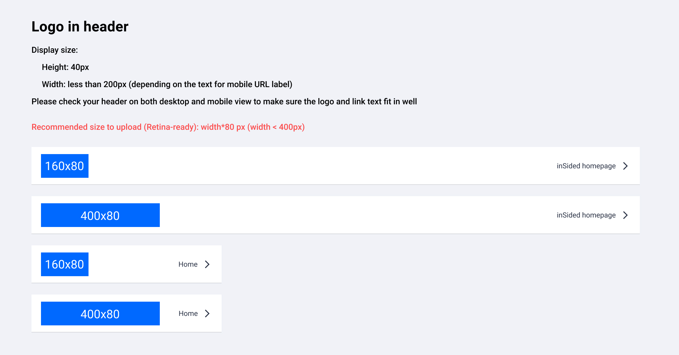
Logo in header

Where to upload? → Control> Customization > Header
 

Missing anything?


Please leave a comment below.😊


Thanks for the updated guide! I've just made a test image 720x320 pixels.


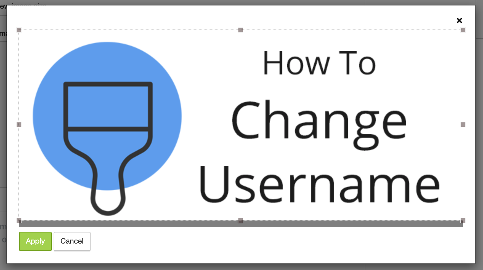
When I tried to upload it to my article the uploader forced me to crop a few pixels off the bottom


I've checked how the image is displayed in various places as well.


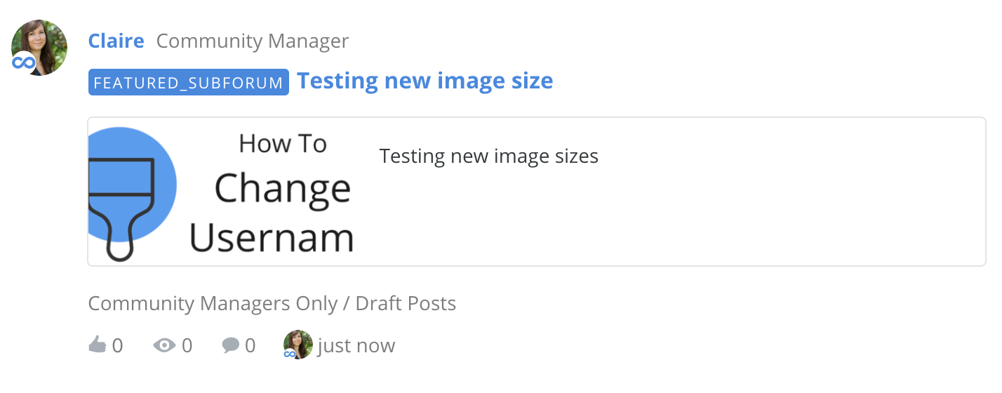
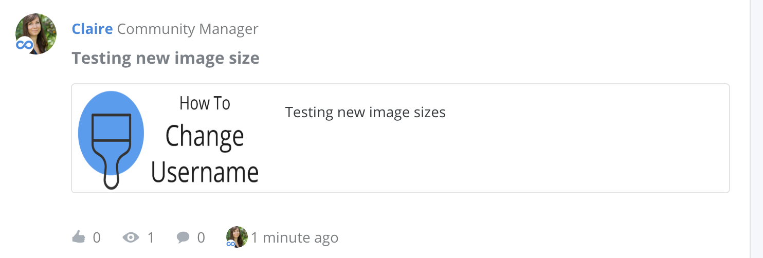
In the list of 'Recently Active' posts the image is cropped:


It displays fine as a featured topic at the top of the forum (only if there are 2 other cards alongside it).


But in the list of posts in that forum, the image is displayed squashed:


It would be great if you could use one aspect ratio in all of these places so a single image can work, or allow us to upload a different image for display in each of these places. Unfortunately simply making article images 720x320 isn't going to work.
Hi Claire,


Thanks for your detailed research and suggestion! Indeed, the article image does need more care. I will look into improvements and give you an update.


The image display in post list is a bug. Images shouldn't be squeezed in any case. It will be fixed soon.
Hi @Claire,


Great to read the questions and answers allready placed in this topic.


I have a new question:


When looking at this featured image https://community.insided.com/news-platform-updates-16


i see original image sizes of 3178 x 1365 and 3200 x 1371 in the code. So 720 x 320 seems a bit small also the large originals seem a bit large concerning page loading perfermance.


  • Can you give more details about this size difference / what is going on below the hood?

  • Is it wise to create larger files then 720 x 320?

  • Is there a difference in featured image size between Article and non-Article topics?


Thanks,


Anne
Hi @Anne, those are great questions, I'd be curious to know the answers as well. Maybe @xiaoyu-shen can help?
Hi Anne,


Regarding your questions:


Can you give more details about this size difference / what is going on below the hood?


While uploading the image in control, you need to crop the image according to the required image ratio. The cropped image will be the image you actually uploaded. That is also the image size you see in code (e.g. 3178 x 1365 and 3200 x 1371). In this step, the image size will vary depending on the image you uploaded and how you cropped it. Our system will resize the images to show it properly in front-end. In some cases, the image needs to be displayed in a different image ratio, then it will be cropped automatically, e.g. homepage hero image.


Is it wise to create larger files than 720 x 320?


The suggested sizes are the smallest sizes that are required to keep the image sharp (retina display considered). A larger image can also work, but it will potentially slow down your webpage because of larger file size.


Is there a difference in featured image size between Article and non-Article topics?


Featured image is only supported in articles.


Back to featured image in article, we are currently working on some adjustments article image ratio. I will give an update after it is implemented. :)


Best,


Xiaoyu
Hi all,


We've been working on improving article featured image, as well as its visual guidelines. Please check this post for further information: https://community.insided.com/news-platform-updates-16/article-image-design-specs-and-changes-1568


These info will be merged to Visual Guide 2.0 (current article) once they are all implemented.


One upcoming change is the article image in topic list. It will be live in 2 days.


Article featured image in desktop topic list


  • Currently on desktop, article featured images in topic list are displayed in original proportion in a 3:2 container (168*112px). We've noticed some featured images contain a wider visual or long text, which would be cropped quite a lot.

  • What will be changed: To provide a better view, the width of the image container will be changed from 168px to 200px.

  • Action: If you have featured images containing main visual/text, make sure they are visible in the centre. And be aware that featured image will be slightly cropped (10%) on each side in topic list.


Hi @xiaoyu-shen ,


I’m missing guides on visuals to for example Events. I take that the image should be 1200*600, but could you confirm this? :relaxed:

Thanks!


That’s correct 🙂 @Suvi Lehtovaara 

And note that the left and right sides of the image would be cropped slightly in card view, e.g. on the event overview page. Please try to keep the main visual and text in the center. :) 


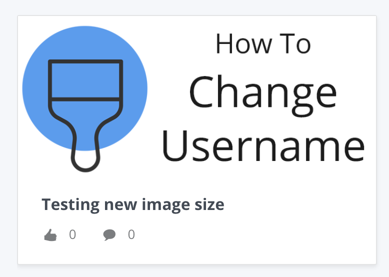
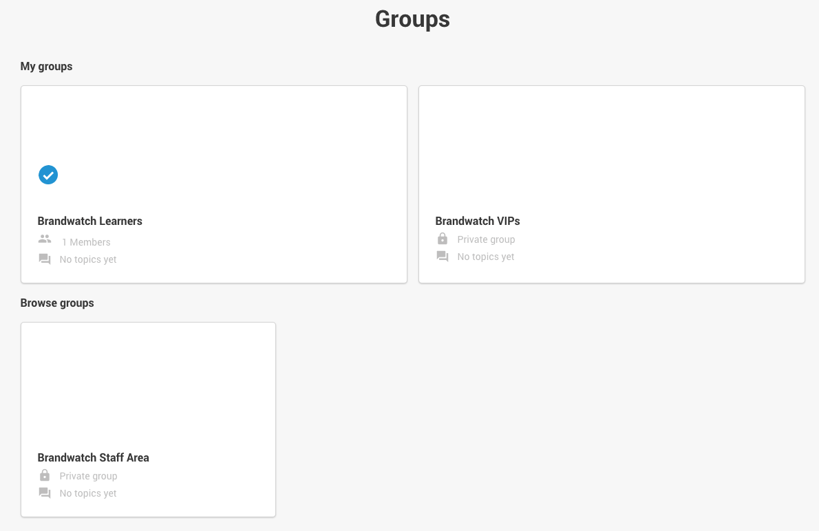
@xiaoyu-shen which asset types are used for the group selection screen? It looks like it’s the article featured images - but the sizes seem to be different depending on whether you’re looking at “My Groups” or “Browse Groups”:


Thanks!


Hey @Onomatopoeia, happy to help out. :)

How the images get display in the group overview actually depends on the amount of cards in a row. The recommended image size is for the smaller card in your screenshot (so when there’s one or three cards in a row). When there are only 2 cards, the image will be slightly cropped on top and bottom to fill the row. 


Thanks so much @xiaoyu-shen that’s super helpful. So for best practice, our designers need to make sure that critical information / design elements aren’t included in the top / bottom areas of assets?


@Onomatopoeia Yes, correct. That would avoid important information getting cropped. :) 


Hi! I am simply looking for best practices to share with our Community’s registered users on image size requirements? is it is also the 5 MB restriction?


Please advise.


@xiaoyu-shen what is the recommended image size for the image in the HTML Block/widget?

I have it in my notes as being 259 x 311, but it looks funny as the other elements on the sidebar are wider:
 

This is just an example, not a real life banner ;)


@xiaoyu-shen what is the recommended image size for the image in the HTML Block/widget?

I have it in my notes as being 259 x 311, but it looks funny as the other elements on the sidebar are wider:
 

This is just an example, not a real life banner ;)


@Alistair FIeld could you help me with this? Or at least connect me to the right person?😊


Hey @Suvi Lehtovaara 👋,


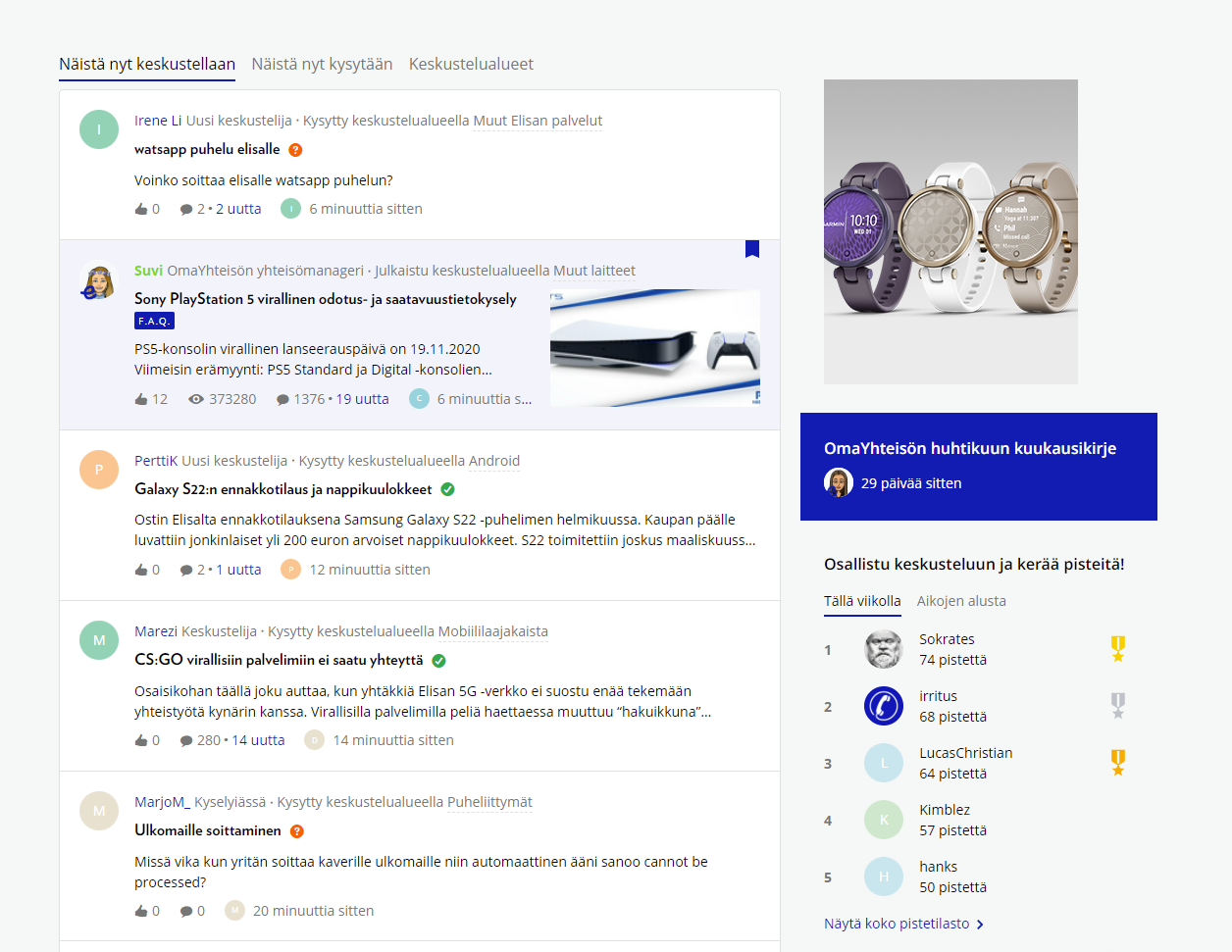
So the width of the container is 364px, which is the width the blue announcement card is using currently. Within this container, the other contents of the sidebar e.g. leaderboards etc. have some padding which mean the content has a width of 316px (padding of 24px left and right). See below:


It depends on if you want your image to take up the full space of the container, like the blue announcement card or if you would like this to line up with the other contents of the sidebar. My advice would be to try 364px to see how it looks and if not apply padding to the image and the announcement card.


Let me know if you need help with this 😀


Hi Community❓about what Community blocks are being used to represent these smaller categories on your overview page (see pic below)? Is it customizable?

Right now we use ‘Quick links’ to customize the category blocks on our homepage which are larger and standout (this is ideal for these blocks)

We would like to create a custom ‘Key resources’ section below it that helps drive customers to where they need to go easily but would like these blocks to be smaller, more rectangular like. Some of the categories will be more like a quick link where a url would need to be added. Some of them would be a parent or child category.

Is this possible? if so, which block should be used to create these?


Hi @ryanne.perry 👋,

This is using the ‘Community Category’ widget with the cards configured to small category cards. Unfortunately, you wouldn’t be able to use this as it’s linked to your community categories.

As you want this section to be different to the current ‘Quick Links’ styling, it sounds like you will need a Custom HTML widget in order to create these smaller cards to point your community members to the ‘Key Resources’. You’d be able to create cards very similar to the ones belonging to the ‘Community Category’ widget with some HTML and CSS.


Thanks @olimarrio

3 more questions - 

  1. Will the customizations be available eventually as part of the ‘Custom Pages’ or will it always have to be a some html and css?
  2. Do you know of any customers who are already doing this so we might be able to ‘mimic’ their html and css?
  3. Does the custom widget allow for icons to be displayed with each category listed?

Hello, 

I had a question about the logo placement. From the post I was confused by the specifications that you recommend. Is it 160 x 80px or 400 x 80? Basically I would like some guidance as our design team packages up our logos on what you would recommend. 

Thank you! 

~Chloe


Hi, @cstrange! Thanks for the question.


The main place where you would use the Logo is in the Mega Menu, which we recommend using an 80x400 asset. For the logo you configure in your Customization settings in Control, you would use a 160x80 asset. 


Please note that in my experience, most folks hide the header, since it just includes a logo and a ‘back to the homepage’ redirect. If you are not going to hide it, I most often see a custom header used.


I hope that helps! 🙂


Reply