Hi!


I noticed a new feature on the Insided community


How can I set this up? Anyone?


Cheers!
Hey Pieter,


This is what we call Quick links, these links can be set up in the Control environment. Here's a guide to set them up: https://community.insided.com/highlighting-content-80/set-up-quick-links-on-your-homepage-1170#post3780


Apart from the steps above we applied some advanced configuration to make them look different, this is what we did:


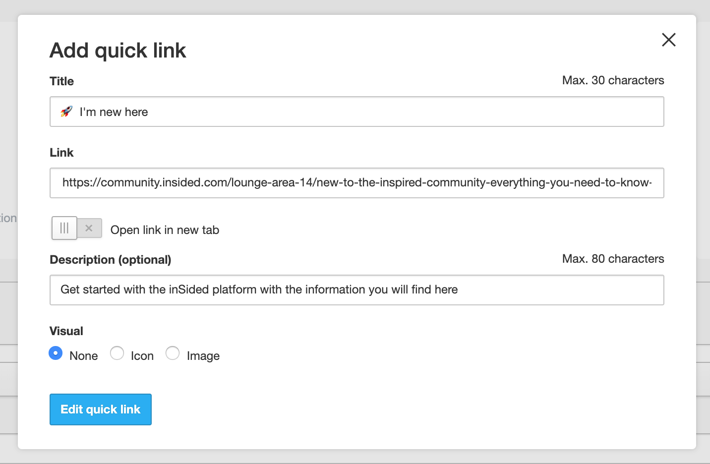
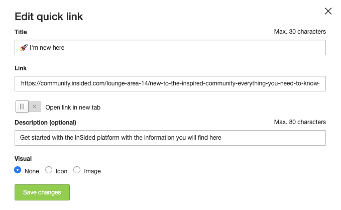
1.We created 3 quick links without a visual


2.We used an emoji in the Title copied from https://emojicopy.com


3. In Control > Settings > Third-party Scripts we injected the following custom CSS in the Before < /body> panel


code:
< style>
.quicklink__box__novisual {
display: none;
}
.quicklink__title {
text-align: left;
padding: 24px 24px 16px 24px;
}


This Custom CSS makes the card more compact and makes the text left-aligned (by default there is more space in the card and the text is center aligned)


Hope this helps 🙂
Thanks!! @Yoeri
@Yoeri here's the result! Thanks 🙂


https://community.eigenhuis.nl/
Great job! 🙌
I've also noticed a Title for the quick links: Articles and Guides. Does this also require a third party script? If so, how do I implement this one? Thanks in advance!
This is not part of the quick links but part of a new module which we call the knowledge base. This is a new module that was introduced in the inSpired event last Thursday. We will soon launch this module for your communities, you can already read some information on this knowledge base here: https://community.insided.com/knowledgebase-86
Great! Thanks. 🙂
Looks great @Pieter !! And thanks for asking this, I was wondering how they'd achieved that too!!


Super helpful!


Darran
Hi @Yoeri. I used this third-party script to create the smaller quick links, as well.


Unfortunately, it seems this script is having this adverse effect:


When using the search bar in the community, if a topic comes up that I want to navigate to, when I click it, nothing happens – the topic title sits in the search bar but I am not taken to that topic (as before). I have to then manually click the magnifying glass icon at the left to get to the topic.


I wrote in to inSided support about this and Tom let me know that it's a result of a third-party script running. When I followed his instructions, by adding "?disableTps" at the end of the community URL, it shows the quick links the standard size and selecting a topic from search brings me to that topic page.


This means I have to choose between smaller quick links and having the search function work properly. I'm afraid I'm not savvy enough to adjust the third-party script on my own – wondering if you or maybe anyone else here can advise? Thank you!


Here's the standard URL with third-party script enabled: https://coursera.community/


Here it is with third-party script disabled: https://coursera.community/?disableTps


cc @OVOdarran and @Pieter in case you're having the same issue or have any suggestions!
Hi!


I am happy to inform you that my colleague @tom.shaddock was able to fix the issues with the search on your community! :)


This was not caused by the specific piece of code. Hence we (or Darran / Pieter) did not experience this problem.


According to Tom, this problem was caused by a missing styling close tag which was unrelated to the code described above. Basically somewhere in your own custom styling code an action was not closed of (and thus limited) properly, with the result that it also was applied to the behaviour in the search bar.


Everything is working now as expected again, including the layout of the quick links. :)


A gentle reminder to everyone: Be careful when working with the script feature, as it can easily affect the behaviour of your community. 😉
Thanks, @Julian. It's interesting that there was no issue until I applied the code shared here. But I'm not a coder so I don't fully understand how these things work. 🙂

Hi all,


I added this code to the Before < /body> panel, but didn’t notice any changes:


< style> .quicklink__box__novisual { display: none; } .quicklink__title { text-align: left; padding: 24px 24px 16px 24px; }


Any advice on what I might be doing wrong? Could we find and edit the CSS width and height % manually as a workaround? @Yoeri 


@timcavey I know on inSpired we use emoji’s instead of icons to make use of the small Quick Links. And that script is only for when no visual is selected.

So either you need a different script for making the Quick Links small with icons, or else you will need to select ‘none’ for ‘visual’ and then add emoji’s instead like we do


@tom.shaddock do you have any thoughts on this?


Yep you’re suggestion @Shane1 is correct - @timcavey  those css rules will make sure the text is aligned left and that the box for the icon is correctly hidden if no image is selected.

For the quicklinks on the homepage we’re just using some normal off the shelf emojis for the images instead of an uploaded user icon.

@timcavey if you remove the images and apply those CSS rules, you’ll end up with something that looks like this (dont worry i’ve only made these changes to my local browser):


@timcavey  if you wanted to make a custom emoji with your icons - you could use this service: https://www.emojicopy.com/ and then copy and paste the emoji into the title bar. Hope this helps!


Thanks for the help @tom.shaddock and @Shane1 


Your advice has worked, but the emojis on their emojicopy site (when selected to copy) and on control (when copied over) and on the front end are black and white and basic versions. They don’t look great to be honest. 


Is this related to my version of windows? Any workaround or fix?


Hi @timcavey yep this sounds like an issue with emoji support on your PC - unfortunately emoji support isnt as ubiquitous as it should be, im not able to think of a suitable workaround besides picking more common emojis (which you know will be supported on more operating systems).


Your quicklinks are looking pretty good how they are though, this is how they’re rendering for me at the moment:


Thanks both, yep looks like there’s nothing we can do to make these look universally great. 


The ‘unicode standard’ emojis just look different depending on the device / OS. In the case of me and other moderators on our version of Windows, they look a bit naff. 


For for phones, and more UTD OS, they look great - we’re sticking with them! 


Reply