mitchell.gordon
Expert ⭐️
August 10, 2026
Solved

How to use Hero Images and Descriptions in Community pages?

  • August 10, 2026
  • 5 replies
  • 72 views

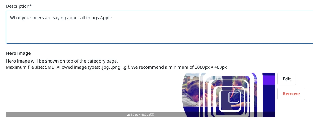
I have been having some issues using Descriptions and Hero Images in GS CC. When the page scales outside of monitor sized screens, the text from the descriptions get blended into the Hero image input in admin.

I put the examples and locations where this is happing at for clarification. 


Does anyone have any suggestions to have this be a better user experience?

Best answer by Sudhanshu

Hey ​@mitchell.gordon Had a proper dig into this one.

The readability issue on the category pages comes down to how the hero image is anchored in your custom CSS. It's currently pinned to the bottom-right, so on smaller screens the image crops to its busier side and slides that under your text, making it hard to read, especially on mobile.

Switching the anchor to the left keeps the lighter side of the image behind the text, so it stays readable across screen sizes. If you swap your two .forum-featured-image rules for this single block, it should sort it:

.widget-container--category_hero .forum-featured-image {
height: 315px;
background-position: left center;
}

@media (max-width: 767px) {
.widget-container--category_hero .forum-featured-image {
height: 450px !important;
background-size: cover;
background-position: left center;
}
.widget-container--category_hero .forum-featured-image__content {
height: -webkit-fill-available;
margin-top: 3%;
}
}

One heads-up while you're in there: your old mobile rule was targeting #root > .forum-featured-image, which no longer matches the current markup and quitely stopped applying. The block above uses the updated selector, so mobile behaves again.

Worth testing on sandbox first, but that should get you sorted. Let us know how it looks.

 

5 replies

samanthahamlet
Gainsight Community Manager
August 11, 2026

Hey ​@mitchell.gordon 

I’m just checking internally on this, will let you know as soon as I have an update for you! 😊

mitchell.gordon
Expert ⭐️
August 11, 2026

Thank you! Mobile screens UI/UX is currently unusable and not accessible.


Sudhanshu
SudhanshuAnswer
Gainsight Product Manager
August 18, 2026

Hey ​@mitchell.gordon Had a proper dig into this one.

The readability issue on the category pages comes down to how the hero image is anchored in your custom CSS. It's currently pinned to the bottom-right, so on smaller screens the image crops to its busier side and slides that under your text, making it hard to read, especially on mobile.

Switching the anchor to the left keeps the lighter side of the image behind the text, so it stays readable across screen sizes. If you swap your two .forum-featured-image rules for this single block, it should sort it:

.widget-container--category_hero .forum-featured-image {
height: 315px;
background-position: left center;
}

@media (max-width: 767px) {
.widget-container--category_hero .forum-featured-image {
height: 450px !important;
background-size: cover;
background-position: left center;
}
.widget-container--category_hero .forum-featured-image__content {
height: -webkit-fill-available;
margin-top: 3%;
}
}

One heads-up while you're in there: your old mobile rule was targeting #root > .forum-featured-image, which no longer matches the current markup and quitely stopped applying. The block above uses the updated selector, so mobile behaves again.

Worth testing on sandbox first, but that should get you sorted. Let us know how it looks.

 

mitchell.gordon
Expert ⭐️
August 18, 2026

Thank you! I will put this into stage and play around with Claude today.

Sanne van Opstal-Brakel
Helper ⭐️
August 19, 2026

To be honest, we had the same issue but we also came to the conclusion that a lot of the text that was in there, did not necessarily needed to be there. So we just shorted out text. 

Sharing = caring