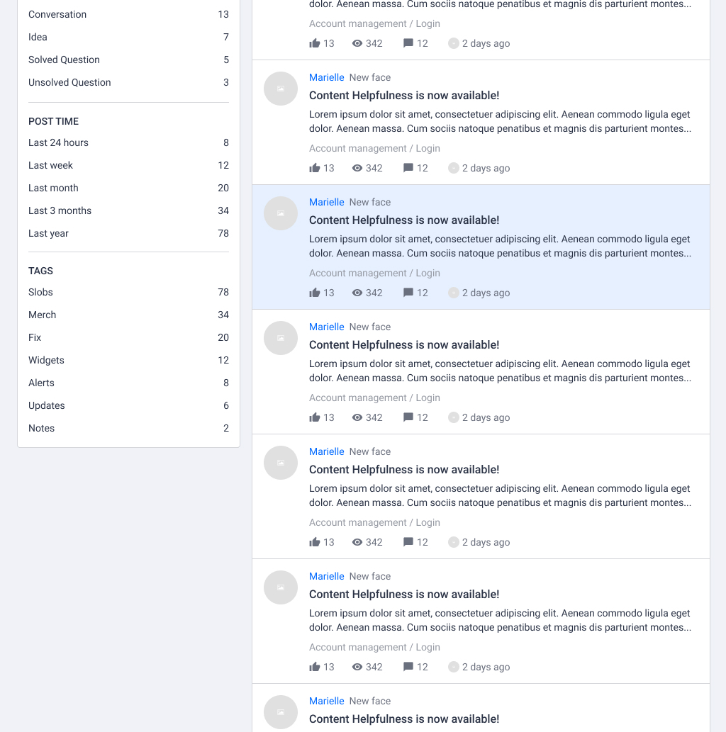
InSided aims to help your customers find their answer easily. We are currently investigating an improved search experience with possibilities to filter results based on categories, topic types, post time and tags. We’d like to share some early concepts about the search page and hear your feedback.


🎯 Goal


Help users to find answers easily with search filters.


  • Provide powerful filters to scope down search results

  • Make search a delightful experience on all devices


💡 Concepts


🤔Questions


  1. What is your biggest pain with searching currently?

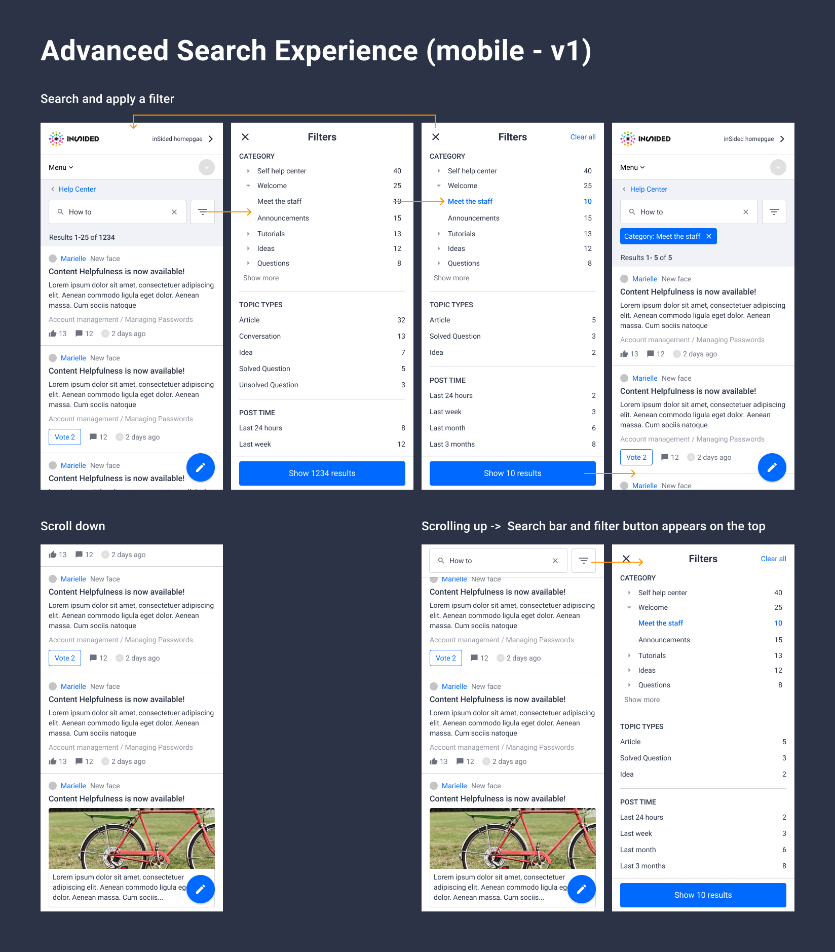
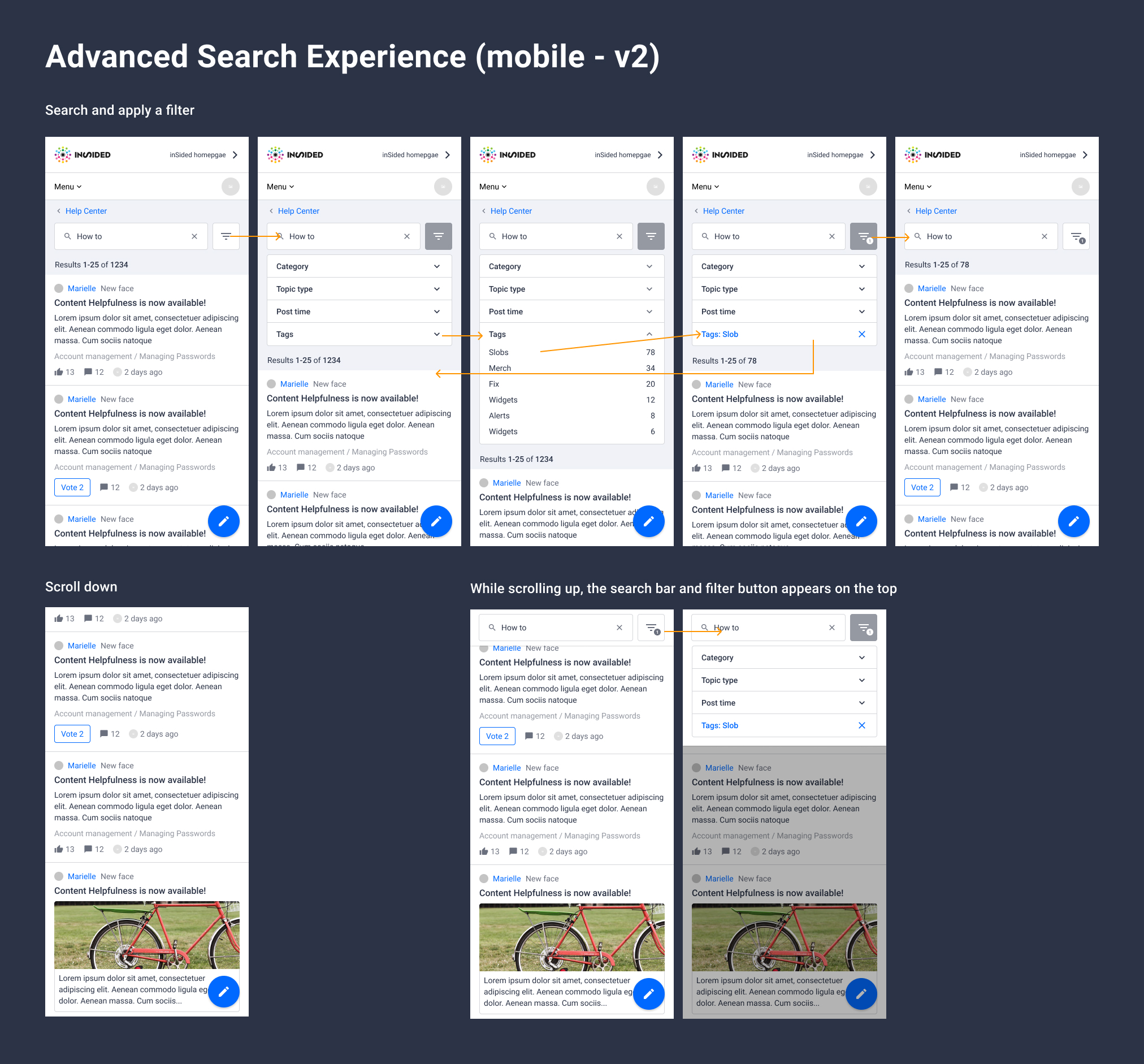
  2. Which mobile version would you prefer, and why?

  3. Which filter do you find most important, and why?


We’d love to hear your feedback.😊
Hi,


thanks for the interesting post and what you're investigating for improving the search functionality. Speaking of the search, my biggest pain (which is also backed by our users) is the accuracy because a lot of times there are no search results displayed although the search keywords should find something and also that is not as "modern" as many other searches where you can for example pin certain search suggestions.


Regarding the mobile version - I would prefer version 2 as it allows you while filtering to see how that at the same time changes the display of the search results.


In terms of the filter, I think searching for an author or a user role (for example threads which have been created by administators or moderators) would be very practical.


Regards,


Esther
Thanks for the update!


The biggest issue (for us) with searching right now is not being able to use any filters at all when using live search. In this the most missed filters are (ordered in importance): Category, Post time, Last active date range and answered yes or no (no being for the Super Users). Secondly it would be nice to sort on number of reactions.


For me however there is somewhat of a question mark for the filter on answered questions. Because by using this you do focus more on just finding and not interacting with the Community. Maybe its better in just making the order in showing the answered questions first, but continuing in the topics that are not answered or a discussion. But I'd love to hear other opinions on this.


Considering the above mobile examples, the second one speaks the most to me as it is a more combined experience.


As a last one, I also support Esther's example for searching on authors or user roles.


Hope this helps :)


Cheers,
Speaking of the search, my biggest pain (which is also backed by our users) is the accuracy because a lot of times there are no search results displayed although the search keywords should find something and also that is not as "modern" as many other searches where you can for example pin certain search suggestions.


Fully agreeing with Esther - and the issue only becomes bigger the more content you have. Large communities with millions of content won't give you neat results like in the mock-ups (yes, I volunteer ours to pilot 😉). Part of the accuracy issue I think is that currently results are too much skewed the accuracy of the search term, which assumes that users know what and how to search - which in my experience (and I guess in a lot of others') is not a valid assumption.


For the user the accuracy is determined not only by fit with the search term, but by also applying the context they are searching in.


  • As @Ronald Posthumus and @Esther Groth wrote, the category, post time, author, etc. are good for enriching the search with context.

  • But I'm missing relevancy indicators which can provide the user with understanding why a search result could/should be relevant for him/her: views, helpful, likes, timeliness (when OP or answer, not last activity), solution by trusted member, user-history & interests

  • Strong relevancy can be a unique asset for the community and greatly enhance the community experience, but for that a richer set of information would need to be build, e.g. making helpful voting at a post basis to most effectively guide to the most relevant post, understanding users' interests to e.g. suggests from his interest in which category he might find the most suitable answer, etc.


Also, I have a question: what's the experience of the user after he chooses a content-item which he thinks is relevant? Will it open in a new tab, in the same tap, be first a preview with a x-character blob (similar to embeddable widget)? And what is the intended experience for the user to come back to his search?


Cheers,


Florian
Hi,


We are very happy to see that you're investigating improvements on search experience, as this is one of the biggest issue that our customers are complaining about.


1. What is your biggest pain with searching currently?


We have done a survey among our community members. The majority states that they do not find the seach engine easy to use: they are not able to easily find the information they are looking for.


The biggest reasons are:


· Not able to search through categories: most of our customers do not come from google; they actually use the categories to search for information.


· Not able to search on usernames/organization within a certain area/ country: our customers want to easily get in touch with other customers. You can now only get in touch with someone, if you accidentally see someone at the community (for example in a topic or at the leaderbord). As a consequence, our customer email us for help, after which we have to go the back end and use the search engine to get in touch with the relevant customer. Our customers need to have the option to filter at region, country, the Infoland products that they are using etc.. In other words, they want to search through customers profiles.


· Not able to search/ filter with tags; our customers use the tags quite a lot. They would like to have the option to filter on tags. Actually on multiple tags: it would be very helpful if customers could search on combined tags and if they were able to search on ‘’excluded tags’’


Example: I want to search for topics about reports, but I want to exclude the topics that are ideas (idea is a tag)


2. Which mobile version would you prefer, and why?


We prefer the second version, as there seem to be more combined options.
I agree with all the above comments. 🙂
Also, I have a question: what's the experience of the user after he chooses a content-item which he thinks is relevant? Will it open in a new tab, in the same tap, be first a preview with a x-character blob (similar to embeddable widget)? And what is the intended experience for the user to come back to his search?


Good catch @Florian .


One idea is to open a topic page in the same tab, and user can easily come back to the search results by clicking 'back' button in browser (scroll depth will be maintained). The viewed topic card will have a different background color to indicate browsing history, and tell user where to start.


What is your biggest pain with searching currently?


- Search results leaving a lot to be desired


- No manual way to demote and promote search results


- No sorting results


- No filtering results


Which mobile version would you prefer, and why?


Version 1, because I prefer seeing my filter options at once in stead of having to tap to expand my options. I think the design would be improved if a visual cue is added when you have selected a filter. Like a checkmark.


Other than that, both designs are good as far as I can tell.


Which filter do you find most important, and why?
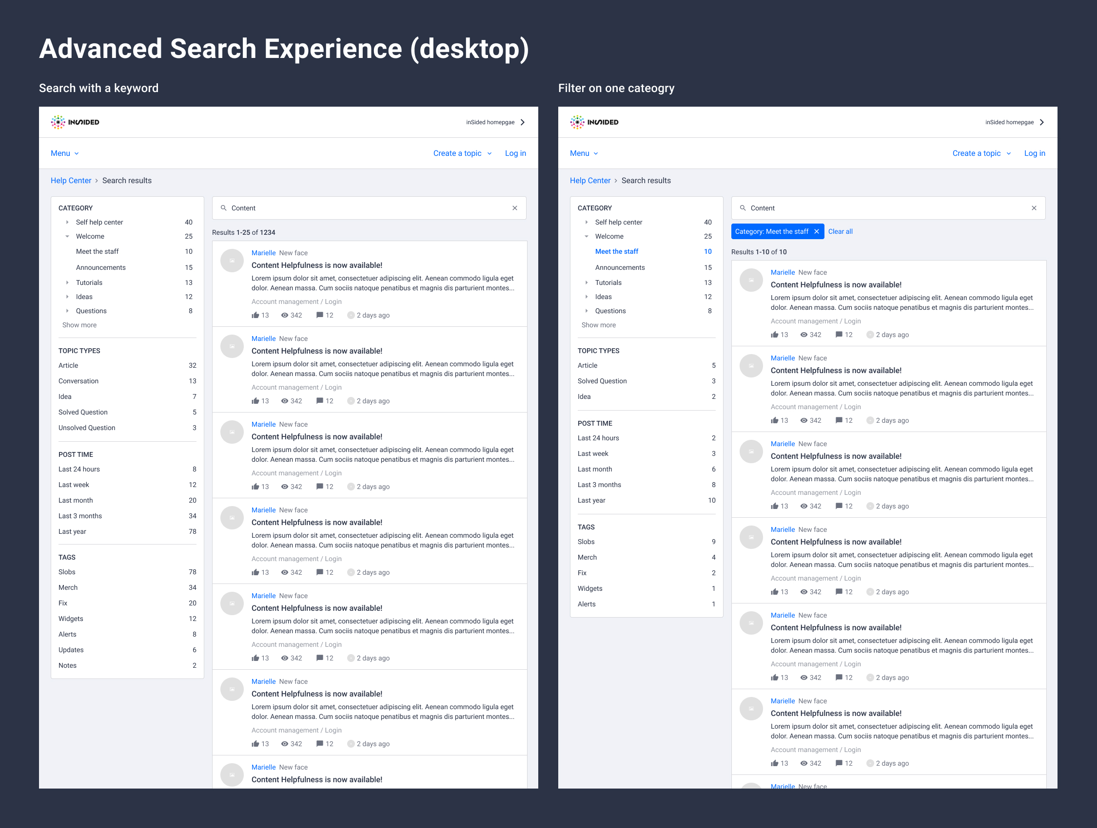

The ones you’ve added in this design are all pretty important, and decreasing in importance from top to bottom. I'm not sure what 'Post time' means: 'Last active' or 'Date created'? Creation date is probably more relevant.


Other than that, I’d just keep track of usage to decide if there’s a filter that doesn't need to be displayed.


I’d consider two things, mainly for our superusers:


1) Adding the ability to sift through topics with these filters but without a search query


2) Adding the ability to filter topics that haven't been active since the users last visit
We recently moved our 7 year old community to inSided. The migration went really well but it is difficult for us to find specific posts/topics now compared to before. We had more search capabilities before and I didn't realize how much we relied on them until recently. This update would be a massive help to us as we have hundreds of thousands of topics in our community.


  1. What is your biggest pain with searching currently? We simply have too much content for a basic search algorithm to sort through. Advanced filtering will really help our community.

  2. Which mobile version would you prefer, and why? v2. I like seeing the topics at the bottom of the experience opposed to an entire filter/search screen takeover.

  3. Which filter do you find most important, and why? Category. Users will be able to easily sort which area of the site they want to focus on opposed to the entire community site.

1.What is your biggest pain with searching currently?


There's just too much data in our platform for the search function to be effective while searching. At least the new search will help limit the amount of data that pops up :)


2.Which mobile version would you prefer, and why?


Number 1, it's easier to find desired filters when they're all available at one glance


3.Which filter do you find most important, and why?

Category, it helps to sort out at least the correct frame where you'd expect the correct answer to pop up


Things I'd add:


  1. Option to include only topics that have unread comments for you (could be used solely to see all the unread comments from either the forum or category of your liking in addition to looking for information that you might have missed while away from forum)

  2. Ability to save search to favorites either via platform or if that's not possible, via the URL to bookmarks in browser (latter might be possible already, don't know as examples didn't show the URL)


1. For me, there are a few frustrations when using the search feature currently:


  • If I know the first few words of a topic title, the entire topic title will show up as I type, but if I select that topic title, I find that it appears in full in the search bar, but I am not re-directed to the topic. And then, if I click "Enter," a search is performed rather than taking me to that exact topic.

  • I've been using the platform as a community manager for 4.5 months and I still have the urge to type a username or a user's first/last name into the search bar to find a community member. I echo the others here who would like to be able to search for users this way – for example, this would help me find posts that I know a particular user made and it would allow me to quickly find someone if I want to send them a private message.


Some other ideas: an index or table of contents would help make browsing threads more intuitive/easier (this could be achieved with filters, I think), along with the ability to organize topics based on number of replies, likes, or helpfulness.


2. I'm finding it difficult to get a sense of which version is (personally) preferable; if I had to choose a version, I would probably say version 2.


3. Bring on the filters! Of the filters in the examples, I find post time and tags to be most useful. Would post time be for new topic creation date or most recent post (i.e., new topic or reply)? I could argue that category is important as a filter if it is expanded to include "Users" as a category. As one of our superusers has observed, there's currently no way for members to search for other members based on their profile information. But our community wants to find other people who share interests, languages, careers, etc. It would be great to be able to filter by profile fields, for example, I do a search for other community members who list French as one of the languages they speak. This immediately allows me to begin to build relationships with others on common ground. (This sort of connection is what we aim for in our community, as it's not a technical support hub.)
+1 on everything that's already been said.


I think there are 3 reasons why people search within our community:


  1. To find the answer to a question or some specific information

  2. To see what's out there that they might be interested in

  3. To find a thread they know exists because they want to add something to it, send the link to someone, or just refresh their memory


#1 and #2 are more for new members and lurkers and #3 is more for superusers and is particularly difficult at the moment.


I like all the filters you've got in the screenshots.


I think filtering by category is helpful for all 3 use cases.


Being able to search by user I think is key for #3 since you often remember who posted it more than the other details.
We are super happy that you look into this! And reactions are also very insightful.


1 - What is your biggest pain with searching currently?


Even if we agree with everything mentioned above, our biggest pain is to show search results that are outside of our community. We are a software company, and we would also like to connect our documentation to this, and other relevant resources.


2 - same as @LPortalupi


3 - Which filter do you find most important, and why?


Filters on Category (which area of the site) and tags seem the most important to us. It would greatly improve overall accuracy. Something similar to the Gitlab search for example 🙂
Another pain point for me as a community manager and for our community members is not being able do a string search to find the most relevant post quickly (this is somewhat related to @Arakou's Manage Search Rules post).
Hello,


This is going to be great, I look forward to test it. :)


  1. No clear chronological results. Some recent topics are mixed up with old ones without apparent logic.

  2. V2 seems easier to use.

  3. Filter answered/unanswered questions. Be able to filter by date (1 week, 1 month, ...). Select a category.


Thanks !
Hi,


is there any news on the current state of the advanced search? Is it already in planning and will it be developed this year?


Kind regards,


Esther
We are currently investigating some advanced search functionality. As mentioned in our latest roadmap update we want to re-enable search in categories again. Xiaoyu shared some insights in the topic "Inside Design: Search in Category" check it out and let us know what you think 🙂

I upvoted a few other posts on this topic regarding user search field being included in Advance Search, but I also wanted to leave a note from my team about specifically what we would look for:

It would be helpful to be able to search for the details of a post (eg post author, category, originally published, etc) using the URL of ID of the post.
 

Thanks for this!


“using the URL of ID of the post.”

I’m not really sure what you mean with this Steph. Also, these type of search queries sound more like advanced searches that your team would want to do in the Control environment, and not something that should be available n the community for all users to do (I don’t think the majority of users would use this, but I may be wrong)


Hello,


This is going to be great, I look forward to test it. :)


  1. No clear chronological results. Some recent topics are mixed up with old ones without apparent logic.
  2. V2 seems easier to use.
  3. Filter answered/unanswered questions. Be able to filter by date (1 week, 1 month, ...). Select a category.


Thanks !

Exactly, I was expecting the most recent results first and chronologically served results but not currently the case. How far are we with Search improvements project @xiaoyu-shen ?


Reply