Good afternoon everyone,
I’m writing to see if anyone has any tips for the following:
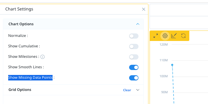
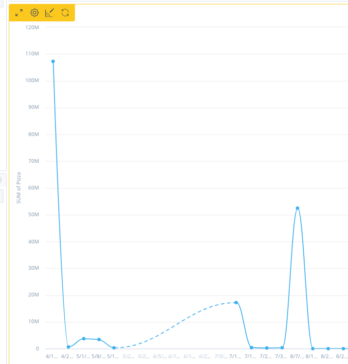
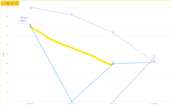
I’ve made a line report to show our NPS over time for several different surveys represented as different lines. In some quarters, we’ve had no responses for certain surveys which shows the NPS there as a 0.
Is there a way to get the line to follow from the last quarter that has data to the next quarter that has data, rather than dipping down to 0 in the middle where there’s no data?
Equally, if the survey hadn’t been sent out yet the NPS shows as a 0 until it’s first sent out, is there a way to start the line only when the survey is first sent out and stop the line when the most recent response is received?
I know using a bar chart fixes this in a way, as the bar is then just absent where there’s no data, but we would like to use a line report as this is showing a view over time.
Any help would be greatly appreciated.
Thank you!
Grace