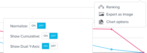
Update: you can turn off the "Dual Y Axis" in the Chart Options. This really solves the pain point here, because you can turn it on for large variances and off for reports like mine. Screenshot attached in how to turn this off.
 +2
+2
If you ever had a profile with us, there's no need to create another one.
Don't worry if your email address has since changed, or you can't remember your login, just let us know at community@gainsight.com and we'll help you get started from where you left.
Else, please continue with the registration below.
Enter your E-mail address. We'll send you an e-mail with instructions to reset your password.