

svaughangainsightcom
Contributor ⭐️⭐️
March 25, 2015
Question

Display Reports 2.0 Line Graph x Axis Chronologically

  • March 25, 2015
  • 3 replies
  • 80 views
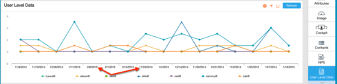
I'd like to display a user-level metric in a Reports 2.0 visualization very similar to the C360 Usage Data graph.  After building the Report, the resulting graph doesn't automatically order chronologically and I don't see a way to order the columns or dates.  (Line graphs aren't specified in the upcoming release notes.)
3 replies

conor_nash
Gainsight Employee ⭐️
April 2, 2015
Seems like a great idea!
emily_mcdaniel_629a86
Gainsight Employee ⭐️⭐️
April 6, 2015
Sara, this will be fixed with the MDA patch which is due out today.
emily_mcdaniel_629a86
Gainsight Employee ⭐️⭐️
April 7, 2015
Hey Sara, the patch was pushed.