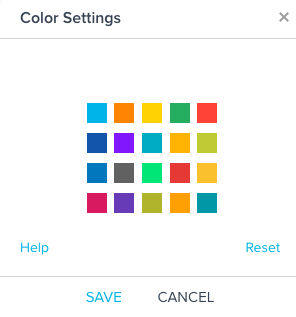
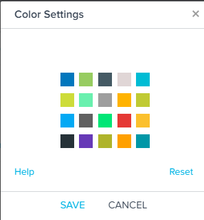
When Exporting a dashboard, some charts defaults to nursery blue and pink, and limits the ability for me to automate chart exportation for my QBR

Background

  • I have my default color palette set up to change the default colors (To one that adheres to my corporate color palette)
  • I have custom colors defined for each Boolean
  • I have reports that I’ve added to a dashboard. 

Problem:

  • When the report contains a list of values or boolean that i’ve color coded, all is fine, and the export uses my selected colors
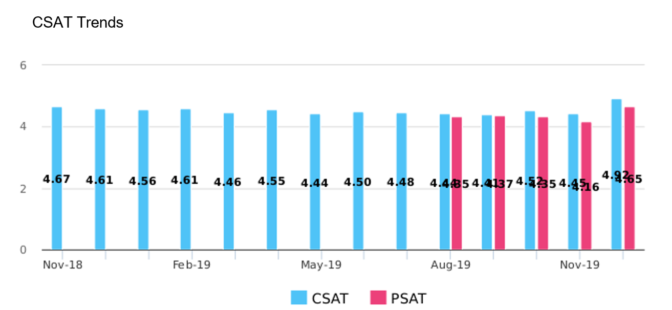
  • When I export something that contains one variable (here I am using overall csat + overall product satisfaction) it exports ignoring my selected color choices and defaults to a (very unprofessional in my industry) baby blue and bright pink.

What am I doing wrong?
Exporting my dashboard  


Hi @werickson - can you share the color palette settings that you have configured in report builder? For example, this is the color palette that we have defined for our own internal instance of Gainsight. 


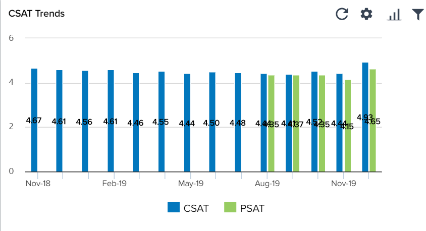
These are used in the reports themselves … here is a snip from my dashboard


but on export turn to the blue / pink combo shown above


Hmm, that’s unexpected. I attempted to duplicate this quickly in my instance and the exported ppt respected our color palette. I think this might make sense to contact our support team and see if something in your org’s config might be causing this. Sorry you’re having this issue.


Thanks, will do.  Glad to know it’s not supposed to be that way!

I’ll post the results after I hear back from support in case anyone else has this issue


@werickson did you get a chance to contact our support team? Please let us know if you need any help.


I did thanks..  There was a bug in the hybrid SFDC / GS environment, that was addressed in the last release.


Reply