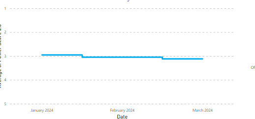
We currently have a usage scoring metric where 1 is best and 5 is worst and we have created a trend chart to see usage over time. However, because we cannot invert the y axis the data looks backwards and is misleading. Is there a way to invert the axis data to show this appropriately?
We are able to do this in other platforms to show correctly
The possibility of inverting values along the Y-axis is not within our current scope of feasibility. However, your support through upvoting a similar post may facilitate its inclusion in our roadmap for consideration.
If you ever had a profile with us, there's no need to create another one. Don't worry if your email address has since changed, or you can't remember your login, just let us know at community@gainsight.com and we'll help you get started from where you left.
Else, please continue with the registration below.
We use 3 different kinds of cookies. You can choose which cookies you want to accept. We need basic cookies to make this site work, therefore these are the minimum you can select.