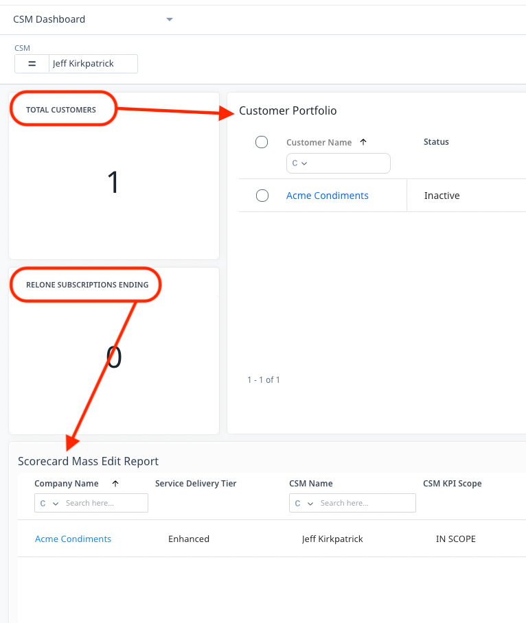
This is really not optimal
Thanks for sharing this Jeff, we’ll take a look at it and share back with this thread.
I personally like the new style of the report titles but believe that if this is the move, it should be universal across other areas of Gainsight too, such as with scorecard reports and the Customer Portfolio widget.
It sounds like the primary concern is consistency in formatting and capitalization and less about the change itself, is that right @darkknight @kstim @romain?
@jake_ellis From my perspective, yes that is correct!
Echoing @kstim…
I personally like the Report Title change, as it reduces the number of times and the amount of text that is cutoff from the Report Title.
I’m not fluent in UX, nor did I stay at a Holiday Inn Express last night, but I do see this as an additional example of the Gainsight CS product not having a consistent look and feel within itself. Whether it’s filtering UX, or parity between Rules Engine and Data Designer functionality, the disparity within the product adds to the Admin overhead--and therefore the total cost of ownership--when these inconsistencies appear.