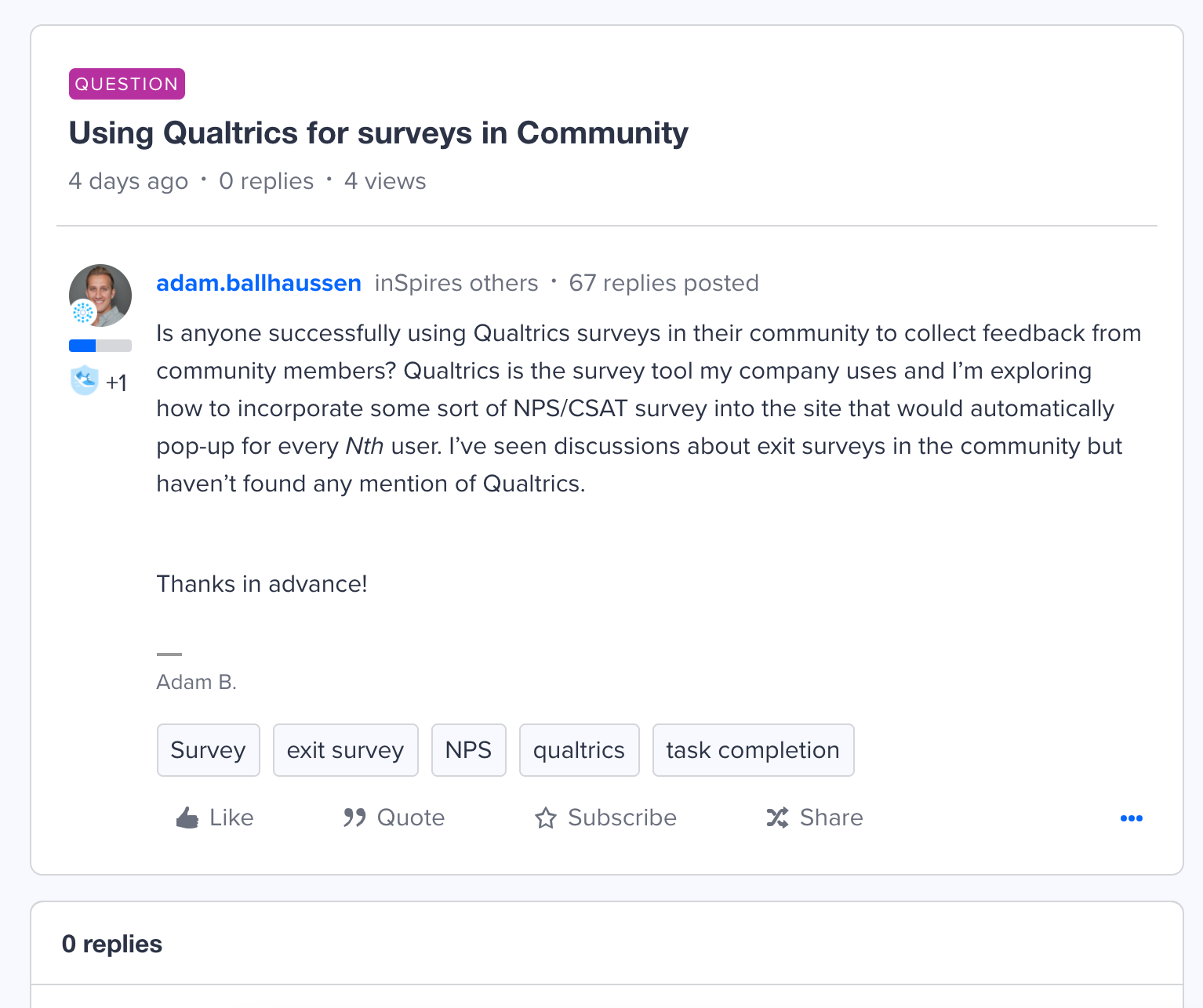
We’ve received some user feedback that it was not intuitive where or how to reply, and had seen an abundance of users using Quote to initiate a reply even when quoting isn’t necessary.
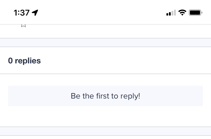
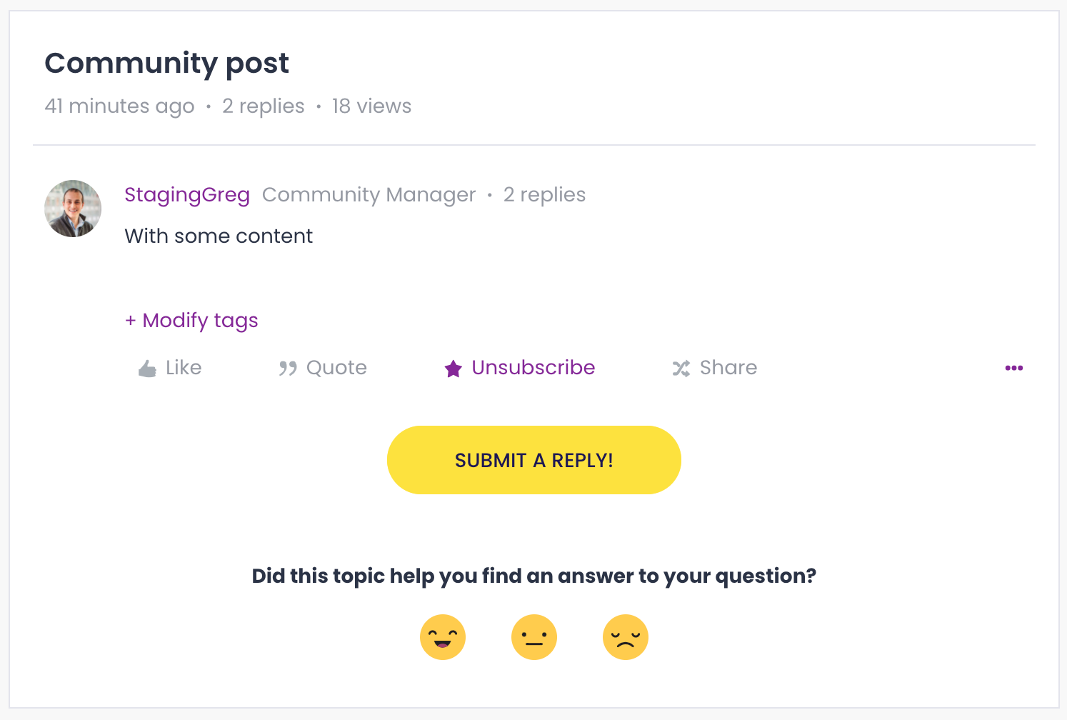
My analysis is that the Reply (editor) box is often pushed “below the fold” and obscured by the 0 Replies box. Even with the “Be the first to reply” call to action, there’s not a clickable area that’s intuitive for the end user.
See image below. Reply option is not visible within the window.
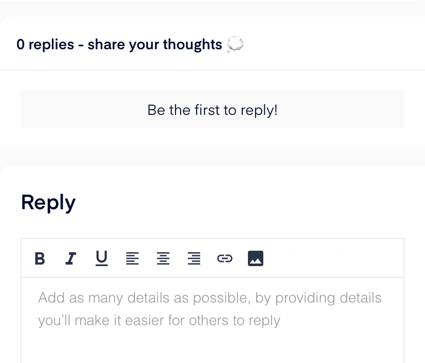
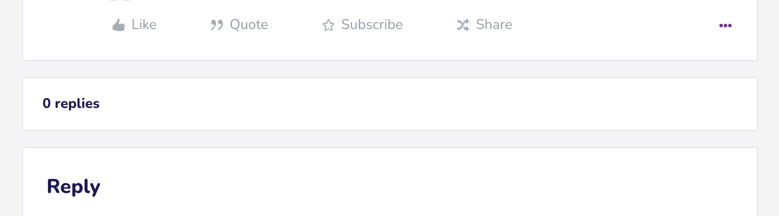
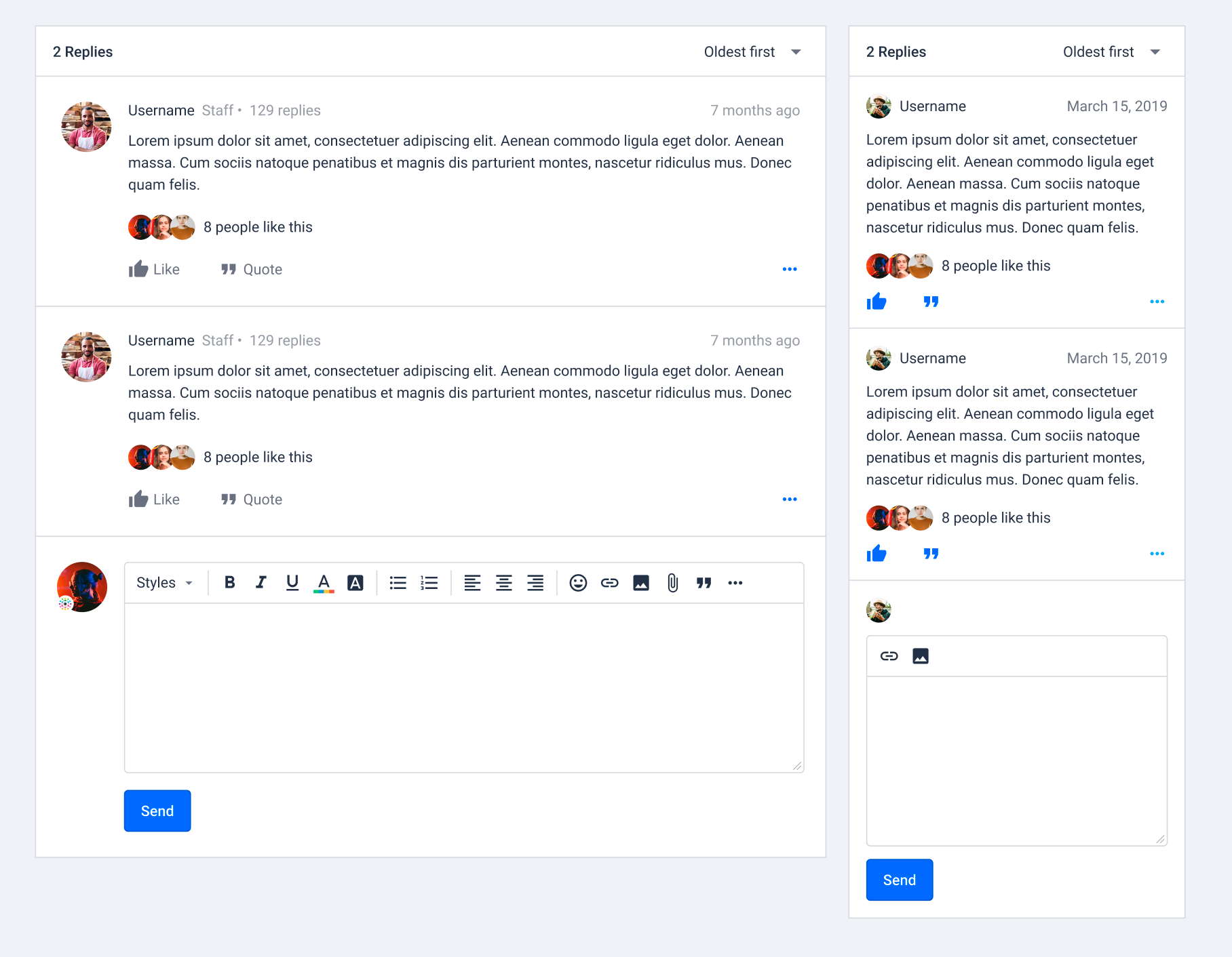
It seems that the 0 replies box is actually more of an X replies box that populates the reply feed on each post (and just displays a message when there are no replies. So it seems necessary to the architecture of each post that it goes:
- Post
- X Replies box
- Reply (draft/edit) box
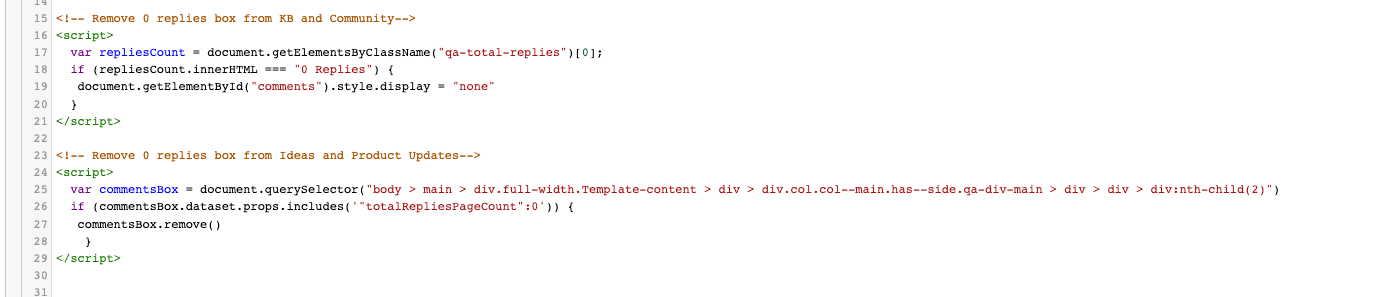
My proposed solution is to introduce logic that hides the X Replies box for posts where Replies >1. That would move the reply editor higher in the page and introduce a more intuitive UX.
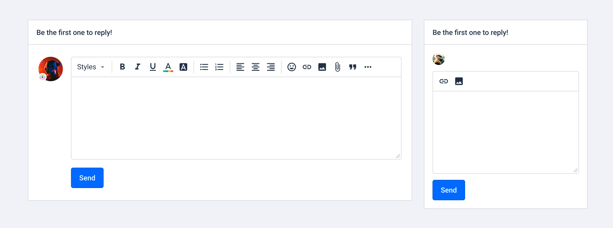
Alternatively, the most intuitive solution would be adding a reply option to the original post that’s similar to quote functionality: jump to the reply editor, just without the quote.
I’d personally recommend both.