Last Updated On: August 06, 2025
This article helps community users learn about the changes in the search functionality in Community.
Overview
Community is where customers collaborate, learn, and share product or service experiences. They heavily rely on search capabilities to navigate through all available information and access information that is most useful.
Overview of Key Changes
The following table lists an overview of changes that are brought to the search experience for the community users.
| Area of Change | Improvement | Current Experience |
|---|---|---|
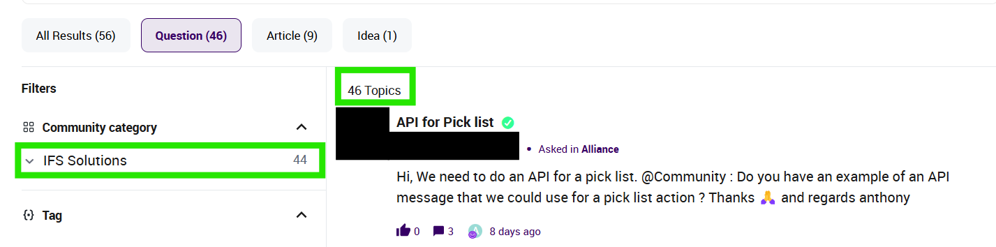
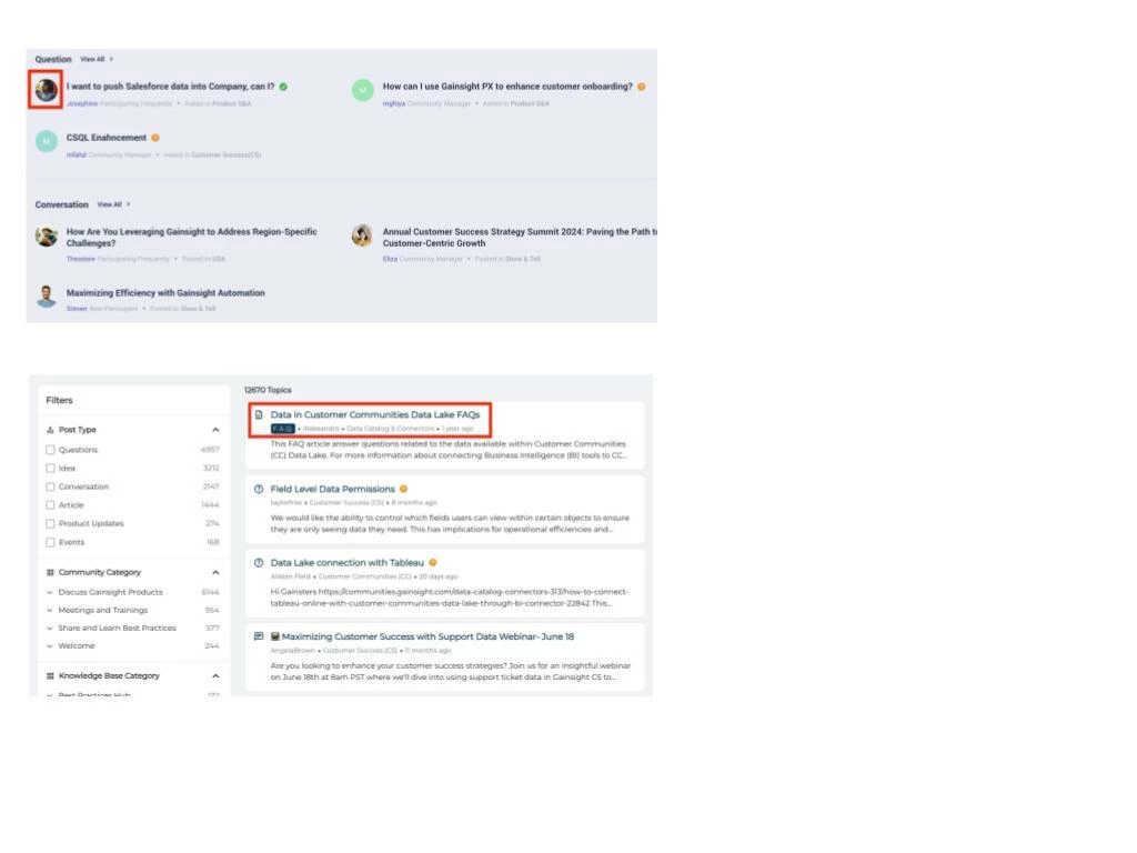
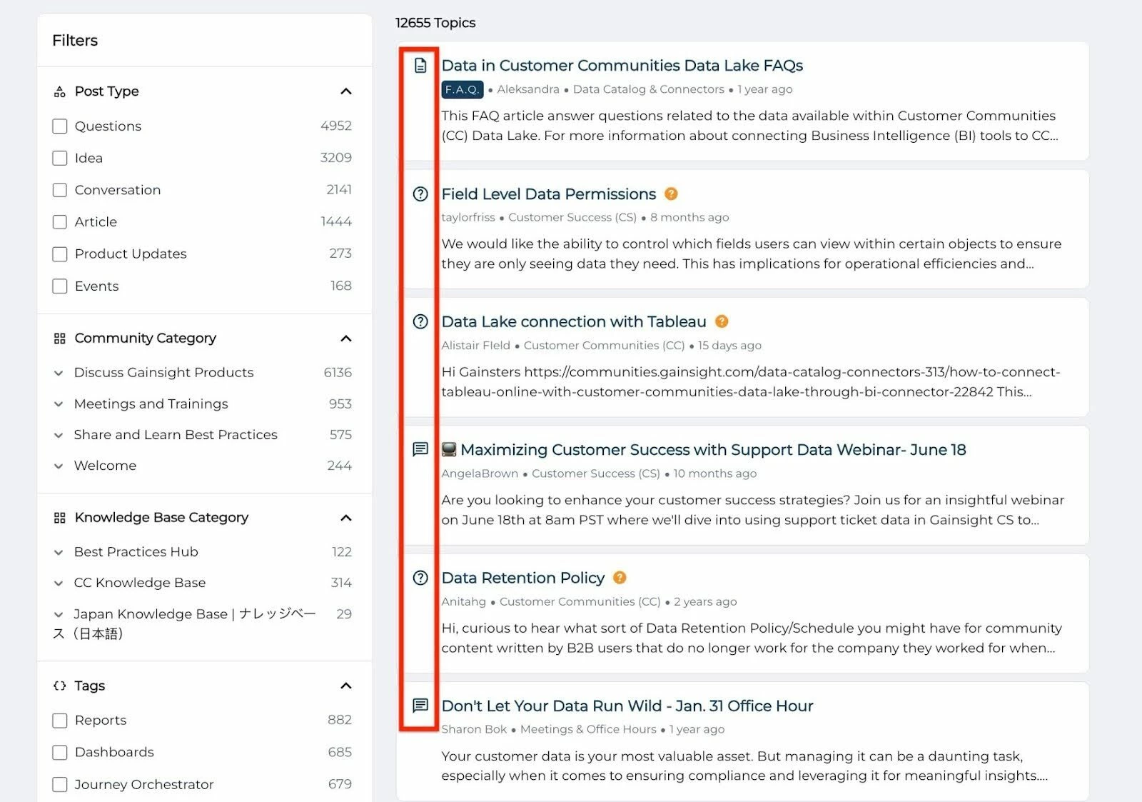
| Display of search results | Search results are now shown in a single, combined list, instead of grouping results by source (such as community or external content). | Search results from the community are displayed first above any external content |
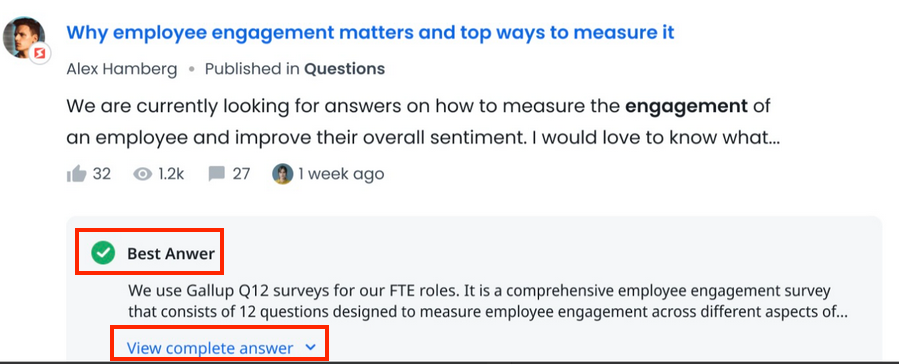
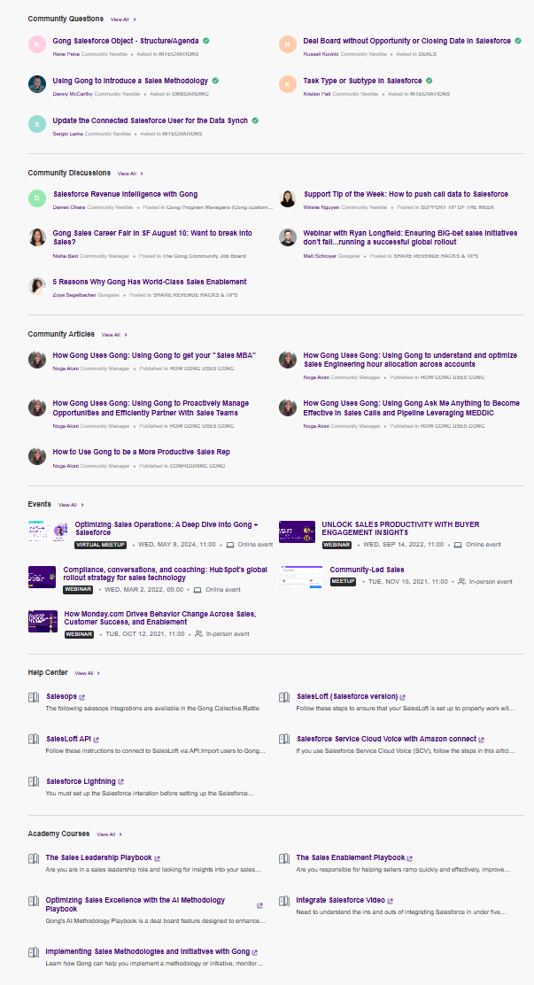
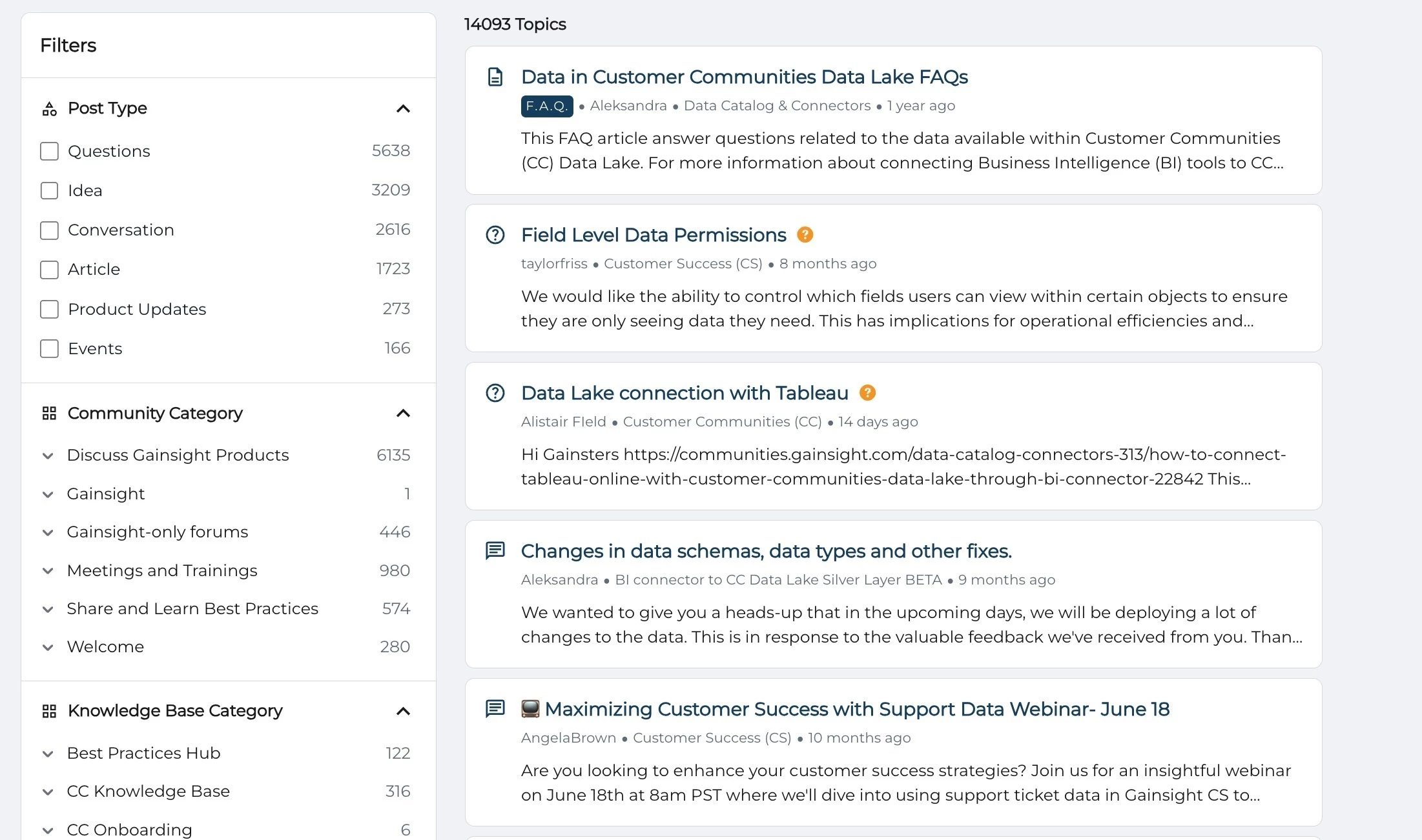
| Simplified search results layout | The search result page reduces visual clutter to highlight content, introduces clear icons to quickly identify content types, and features an improved sidebar with smarter, easier-to-use filters. Note: Only available when you have enabled the Enhanced Search Experience beta. | The search page displayed less useful data, such as avatars and statistics. Moreover, different content types were hard to distinguish. |
Note: The new Search experience is available as the default search bar to all community members.
Functional Improvements
These improvements focus on how search behaves behind the scenes. The goal is to surface the most relevant content regardless of its source or type, ensuring users spend less time finding information quickly so they can focus on engagement.
What's New in Search
Recent updates to our search functionality provide better precision, control, and clarity:
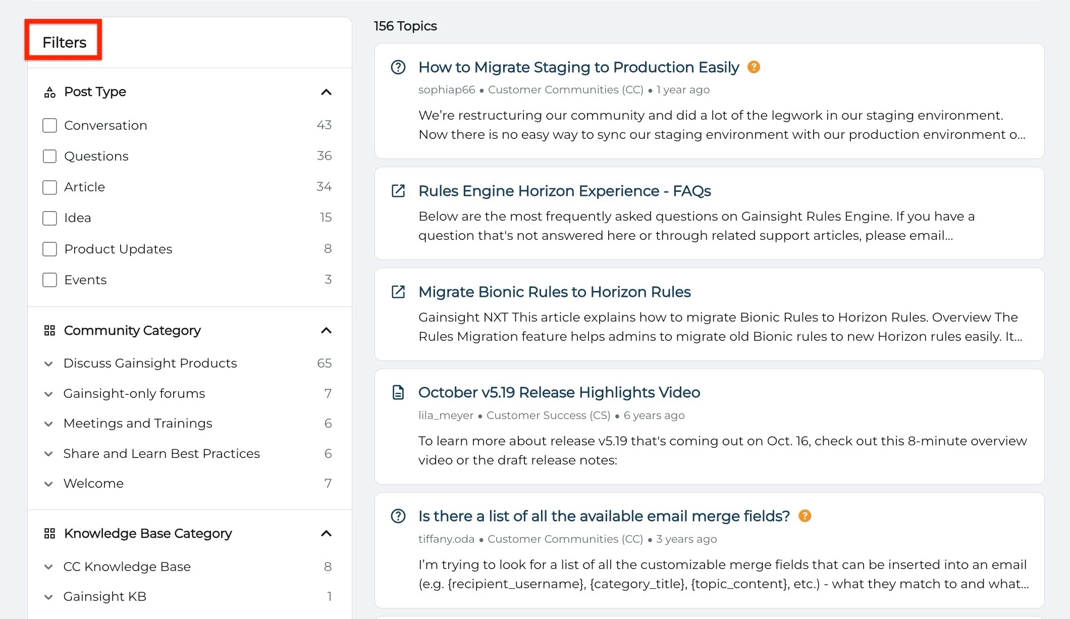
- New Filter Options: Narrow results by source, content type (article, discussion, solved question), product area, tags, and categories.
- Improved Relevance Ranking: Updated algorithm prioritizes content based on recency and user engagement.
Enhanced Visual Cues: Content types are now more clearly marked in search results, helping you identify what you are viewing at a glance.
Unified Relevance-Based Search Results
Search results from the community and external sources are shown in a single, combined list. Instead of grouping results by source or category (such as community or external content), everything is ranked together based on relevance to your search. This makes it easier to find the most helpful information right away, without needing to switch between tabs or sections.
UI and UX Improvements
In addition to functionality upgrades, there is a significant improvement in the look and feel of the search results page. These updates help users process information faster and interact with content more intuitively.
Clear and Condensed Layout
The new design minimizes clutter and distraction. By removing less useful data such as avatars and social stats, the search page now focuses on what matters: the content itself.
Visual Clarity Through Content-Type Icons
Each search result includes an icon that shows what type of content it is, such as a question, article, discussion, product update, idea, or event. External content is marked with an icon to indicate that it opens outside the community.
Sidebar Filter Improvements
Finding the right filter is easier than ever. The redesigned sidebar offers better contrast, categorizes options more clearly, and dynamically adapts based on your current search.
If you have any queries or feedback, please feel free to drop an email to docs@gainsight.com or post a reply to this article.