Hi there -
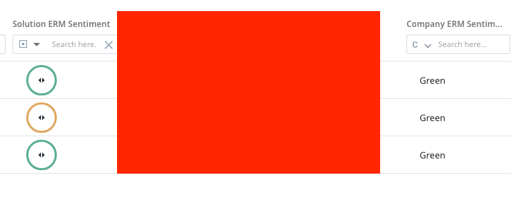
I’m working on rolling out relationship-level scoring in our org. When building out a relationship-level mass edit report to show these scores to our end users, I noticed that the UI that shows the actual color (and therefore the scorecard comments when you hover over it) is only available for relationship scores and measures. If I want to show the Company score, I’m resorted to just showing the label (as you can see in my below screenshot.
I’d like to see an enhancement where Gainsight allows the same UI color option for Company level scores when sourcing from the relationship level. It would be super helpful for us to quickly ascertain if there’s a difference between the relationship score and company score, plus it just looks nicer! Thanks for considering.