As a user or administrator, I want greater control over the display of date fields in reports. I also want this control when working with formula fields. (in Reports, Data Designer, etc.) This would allow me to display or convert date values however I need for my use case, e.g. 4/15/2024 could be presented as “2024-04-15” or “15 April 2024” or “April 15” or “Apr” or “Q2” or other formats in a table or chart.
Example use case - 2 dimension chart:
I want to show a bar chart where values are grouped by Month and Year so that 12 sequential months make up the x-axis and year-over-year values grouped for each calendar month, as seen in this example from a spreadsheet:
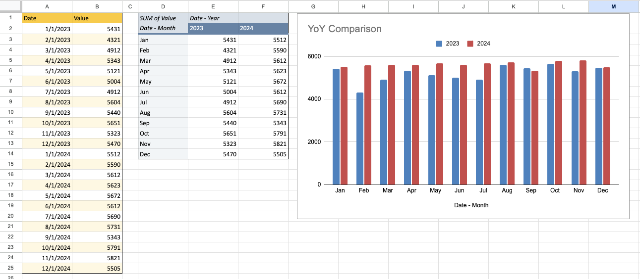
A presentation like this allows customer metrics within a certain time period to be visually compare to the corresponding period of a prior year., e.g. one month year-over-year as shown above, or one quarter year-over-year, or each week of a month compared to that week of a prior month.
String conversion sequence problem
If I want to represent a date as strictly a month like “Apr” or a quarter like “Q2” in a Gainsight table or chart, I must convert the field to a string using a Formula Field and the string function “Month” which behaves as needed. But converting a date to a string for presentation purposes causes the chart to sort months alphabetically instead of chronologically, creating the problem seen here:
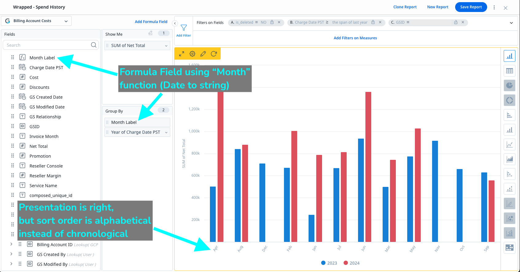
NOTE: I can’t choose “April” since the function defaults to abbreviated month strings.
If date fields could be presented simply as the month, chronologic sorting could be preserved.
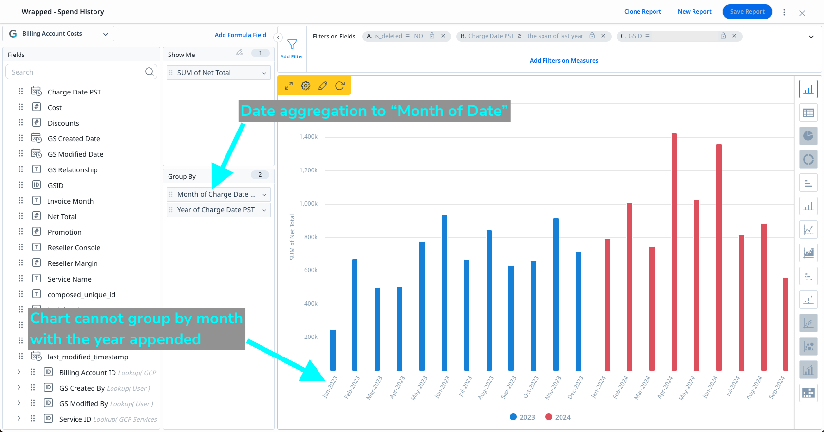
Date aggregation grouping problem
If I aggregate my date field using “Month of Date” instead, the chronology is maintained in the chart x-axis, but the year is appended to the month in the chart presentation. This eliminates the grouping of values by month across years, as seen here:
The only way I have found to get close to my goal is to use Data Designer to prepare a label string field which concatenates a month number onto a month name so that “03-Mar” comes before “04-Apr”, for example:
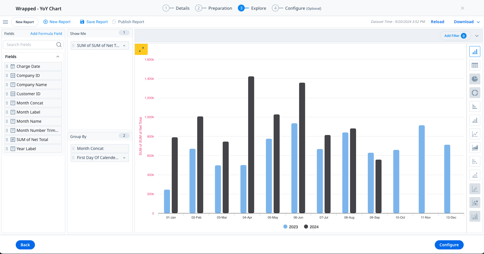
This workaround isn’t ideal for a few obvious reasons:
- Our goal of a simple month label like “Apr” is not achieved
- The level of effort is too high for admins:
- Create a Data Designer that fetches the dataset
- Convert date field to a string to create the month number (“2024-04-15”)
- Trim the date string to isolate the month number (“04”)
- Convert date field to a month label (“Apr”)
- Concat the month number string with the month label string (“04-Apr”)
- Data freshness would require a scheduled D.D. run for up-to-date presentation
Thanks for considering my request!