Currently, Gainsight CS provides standard color schemes in reports, or the ability to set color based on predefined values.
It would be highly beneficial to have the flexibility to select specific colors based on columns or grouping categories.
This functionality would allow us to create clearer, more intuitive visualizations that align with our data presentation needs.
Here are some key points that we believe would add value:
- Custom Color Selection: Ability to manually select colors for specific data groups.
- Consistency Across Reports: Option to save selected color settings for consistency across similar reports.
- Improved Visualization: Enhanced clarity in data interpretation by assigning colors that naturally correspond to different groups or columns.
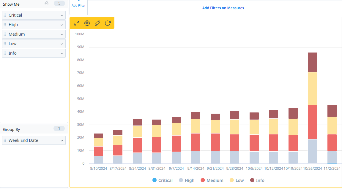
Below is an example of a report where the colors assigned in this chart are automatically generated and don’t intuitively match the severity levels represented by each category.
Ideally, we would expect colors to reflect the criticality of each category (for example, red for "Critical," yellow for "Medium," blue for "Info," etc.).
However, in this case, the colors are simply arbitrary, which can make interpreting the chart less intuitive at first glance.