Hi Team,
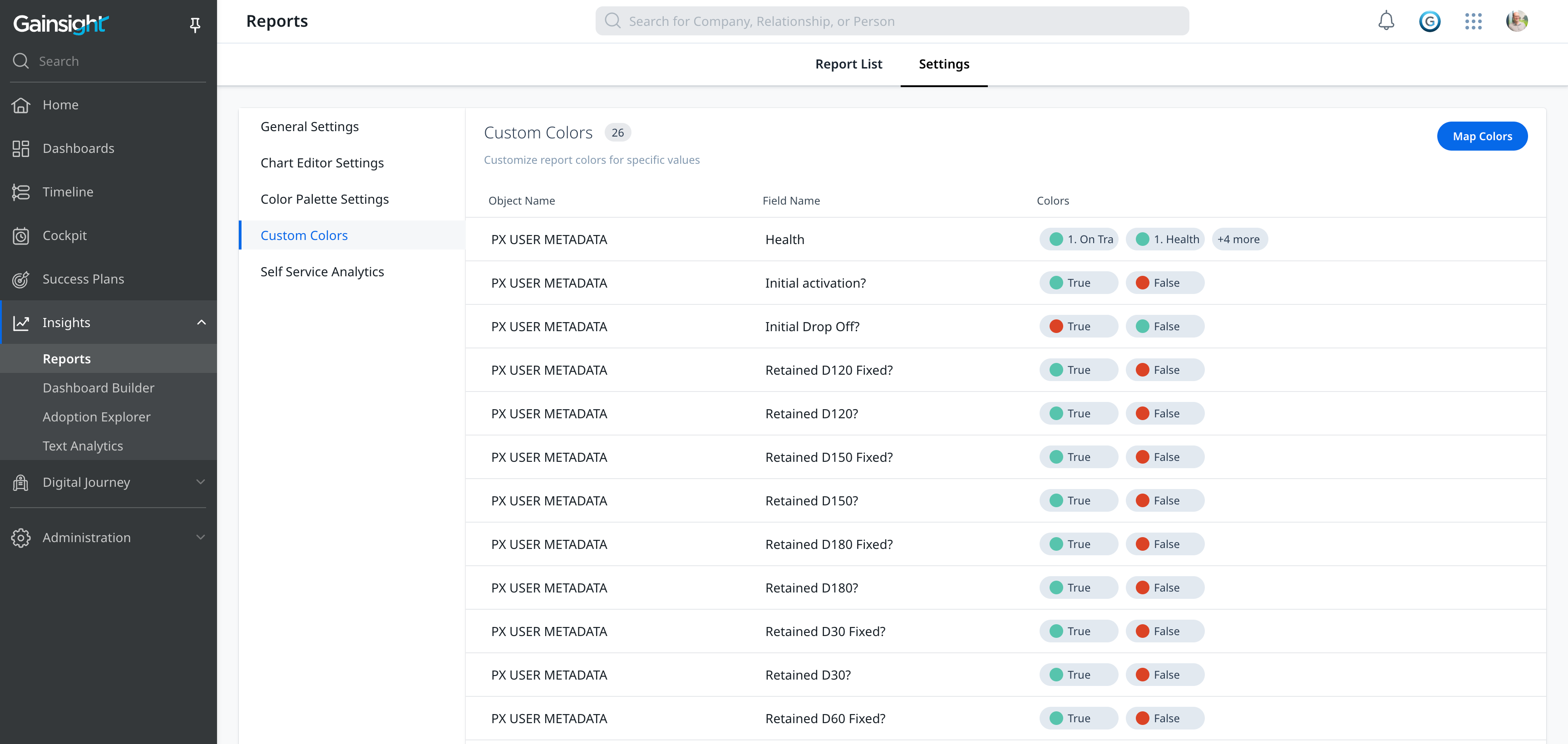
Currently, the pie chart colors appear fixed and are assigned based on the percentage of the data point (e.g., the highest value gets blue). Please provide the option to define the colors of data points based on the user's type (Promoter/Detractor/Passive) across dashboard widgets for query builder report widgets. This change would enhance the user experience.
Thank you.
New Idea
Customizable Colors for Pie Chart Dashboards

Reply
Sign up
If you ever had a profile with us, there's no need to create another one.
Don't worry if your email address has since changed, or you can't remember your login, just let us know at community@gainsight.com and we'll help you get started from where you left.
Else, please continue with the registration below.
Welcome to the Gainsight Community
Enter your E-mail address. We'll send you an e-mail with instructions to reset your password.