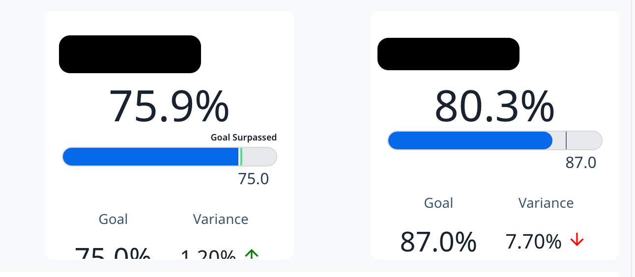
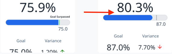
Report widgets with goal variance details are super cool to use and look nice on a dashboard, but when you have surpassed the goal, there’s default text applied to the blue progress bar (that you cannot remove) and that text pushes down the other details of the widget.
What this means is if you have variance widgets next to one another, suddenly one is “off” from the others, just slightly.
This is annoying! I wish it didn’t happen so the widgets can be consistent in sizing and display.