If you try several different filters on a heatmap report, the same record may have a different color depending on the range of your sample size. Here is an example of how people’s NPS category has shifted across surveys. Looking at a relatively large sample size, and here a Detractor (-1) will be red, Passive (0) will be yellow, and Promoter (1) will be green.
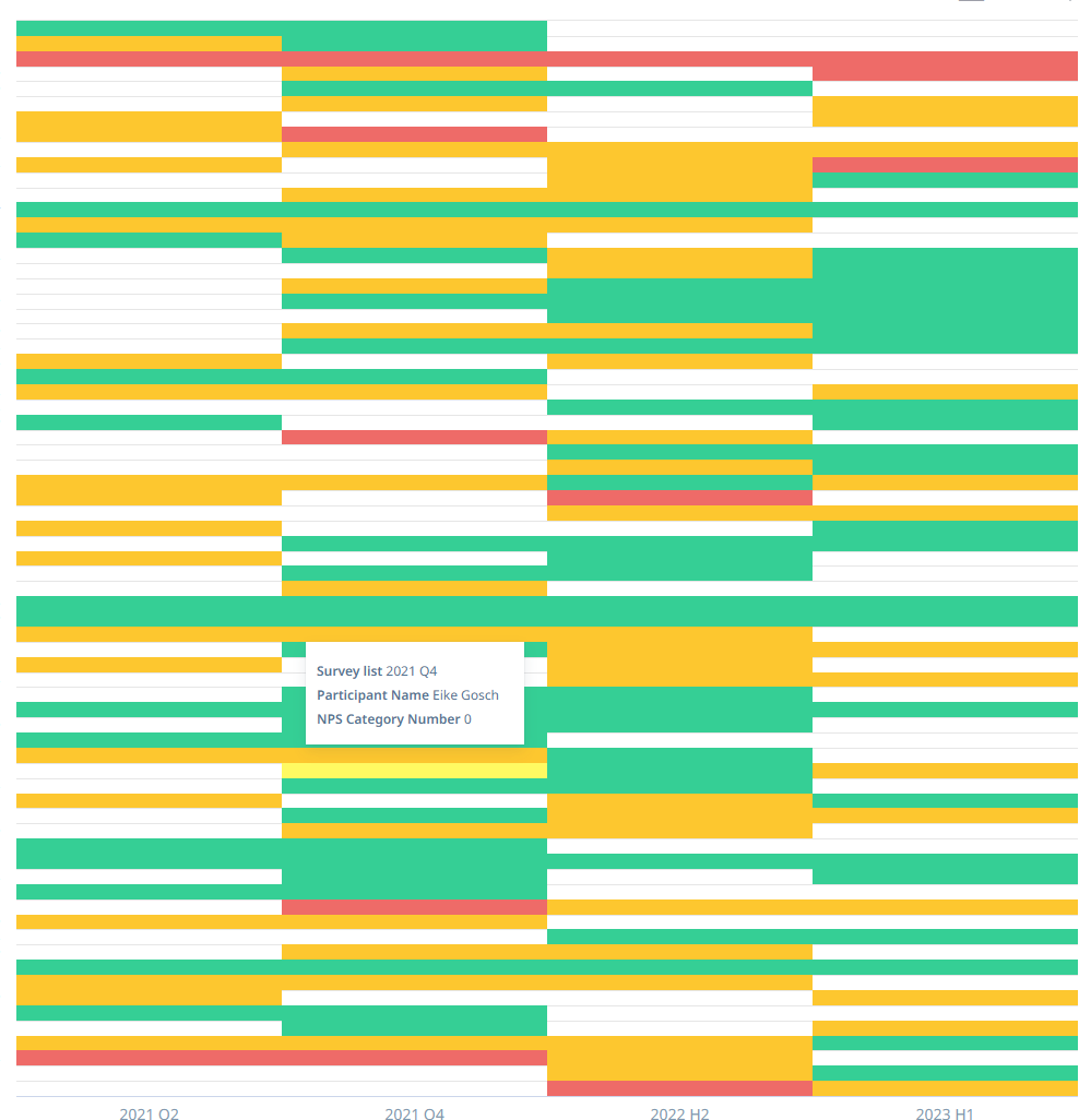
No problem because we have all the three possible values in this sample size.
However, if we take a smaller sample it could lets say only contain the Passives and Promoters. In that case the heatmap shifts the way it treats the value range and begins showing Passives as red.
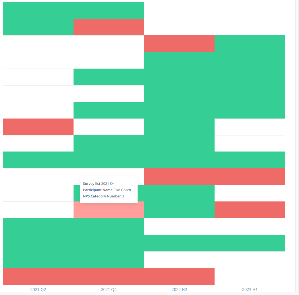
In the examples you can see how this same record shifts in color completely when a filter is changed.
I understand both behaviors may be desirable in certain scenarios so I think it would be good to have an option to “lock-in” the initial value range, or to set a coloring scheme for flat values, e.g. instead of
0%, 50%, 100% to set -1, 0 and 1 and their appropriate colors in this case.
