Closed (Won't Do)

UI suggestion to Rules in Rule Chains

Related products:CS Rules Engine

bruno_giacomelli
Hi,


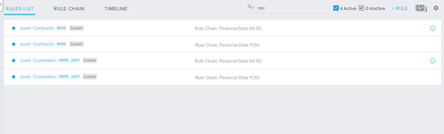
To decrease cluttering, decrease vertical space use in Rules Lists and simplify reading, I would like to suggest that the rule chain label of a rule goes to a center column.


A little mockput to show what I mean:


Image 1: how it is today.


Image 2: suggestion to improve reading


Thanks,

Bruno

3 replies

sundar
  • Expert ⭐️
  • 534 replies
  • July 29, 2016
Wow! Thanks for the suggestion with mockup!! What is your screen resolution? Do you use an extended monitor?

We went with additional line for rule chain name because many of our users have really long rule names and significant users have 13" screen. The ideal way here would be to use dynamic layout and bring it into single line when the resolution is high (wide screen).

murthy_kavali
Forum|alt.badge.img
  • Contributor ⭐️⭐️
  • 7 replies
  • July 29, 2016
How about trimming Rule Chain Name and showing full name on mouse hover in case of 13'' monitors ?

bruno_giacomelli
  • Author
  • Contributor ⭐️⭐️⭐️⭐️
  • 25 replies
  • July 29, 2016
Hi Sundar,


Thanks for your reply. I'm using a 14" screen with 1366x768 resolution without extended monitor.


Regarding the long rule names, I believe the dynamic layout would be the perfect solution here using a responsive structure. Trimming rule chain names as commented by Murthy would be another possibility.


Maybe the rule chain name column could be moved a bit further to the right instead of being exactly in the center as well, giving more space to rule names.


Let me know what do you think and if it would hit a release somewhere in the future ;)


Cheers

Reply


Cookie policy

We use cookies to enhance and personalize your experience. If you accept you agree to our full cookie policy. Learn more about our cookies.

 
Cookie settings