

sarahmiracle
VIP ⭐️⭐️⭐️⭐️⭐️
February 7, 2022
New Idea

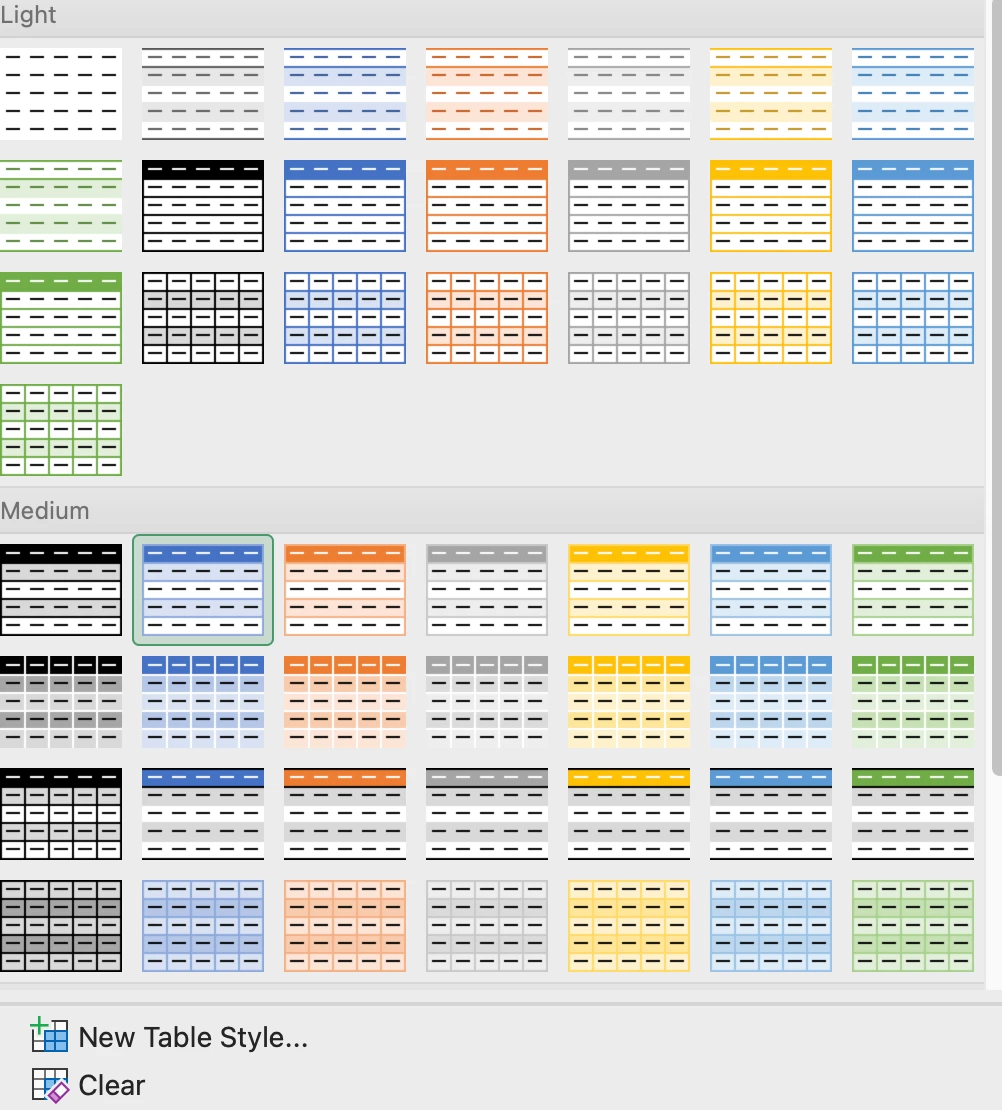
Ability to add "themes" (or colors) to tabular reports like Excel

  • February 7, 2022
  • 1 reply
  • 88 views

We love tabular reports -- it’s what our users prefer and what managers like to see. So, we use a LOT of tabular reports in our dashboards, through report sharing, etc. It would be great if we could set color themes to these tabular reports, to make our dashboards more colorful and eye-catching, like you can do in Excel.
 

1 reply

hardik_mota
Helper ⭐️
June 6, 2022

Hi @rakesh !

I wanted to check if we have any near term roadmap for this request?

Most of the customers Wanted to see if we could the percentage % fields in red, yellow, green kind of like scorecard mass edit or Excel report in the “tabular” format. 


Best,

Hardik


Hardik