

Allow Multiple Labels in Report Visualizations
User Story: As an admin, I would like to be able to include more than one data label on a report visualization to make it easier for my users to understand the data they are seeing. As and end user, sometimes differentiating the colors even with a legend is difficult and requires I click on everything anyways, making it harder to understand my data.
Example:
I have a funnel chart that looks something like this:
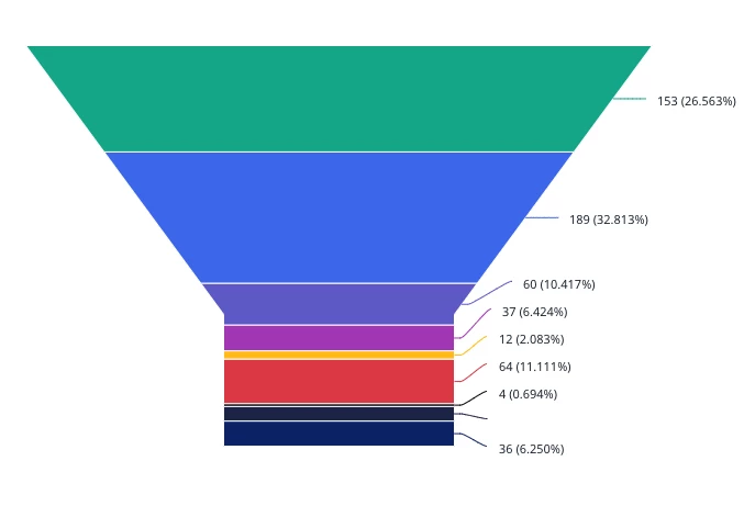
I have the numbers on the right, which is all well and good, but I would really like to better indicate what each stage is. Yes, the legend is cutoff from the image, but I would like the option to either have the different sections labeled on the left side (or opposite) the numbers, or inside the funnel itself.
Yes, you can mouseover to see it, but you can also see the datapoint there as well. In the interest of wanting to see the pertinent information at a glance, I would like the option to add funnel stage names in addition to, or instead of, the legend. Or even as an enhancement to the legend.
Currently, putting the legend on the left side just doesn’t look good because it only shows a few values at a time and you have to click the arrows. Not a great look or really useful.
You might be able to do this for some chart types and not others, but while my specific example is a funnel chart, I don’t want anyone to think this would only be useful for funnel charts.