

New Idea
Better Mapping of CSAT Widget on 360
In the below picture, you are seeing the CSAT widget in the survey module on a C360 which only has one response: a 2 out of 5. The widget makes this look a) like a %, b) like a 0, which is not even within the CSAT methodology.
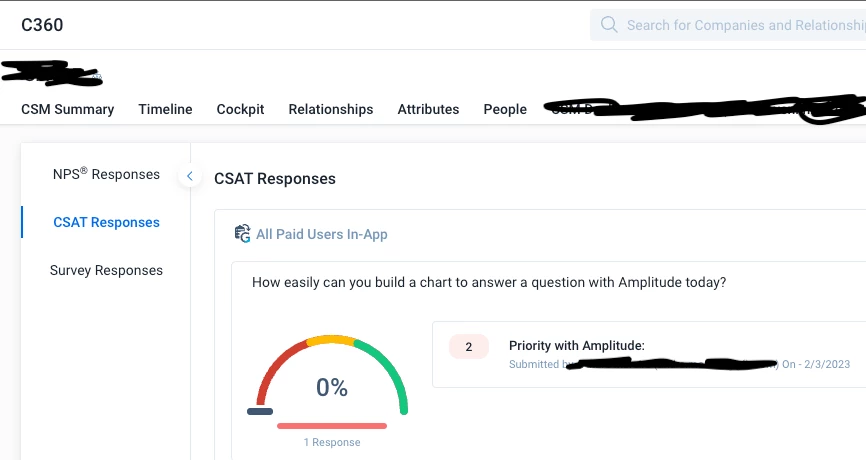
The widget should simply show a configurable avg or median, as opposed to translating to a %, as this is misleading and confusing, especially since it is a gauge. Even if 2 is a detractor, I would expect it to be higher on the gauge than a 1. This is the whole point of a numeric grade on anything that ties to colour: so we can answer questions like, “just how red is it? Is it better or worse than this other red?” and prioritize outreach accordingly.