New Idea
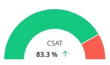
Gauge Chart from Homepage as a Report Visual Type
There is the gauge chart that is available in the reports that has a single-colored band and selective coloring. But there is a segmented banded gauge chart available for NPS and CSAT on the homepage and 360 pages that acts in a similar manner to the donut chart (allowing to view segmented results categorized as good/neutral/bad).
Stakeholders frequently request this specific visual but filtered in different ways as we utilize multiple versions of NPS surveys.
Best case scenario this would be an option in reports that allows for dynamic local filtering as a KPI visual that could ALSO be plugged into the widget summary ribbon on the homepage.