New Idea
Guage chart improvements - add needle & data range
Hey!
The new guage chart is great, but it could do with some extra features please.
Some items missing are:
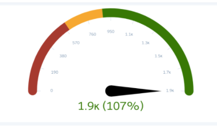
- the needle itself
- the data range for the guage (0, 190, 380, 570 etc..)
- the current value and %
- Maybe what the values are for “red vs yellow vs green”
example from the salesforce guage included below as a good example
as a side note, we have noticed that when we use the guage object in a dashboard, it displays poorly and is very small