

Improve GSHome Ribbon CTA Widgets Drilldown Display based on Column Length
Hi all
Here’s some whitespace feedback for change 🙃.
I’ve recently moved our team of CSMs to the new Gainsight Home layout with the “new” ribbon and CTA widgets. They like that they can now click on to see details of what’s open, overdue etc. without us having to provide additional homemade widgets.
However, they’re frustrated at the way it displays because they can’t see the name of the relationship nor click on it without expanding the Company > Relationship column (and with the width of the side pane, it takes several expansions to see the relationship link).
Currently, the width of all columns is the same regardless of that column’s actual content. While clearly, the longest columns are the CTA name and the Company > Relationship column.
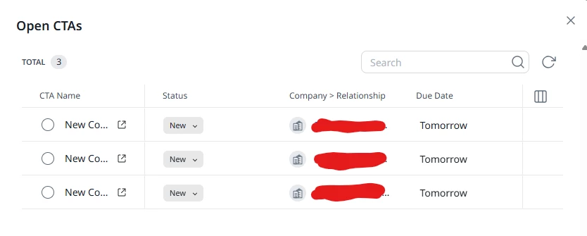
Our ask:
Better utilize whitespace for a more usable drilldown feature in CTA widgets (all of them).
- Instead of opening a sidebar, open a pop up with the CTA information.
- Allow column wrap OR column sizing based on actual column content by default → the Company > Relationship column width is just insufficient.