

Improve multi-select picklist display in C360
I think this has been touched upon in several posts that weren’t directly related either (or at least I couldn’t find any).
I reference this question from
Making multiple choice drop-down field easy to read | Gainsight Community
It’s high time we had a better way of displaying the contents of multi-select picklists in C360 for CSM QoL purposes. When we have extensive picklists, the semi-colon separate list is unreadable. Specifically where we have narrow spaces in C360.
Here’s an example where I can see the full list of values in multiple lists in the attributes section:
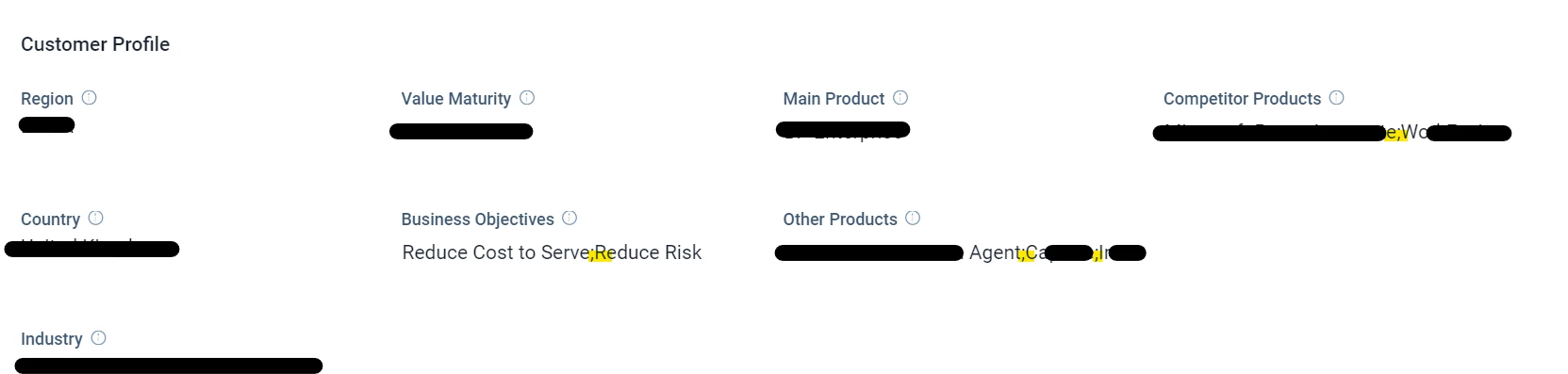
And because we can’t expand the width of attributes in attribute sections… well, it takes hovering over the field to see what other values are set.
In my mind, we’d need to:
- Display selected attributes only (as today)
- But in a column, each attribute equating a “bullet point”
Exactly as described in