New Idea
Improvements to control category behaviour in Adoption Report chart section
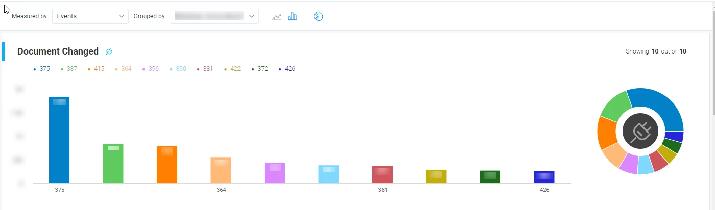
The current bar chart (as well as the line/donut) chart in the Adoption report is capped at showing 10 categories - I assume top 10 numerical values from ‘Measured by’.
Improvements to this chart include any of the following:
- control the number of legend entries
- sum the remaining categories into ‘other’
- display ALL legend entries on the x-axis
- Interactivity that allows selecting a specific bar to filter the underlying Events/user table
- control individual legend colours