

matthew_lind
VIP ⭐️⭐️⭐️⭐️⭐️
February 4, 2022
New Idea

Increase clarity of Report Name in Dashboards

  • February 4, 2022
  • 8 replies
  • 106 views

Improve the readability and clarity of the Report name in Dashboards, especially for Reports taking up smaller spaces, such as Widgets.


Here’s an example of the Report Name being cut off when 3 widgets are added to a Dashboard.
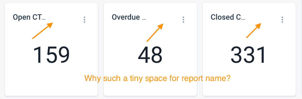
 

Yes….if you mouse over the Report Name, the full Report Name will appear as a pop-up. However, the basic use case for a Dashboard is fast scanning. Having to mouse over elements just to see Titles runs counter to the basic use case of a Dashboard.

    8 replies

    February 4, 2022

    +100 to this.


    This also should be applicable to the reports that are utilised in the adoption explorer dashboards. 

    heather_hansen
    VIP ⭐️⭐️⭐️⭐️⭐️
    February 4, 2022

    Plllleeeeaaasssee

    bradley
    Expert ⭐️
    February 4, 2022

    Related posts as well, send your votes!


    sarahmiracle
    VIP ⭐️⭐️⭐️⭐️⭐️
    February 4, 2022

    +100 to this as well. It’s annoying to need to make my widgets bigger just to fit the report name (and then the actual widget is drowning in excess white space).

    Tangentially related post -- if we could have aliases for our report names in a dashboard I could also shorten my report names in the dashboard


    Customer Success Systems Admin @ Amplitude, 3x Gainsight CS Ops Product Council Member
    matthew_lind
    VIP ⭐️⭐️⭐️⭐️⭐️
    February 4, 2022

    Awesome call out, @sarahmiracle . 

    The item you’ve linked to is another of my HA pet peeves. (And yes….I’ve voted!)

    Making people their best....currently disguised as a CS Ops Architect. How can I contribute to your success?
    Azad
    Gainsight Employee ⭐️
    Gainsight Employee ⭐️
    April 25, 2022

    @matthew_lind - we took a stab a fixing this, now you can see more of the title by default, while we are looking into improving this further in the coming releases would love to hear feedback on the current implementation.  


    PM- GS Home and Analytics
    matthew_lind
    VIP ⭐️⭐️⭐️⭐️⭐️
    April 25, 2022

    @Azad - Consider me a fan! I like seeing just a bit more of the Report Title. This enhances clarity, especially for the “Widget” style Reports, which tend to be the ones which get cutoff most easily.

    Making people their best....currently disguised as a CS Ops Architect. How can I contribute to your success?
    bradley
    Expert ⭐️
    April 25, 2022

    @matthew_lind - we took a stab a fixing this, now you can see more of the title by default, while we are looking into improving this further in the coming releases would love to hear feedback on the current implementation.  


    Hallelujah! My only recommendation visually is to make the contrast of the buttons on mouse-over a bit more defined, as the refresh starts to fade into the title a little, even when fully resolved.