Make Filtering UI and UX Consistent Across all Features
I’d really like to see a consistent filtering experience across every feature in Gainsight. I know this might be asking a lot, but right now the experience is so disjointed across so many different features, why not just shoot for the moon right off the bat?
Also, I know there is a similar post to this about making filtering options uniform - i.e. including “next N days” on every filter, but I believe my post is a little more comprehensive.
I’ll start by saying there are so many filters across the Gainsight platform that there’s a good chance I’ve missed a few examples. Please add anything I missed in the comments! But here’s what I’ve come up with thus far:
- Rules Engine list
- Data Management
- Data Permissions
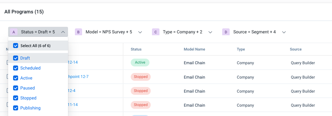
- Journey Orchestrator Programs
- Journey Orchestrator Emails
- Global Timeline
- Unification
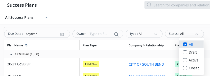
- Success Plans
- Cockpit
- Gainsight Home
- Report Builder
- Dashboards
I think the most efficient way to do this is to break it down by issue, which includes the following:
- Inconsistent icons
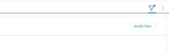
- Some filtering experiences show a filter icon, some show “modify filter”, some show “advanced filter” etc.
- Inconsistent formatting
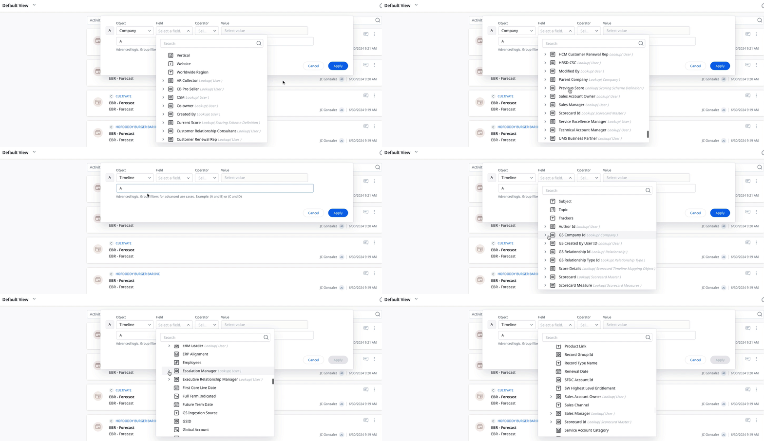
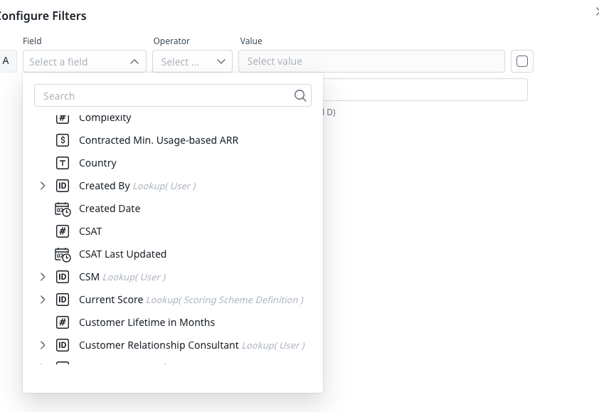
- This is a big one. First of all, some filters show everything in alphabetical order - i.e. our “CSM” lookup is sandwiched between “CSAT Last Updated” and “City” whereas in other areas all the lookups appear at the bottom of the list.
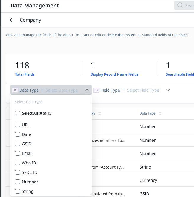
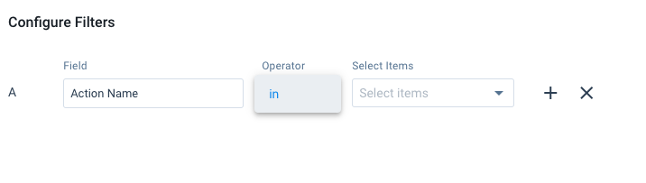
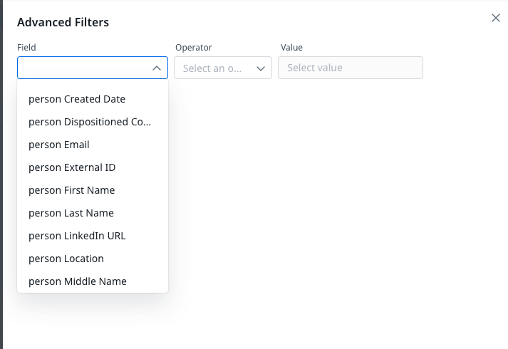
- In some areas such as Data Steward and Data Permission, the format is especially ugly, plus only a few fields are initially available to use as filters. To add more, you have to individually add fields in an obscure area of the module.
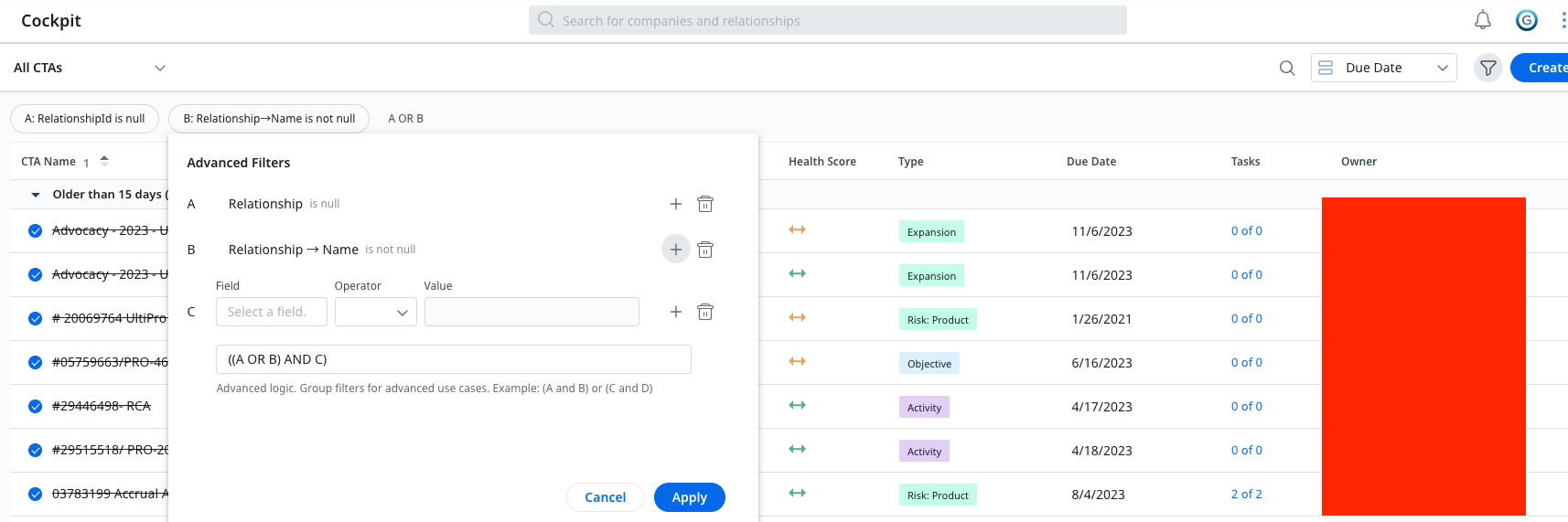
- In most modules, the filtering screen shows up on the right side, but on some (e.g. success plans and cockpit) it shows up center-left.
- Extra clicks
- In Data Management and the Rules Engine in particular, you have to click “Add Filter” right after you click on the Filter icon. Why?? Clicking on the filter icon should just automatically bring up the filter screen.
- As mentioned above, having to add fields in areas such as Data Permissions and Data Steward is very cumbersome.
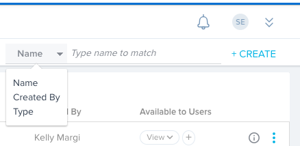
- “Views” vs. Filters
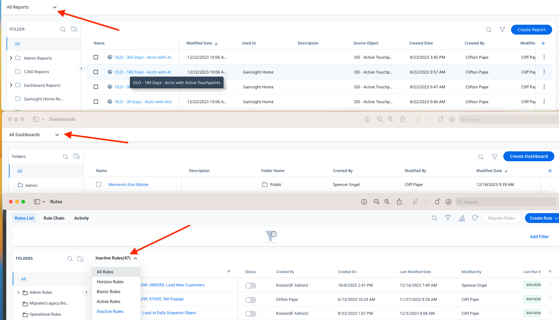
- This is something I’ve never noticed until recently, but it’s confusing and sometimes limiting. For example, in the Rules Engine, we’re able to choose “All Rules” “Horizon Rules” “Bionic Rules” “Active Rules” and “Inactive Rules” in the dropdown right above the list of rules. The filter screen gives us some more options, such as “source object,” “target object,” etc. However, there is no filter option for “active vs. inactive” or “horizon vs. bionic”, so when I recently tried to simply filter my rules list to find all my inactive bionic rules, I wasn’t able to! This is crazy. Can’t we unify this somehow?
- Inconsistent Operators
- The Rules Engine does not offer an “exclude” option, for example. This can be quite limiting. Sometimes I find myself needing this but having to settle instead for checking rules individually.
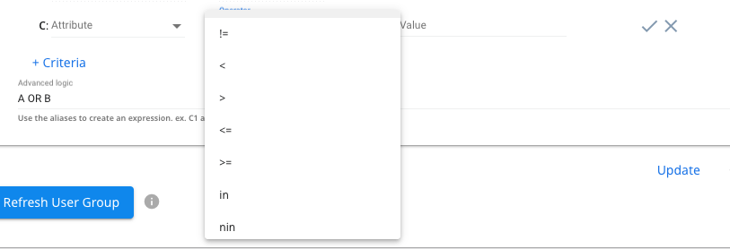
- In Data Permissions, for example, the UI of the operators just look completely different than other areas of the product.
And now, I’ll include some screenshots with some captions that hopefully illustrate some of the
issues/frustrations expressed above.