

New Idea
Make the Gauche chart conditional coloring fields bigger
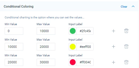
When setting the values for each color, it’s not clear what number you are looking at, nor inputting.
This one looks like the values are thousands, but actually they are millions. You have to set the cursor on top of it and move it one position at a time with the right arrow and count, or assist yourself copy-pasting in a notepad just to understand the number that’s living inside those fields.
Would be a small but significant improvement in the UX just to have bigger fields to be able to see the whole value at once
Thanks