

kevin_ly
Helper ⭐️
July 27, 2021
Released

Responsive Engagement Configuration For When Shown Screen is Resized Or Is Small

Related products:PX Engagements
  • July 27, 2021
  • 10 replies
  • 243 views

Typically PX Engagements retain their original size as shown in the editor, which is then shown to end users.

At times if a tooltip is left or right position biased , and being close to the viewport edge of an engagement creator’s screen,  if an end user viewing it has a smaller screen in the end, things can go off the viewport like below.
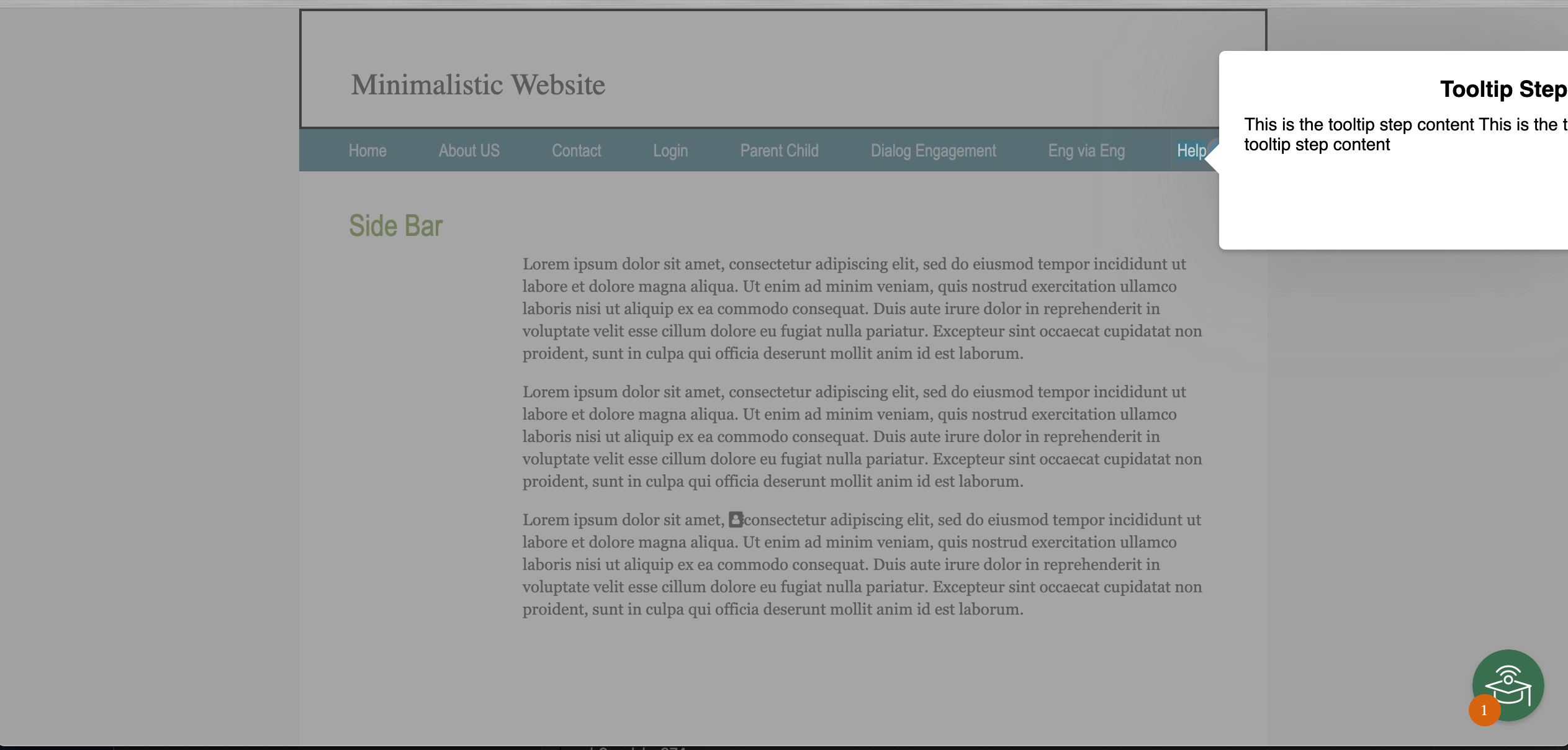
 

It is desired to have some configuration to control over the responsiveness aspect of engagements. Maybe if the screen is two small, go ahead and do word wrap to fit or remove an image within the engagement or remove certain text as things get smaller. etc.

10 replies

sai_ram
Expert ⭐️⭐️
July 28, 2021

@kevin_ly thank you for bringing this up here. We will get back to you with the possibilities here. 

skalle
Gainsight Employee ⭐️
August 2, 2021

@Namrata Mitra  Have we considered this for our new engagement experience

mmarques
Helper ⭐️⭐️
June 2, 2022

We just ran into this issue. I understand that we can manually edit each engagement to position the tooltip that will keep it on the screen. However, this should not be needed. For example, in @kevin_ly ‘s screenshot, the tooltip could display if automatically shifted to the bottom left position. Shifting and resizing tooltips automatically would be good and save the effort for manually testing and adjusting.

Contributor ⭐️
January 11, 2023

Hi!

Any updates on this issue? The unresponsiveness of the engagement like a tooltip one, is really affecting the user experience in a negative way. 

JayS
Helper ⭐️
February 24, 2023

I was just looking into this idea. I think another option might be to be able to size the tooltips/dialogs using percentages instead of pixels.

As you can see from this article, worldwide screen sizes are all over the board. So when we place badges, or design the size of steps could we use percentage of the screen as an option?

https://www.browserstack.com/guide/ideal-screen-sizes-for-responsive-design#:~:text=According%20to%20the%20Worldwide%20Screen,360%C3%97640%20(5.88%25)

One example of using percentage sizing is when you add a picture to a tooltip/dialog. If you resize the picture using 100% width and 100% height, it will fit the tooltip size. This is also the same when creating an Article for the bot. @link_black describes it in this post: 


Jay Sherwood
mmarques
Helper ⭐️⭐️
February 24, 2023

@JayS - I would want the option for sizing tooltips by either pixels or %. And it would be great to have an option to position a dialog by other pixel or % offset. 

JayS
Helper ⭐️
February 24, 2023

Excellent point, @mmarques! With the images in an article, you can still use pixels; it’s all typed in manually … you can type “100%” and it will resize with the bot window, or can type “200px” and it will maintain that static size.

Jay Sherwood
mmarques
Helper ⭐️⭐️
February 27, 2023

@JayS - I wasn’t thinking about images in engagements. That’s another good point! I was thinking about the offset of dialogs and tooltips.

aharkut
Gainsight Employee ⭐️
February 28, 2023

This has been released in the February 2023 interim release today.

Please note in SDK settings, at a specific product level you can enable/ disable the config for having responsive tooltips. For more details check the release notes.


https://support.gainsight.com/PX/Release_Notes/Current_Release_Notes_-_2023/PX_Release_Notes_February_2023_Interim_Release_Version_3.13.0#Configure_Responsive_Tooltips


Thanks

aharkut
Gainsight Employee ⭐️
February 28, 2023
Acknowledged→Implemented