
christopher_sanderson
Helper ⭐️⭐️
July 5, 2017
New Idea

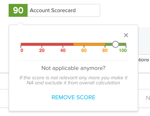
Scorecard scoring scheme slider bar

  • July 5, 2017
  • 7 replies
  • 88 views
Thinking it would be cool to get rid of the slider bar at this point.  The visualization is cool, but I feel like I spend an extra 5 seconds trying to get it on an exact number, and even more if I want to slide it all the way to 100.  I am sure I'm exaggerating, but it just feels like a nuisance.  What if we could just insert the number of the score in a box, but could still see the slider bar for guidance in what makes red/yellow/green etc?

    7 replies

    ganesh_burle
    Contributor ⭐️⭐️⭐️
    July 6, 2017
    I agree and it can make user comfort. I would recommend the text box could be on top of the bar and in middle of the container. The text(number) color shall match with the stage grade.

    https://community.gainsight.com/gainsight/topics/scorecard-scoring-scheme-slider-bar A sample mock attached for reference. 

    christopher_sanderson
    Helper ⭐️⭐️
    July 6, 2017
    Awesome!!
    dan_ahrens
    Expert ⭐️⭐️⭐️
    July 6, 2017
    Great suggestion Christopher! I'll definitely +1 this one. 
    VP of Customer Success at Forcepoint
    ashok_dugaputi
    Helper ⭐️⭐️
    July 16, 2017
    Ganesh - Glad to see your feedback around UX on the community! Appreciate your time.
    ashok_dugaputi
    Helper ⭐️⭐️
    July 16, 2017
    Chris - As usual, thanks for sharing quality feedback!
    heather_hansen
    VIP ⭐️⭐️⭐️⭐️⭐️
    January 11, 2018
    Agree.  We're asking our CSMs to select a specific number to indicate a specific customer state, and the slider is causing them some frustration.  Any updates on when this might happen?  
    Contributor ⭐️⭐️⭐️
    March 2, 2023

    Big +1 on this. Often I can get it right away, but I just literally spent almost 10 minutes trying to get the slider to 100 before finally getting it to work.