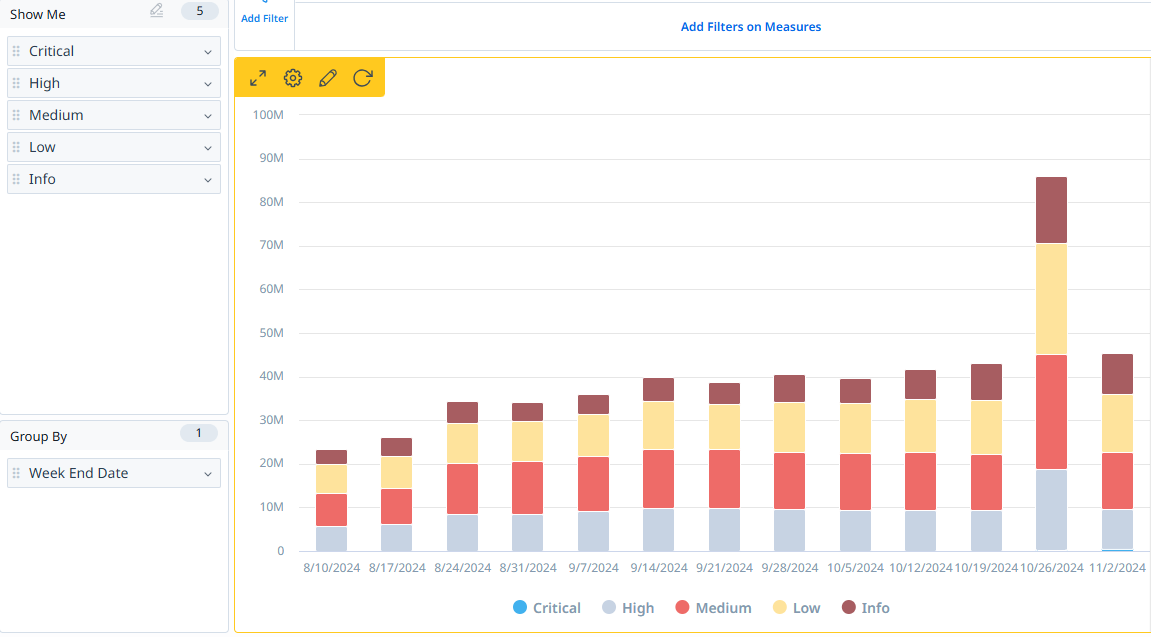
I have had multiple clients ask for more customizable colors within every part of Gainsight. The current limited selection of colors within scorecards, CTA types/values, and reporting limits the company’s ability to display data effectively to its users, CSMs, and clients. The addition of universal color picker would allow for bigger companies to segment their business units better and display information more effectively to its users. It would also allow for better internal communication of business practices by showing users more distinct differences in the data.
- Scorecards: be able to customize the Scorecard color scheme and individual score colors
- The color scales only allows for Red/Yellow/Green of varying shades. Previous client asked for Black to display customers that have churned. Red/Yellow/Green cannot convey this accurately. Another previous client asked for a Blue color to display customers that are new and should not be considered “good” or “bad” until they have been entirely onboarded. The current RYG color scale only allows for a “good” to “bad” ranking.
- You can currently only adjust color scales at a Global level; setting the color scale effects ALL Relationship types. My current Fortune 100 client has multiple organizations using Gainsight that all have different needs that should be able to be customized at a local/Relationship level. The current product is not scalable enough to accommodate these types of clients.
- Communicating to users that a customer is special in some way is currently impossible with the limited RYG color scales. Need more options to easily convey the information to CSMs
- CTAs: be able to change the CTA value color in dropdown lists to better portray similarities and differences.
- Covered in this idea.
-
- Covered in this idea.
- Reporting: Be able to change bar, pie, and line charts with whatever color you want to display
- Charts and graphs need to be more customizable in terms of displaying information that is familiar with the user.
- If a company uses a certain color to display a type of customer within their own presentations/marketing material, they should be able to create a graph/chart that is immediately transferable to their presentation in Gainsight. Right now, I have to create a chart in Gainsight and then export the data into excel, create the exact same chart in Excel, and then choose the right colors for internal presentations. Being able to choose the right colors in Gainsight would eliminate this issue.
A universal HEX color selector would solve all the issues above and make Gainsight a more scalable solution for bigger companies.
Some examples of where this could come in handy:
- Churned customers could have a different color in Scorecards to tell CSMs not to communicate with them.
- New customers who have yet to be onboarded could have a Blue color to display that they should not be included in the normal scorecard rankings.
- CTA values related to each other could have shades of the same color, but still different. This would allow CSMs to properly choose the right CTA reason/type/status more effectively.
- A company with multiple logos could accurately align logo colors to reporting charts and graphs. Gainsight could display CX customers as blue and PX customers as yellow within the same chart and have the colors accurately match the colors they use in their marketing materials.

