

Configure List Views
This article explains how community managers and admins can customize their community tabs to highlight the content or to make it visually appealing.
Overview
The community tabs focus on the most recent information, and is segregated into Categories, Recent activities, and Help Others.
To keep your homepage engaging and visually appealing, it's essential to highlight key content within these tabs. Without proper highlighting, the page may appear dull and uninviting.
Admins can also adjust Card themes for a structured, engaging layout by switching between list and card views.
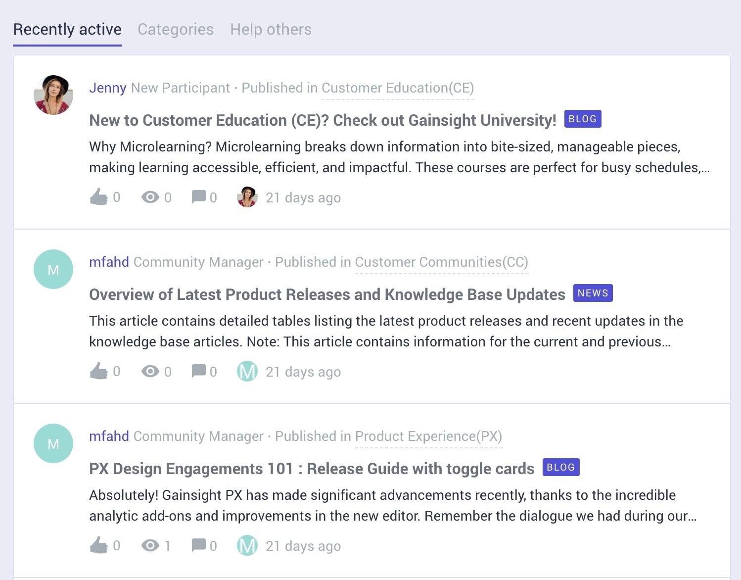
You can customize how the community page looks by navigating into Destination and using Styles.
Configure List Views
To customize how the feeds or tabs are represented on the community page:
- Log into Destination.
- Click Style.
- From the Style drop-down, select List Views. The List Views slide-out panel appears.
- Turn on the Use Card Theme toggle. The customization options appear that allow you to design the look and feel of the tabs to match your organization’s guidelines.
Card Customization Options
The community tab can be modified using the below customization options:
IMPORTANT: The colors can be assigned separately for the Default, Hover, and Click actions.
| Customization Option | Description |
|---|---|
| Card Border Width | Enter the border width in pixels (px). |
| Card Border Radius | Enter the border radius in pixels (px) to adjust edge roundness. |
| Background Color | Select a color or enter a Hex value using the Background Color dropdown. |
| Title Color | Select a color or enter a Hex value using the Title Color dropdown. |
| Text Color | Select a color or enter a Hex value using the Text Color dropdown. |
| Border Color | Select a color or enter a Hex value using the Border Color dropdown. |
After modifying the cards, click Publish to save the changes done.
If you have any queries or feedback, please drop an email to docs@gainsight.com or post a reply to this article.